
Photoshop Gurus Forum
Welcome to Photoshop Gurus forum. Register a free account today to become a member! It's completely free. Once signed in, you'll enjoy an ad-free experience and be able to participate on this site by adding your own topics and posts, as well as connect with other members through your own private inbox!
You are using an out of date browser. It may not display this or other websites correctly.
You should upgrade or use an alternative browser.
You should upgrade or use an alternative browser.
Self portrait - Before and After
- Thread starter scarmack
- Start date


scarmack
Well-Known Member
- Messages
- 107
- Likes
- 38
Black(or dark) in the graphics world can be your friend. nice touch
I appreciate that, most of my work usually comes out on the darker side. When done right, it can look good. Like you said, it can be your friend or even worst enemy haha


scarmack
Well-Known Member
- Messages
- 107
- Likes
- 38
Kind of in love with yourself a little bit ah?
HAHA, I kept looking for before and afters and going through 70k photos, I only found ones of me! lol.
I found a couple others though, posting now
") haha
haha

Tom Mann
Guru
- Messages
- 7,223
- Likes
- 4,343
Just a couple of suggestions w.r.t. your 1st photo (ie, you and the dog):
0. Background removal or reduction is almost always a good thing when trying to make a casual photo look like a conventional portrait.
1. You have increased the contrast so much globally that you have introduced a very distracting bright patch on your forehead. Use masking or other techniques to control that. Blown highlights look very unprofessional.
2. The same thing has happened at the opposite end of the brightness spectrum. You have increased the contrast so much everywhere in the image that you are now getting an unintentional merge between the black fur on dog and his surroundings. A bit of shadow detail in this area would help define the dog and increase interest in the image. Again, use masks or burn and dodging techniques to selectively make changes.
HTH,
Tom
- Messages
- 22,782
- Likes
- 13,270
Hey scarmack, just found this thread.
You have done very well with the exception of post 4, it's seems a bit dark to me although I do like the letter boxing!
Whatever you do, never post or "like" anything in the Avatar Wars thread.............you have provided way too much fodder!
Exactly! I have stated this many times. It's very hard to get right and most everyone fails.scarmack said:I appreciate that, most of my work usually comes out on the darker side. When done right, it can look good. Like you said, it can be your friend or even worst enemy haha
You have done very well with the exception of post 4, it's seems a bit dark to me although I do like the letter boxing!
Whatever you do, never post or "like" anything in the Avatar Wars thread.............you have provided way too much fodder!
iDad
Guru
- Messages
- 11,578
- Likes
- 4,467
Hey scarmack, just found this thread.
Exactly! I have stated this many times. It's very hard to get right and most everyone fails.
You have done very well with the exception of post 4, it's seems a bit dark to me although I do like the letter boxing!
Whatever you do, never post or "like" anything in the Avatar Wars thread.............you have provided way too much fodder!
you dink Sam!
scarmack
Well-Known Member
- Messages
- 107
- Likes
- 38
Just a couple of suggestions w.r.t. your 1st photo (ie, you and the dog):
0. Background removal or reduction is almost always a good thing when trying to make a casual photo look like a conventional portrait.
1. You have increased the contrast so much globally that you have introduced a very distracting bright patch on your forehead. Use masking or other techniques to control that. Blown highlights look very unprofessional.
2. The same thing has happened at the opposite end of the brightness spectrum. You have increased the contrast so much everywhere in the image that you are now getting an unintentional merge between the black fur on dog and his surroundings. A bit of shadow detail in this area would help define the dog and increase interest in the image. Again, use masks or burn and dodging techniques to selectively make changes.
HTH,
Tom
I appreciate the insight. I usually get caught up when editing and haven't mastered taking a break and a checking over my work with a fresh pair of eyes. Thats usually where a second set of eyes helps. Thanks for your help.
Hey scarmack, just found this thread.
Exactly! I have stated this many times. It's very hard to get right and most everyone fails.
You have done very well with the exception of post 4, it's seems a bit dark to me although I do like the letter boxing!
Whatever you do, never post or "like" anything in the Avatar Wars thread.............you have provided way too much fodder!
Couldn't agree more. I spend way too much time on one image and usually get lost in it, and most of the time end of ruining it haha.
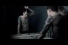
4 was hard for me. I didn't like the way it was coming out originally, so I tried a "cinematic look", wide screen, desaturate, and grunge.
Hard to pull off.
I will be sure to stay clear haha
Jessicayla
Hoopy Frood
- Messages
- 846
- Likes
- 411
Very nice work. I noticed you use a lot of blue/green hues and I'd be interested to see what some other edits would look like in other hues. Your edits definitely make the photos more interesting and stylized! Keep it up