What's new
Photoshop Gurus Forum

Welcome to Photoshop Gurus forum. Register a free account today to become a member! It's completely free. Once signed in, you'll enjoy an ad-free experience and be able to participate on this site by adding your own topics and posts, as well as connect with other members through your own private inbox!

Beautification


Messages
4,145
Likes
6,072
I tried to enhance beauty, grace and charisma of this dancer. Maybe some parts are overdone!?:naughty:
Source: faestock.deviantart.com

dancer9_by_faestock-d67rvhh1400.jpg

dancer9_by_faestock-d67rvhhlLiquify1400.jpg
 

Tom Mann

Guru
Messages
7,223
Likes
4,343
I don't know about "enhancing her beauty, grace and charisma", but you certainly made her skin less pale, and, as I have come to expect from you, you did a great job on it.

However, to me, her skin looks reasonable and fairly realistic in *both* the b4 and after versions. Maybe just a bit too cool in the before version, and just a tad too warm and saturated in the "after" version.

I think the degree to which one darkens / saturates it depends greatly on the eventual use (eg, surrounding colors of text and other components of the design), personal preferences and expectations of the target audience (eg, I like more pale skin, whereas if this were to run in a southern country, the majority of viewers would probably prefer warmer tones), etc.

Also, great job on the background, BTW. It certainly needed some help.

My only suggestion is that if this were a real job, I would reduce the color cast running along the lower edge of her arm (ie, presumably caused by light reflected from her red costume).

Best regards,

Tom
 
Last edited:
Messages
4,145
Likes
6,072
Thanks for your comment Tom, I agree with everything you said.
Since this is not a real job, the reason for the working on this dancer is learning and practicing with the liquify tool. I need more experience in this field, and I'm in competition with others to get the "retouching job" for an upcoming lingery campagne.
 

Tom Mann

Guru
Messages
7,223
Likes
4,343
Hi Chris -

In my previous message in this thread, I only made general comments about the skin color, but decided not to comment on the many changes in shape that you made. I did this because I was reading the forum while commuting on a train, using only my little iPhone. I wanted to get to a real computer where my observations and comments had a chance to do justice to the beautiful and extensive work you did on this image.

First, let me say that independent of personal and regional preferences about the degree of darkness and saturation of the skin, your treatment of her minor skin imperfections, as well as your improvements in the highlights and the transitions between light and dark areas on the skin, particularly her face, are absolutely masterful! I am in awe of the beautiful job you did on this. Don't change a thing.

Second with respect to the many changes in shape you made, here are my thoughts:

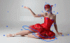
#1, 15, 19 - You vastly improved the background. Everything from removing the odd rectangles of light, tidying up dirt, removing the pieces of tape, and leveling the background are all top notch.

The only odd thing that I noticed was that there now seems to be a bit of horizontal banding in the background, most noticeably up near the ceiling. That being said, I am only viewing your image on a conventional (but quite good) 8 bit NEC monitor, not my usual 10 bit video system, so the banding might only be an artifact of this computer, or might have arisen because the file you posted was an ordinary 8 bit per channel JPG instead of a 16 bpc TIF or PSD. However, you might want to take a look at this.

#8, 16, & 22 - You vastly improved the edges of her hair tie (scarf?), her dress, and point of her shoe. Again, I wouldn't change a thing.

#3, 4, 5, 6, 9, 10, 11, and 7 (the shape of her head) - Once again, IMHO, you did a beautiful job adjusting these shapes and thickness of her arms and neck. Don't change anything.

#7 - The other changes you made in this area, ie, her lips, the shadowing on her face, the improved details in the mask are wonderful. Don't change a thing.

#13 - I love the new shape you gave both her left and right hips.

My only substantive suggestions for change are the following:

#17, 18 - It appears that you slightly enlarged 17, her right (our left) calf muscle and did nothing to #18. I suspect you did this because dancers often have quite muscular calves. To be honest, I don't think that the increased thickness is in proportion to her newly slenderized body. Personally, I would have left #17 untouched and slightly slenderized #18.

#2 and #14 - IMHO, her middle fingers and thumbs are now too long. This makes her entire right hand (ie, viewer's left) look much too long.

#20 and #21 - I like the change in shape and position of both, but I feel you lost too much detail in the fabric in 20, and the vertical seam / pleat in the fabric in 21 has become much too bright/contrasty.

#12 - I like skinny girls, but even I feel that her waist is now too narrow. IMHO, it's getting into "Barbie-doll" territory. That often is what a client / art director wants for a highly stylized look, but for general consumption, I would only do about half of what you did.

Again, I am in awe of the beautiful work you did, your attention to detail, and the time it must have taken to achieve this result. The best of luck on the selection process. I think you stand a good chance of winning the job. Fortunately for me, my current photo job with firemen and fire trucks don't require any of this. If anything, my customer prefers both the firemen and the fire trucks bigger, not smaller, LOL!

Warmest regards,

Tom
 

Tom Mann

Guru
Messages
7,223
Likes
4,343
I guess it would help if I posted the key to the numbers, LOL.

Sorry.

T

PS - BTW, it's an animated GIF. I'm not sure if the forum preview will be animated, but if you click through to the original, you should see the full-rez animation.
 

Attachments

  • dancer9_by_faestock-d67rvhhlLiquify1400-b4_after_comparison-ps02a_final-01_full_size.gif
    dancer9_by_faestock-d67rvhhlLiquify1400-b4_after_comparison-ps02a_final-01_full_size.gif
    883.7 KB · Views: 15
Messages
4,145
Likes
6,072
Tom
Thank you very much for the detailed description of your critique that is very positive in most respects.


I am honored, but at the same time I know my special skills in retouching and my sensitivity to small details in a job. To understand the client and his needs is as important as the implementation in photoshop. If you manage this balancing act you have tied the customer to you and your good work and he will pay you well for it.


The error that the two hands concern (2 and 14) I'm am well aware but had no energy to correct them again.


The calf muscles (17 and 18) I have automatically retouched like this. Interesting that you have discovered these fine differences.


The banding in the background happened during the reduction of the image to the 1400 pixels on the forum , but I tried to soften it a little.


During the enlargement of the bosom (20 and 21) I have unfortunately lost a lot of detail because the liquify tool has stretched pixels in this area. I'm well aware of this. I tried in the RED Canal to retouch the loss, but the oversaturation is actually the problem. You can't win them all.


Tom , thanks again for your detailed comment, I appreciate that very much . You're one of a few who can evaluate a professional job like this one in the forum .

I almost forgot, your gif really works fine, nice to see the changes every second. Very cool!

Chris
 

ibclare

Queen Bee
Messages
11,034
Likes
4,638
I hate to say this, since I like most of your work, but I really dislike the changes. She does look more like Barbie. The background line-up of the floor and wall pull my eye as they meet up exactly as the filmy part of her dress on the left. I do agree that you vastly improved her skin tone, but I would be frightened to meet her in a dark alley . . . or on a bright street for that matter.

Personally, I love the shape of faestock's body and I don't like the body given to her. Freeeeaky. Instead of beautification, I have to name it Freakisization. My apologies.
 
Messages
4,145
Likes
6,072
I hate to say this, since I like most of your work, but I really dislike the changes. She does look more like Barbie. The background line-up of the floor and wall pull my eye as they meet up exactly as the filmy part of her dress on the left. I do agree that you vastly improved her skin tone, but I would be frightened to meet her in a dark alley . . . or on a bright street for that matter.

Personally, I love the shape of faestock's body and I don't like the body given to her. Freeeeaky. Instead of beautification, I have to name it Freakisization. My apologies.

Clare, your response does not surprise me at all, I expected it. You see it from the feminine side, and as I indicated in my first post, the whole retouching is excessive and somewhat exaggerated.


This work is an exercise for a job I would like to get. Please read my earlier post.
I am sure that you understand that this work does not necessarily represent my personal way of working.


Clare, thank you very much for your feedback, It means a lot to me.
 

Tom Mann

Guru
Messages
7,223
Likes
4,343
Hi Clare -

Chris' reply was very similar to a comment I was going to make, but he beat me to it, LOL.

Commercial photographers, PS'ers and graphic artists often are called upon to produce images that they would never produce if left to their own devices. For example, Chris may have had reason to believe that the person/organization setting out the challenge he is participating in specifically requested that samples be submitted with wasp-waists, or perhaps Chris knows this because of previous marketing material put out by this company.

Tom

PS - Just to make sure you don't think I'm a proponent of absurdly small wasp-waists, don't forget, well before your post, I suggested to Chris that he only reduce the model's waist by half of what he did. However, if I was desperate for some work, and I thought putting fake UFO's or Elvis standing next to Obama in an image would get me a job at the National Enquirer, if I needed the work badly enough, I would consider doing so, as long as it was fairly obvious from the context that this was just a flight of the imagination / humor / etc.. :-(
 

ibclare

Queen Bee
Messages
11,034
Likes
4,638
Thanks guys. Yeah, I understand it. Maybe that is why I am a poor not a rich person. I started out in graphic design, air brushing (the old-fashioned way), and photography. I was also painting and drawing but that was for fun. I decided Playboy Magazine and Vogue, or whatever fashion mags were out at the time, were not my thing. So I said yuk to commercial art and veered down the path of starving artist until I was forced to join the medical field! LOL, I don't regret it (not too often) but I blame the hippie consciousness of the 70s for coloring my decision. That and my own suggestibility. Sigh.
 

kylelawso

Banned
Messages
9
Likes
4
Thanks, Well I'm certainly happy to be on these boards because I can tell I have lots to learn when it comes to photoshop :)
 

Top