What's new
Photoshop Gurus Forum

Welcome to Photoshop Gurus forum. Register a free account today to become a member! It's completely free. Once signed in, you'll enjoy an ad-free experience and be able to participate on this site by adding your own topics and posts, as well as connect with other members through your own private inbox!

Making an arcade cabinet logo more vibrant


arucart

New Member
Messages
2
Likes
0
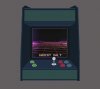
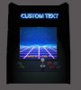
Hi there, we're trying to make a logo and what I wanted was this arcade cabinet with this old tron like grid. I just kinda want the screen to glow more and have on the top it say Salt Arcade in neon blue giving off a bit of neon light as well. So you can see in prototype 1 that was our initial idea, I tried to get the lighting done but I'm really struggling with it at the moment mainly in the upper section where it just goes full black. Just overall I want it to look less flat in colour and more vibrant.
 

Attachments

  • arcade_prototype.jpg
    arcade_prototype.jpg
    132.8 KB · Views: 3
  • arcade_prototype.psd
    984.7 KB · Views: 3
  • arcade_prototype2.psd
    1.4 MB · Views: 3
  • Prototype 2.jpg
    Prototype 2.jpg
    78.9 KB · Views: 2
Last edited:

Tony Bowman

Well-Known Member
Messages
68
Likes
87
Is this what you need?

arcade_prototype3.jpg

In version 2, I renamed Layer 16 'custom text' and set to screen blend mode, and I duplicated layer 14 and set it to overlay blend mode (try different blend modes and try inverting the layer with different blend modes for other effects and colours). In version 1, I renamed layer 2 'box' and imported it (drag and drop - hold shift until dropped) into version 2 at bottom of layer stack. Above that layer, I added a new layer named 'screen light', made a selection of the interior of the box (including buttons and back wall) using the polygonal lasso tool and filled the selection with white on the new layer. Set that layer to soft light blend mode. Added a mask, selected the buttons and used a 50% opacity black brush to reduce the effect from the buttons. Your shadows in layer 15 need adjusting as a result of that last layer, but I wonder if you need them at all. I'm not a graphic designer but it makes sense to me for logos to avoid unnecessary detail.

I recommend getting into the habit of naming and grouping your layers. Hope this helps.

View attachment arcade_prototype3.psd
 

Top