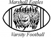
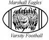
Using paths, one can get a much better outline (see attached).
BTW, for this demo, to save time, I didn't actually use the pen tool to generate a path for the outline of the football. Instead, I took my previous version, converted the B&W artwork to a selection (control-clicked on the RGB version in the "channels" palette), then automatically converted the selection to a smoothed path using a tolerance of 1.5 pixels (pull down menu in upper RH corner of the paths palette).
The bottom half of the outline looked better than the top half, so I selected just the bottom half, flipped it and re-joined them to get a reasonably decent football-like shape.
As the final step, because, IMHO, the upper lettering was a bit too close to the football, I moved it up a bit.
Because this was just a little quick and dirty demo, not a paid job, I made no attempt to make the final result perfect, but hopefully, it demonstrates how these sorts of fixes can be done fairly quickly.
HTH,
Tom M
PS - Obviously, this isn't the only way, and certainly isn't the best way to improve the outline of the football -- but it's fast. A better approach that I could have taken would have been to make an appropriate, infinitesimally thin, single path, and then stroke it with black to get a thick border of constant thickness.