What's new
Photoshop Gurus Forum

Welcome to Photoshop Gurus forum. Register a free account today to become a member! It's completely free. Once signed in, you'll enjoy an ad-free experience and be able to participate on this site by adding your own topics and posts, as well as connect with other members through your own private inbox!

Exact Curve but tidy? :/


ChrisPowell

Member
Messages
13
Likes
1
I have been pulling m hair out over my logo for about 3 months...

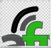
I love the way I made it look on PS. Simple, clean and effective.


One issue... above the 'f', I have 2 Wi-Fi style lines... they curve exactly 90 degrees. The idea is that the angle of the curve matches the curve on the top of the F.

However, I tried warping, distorting, cutting, chopping, starting again, giving up, suicide, trying again, regretting it, throwing the laptop, self harm... All the usual Photoshop related stuff. And it looks extremely untidy. Not suitable for sign writing or anything of a larger scale IMO... Just really needs tidying up :lol:

Does anyone have any suggestions? Or even want to look at the PSD for me? :p
 

Attachments

  • Screen shot 2013-12-02 at 17.19.46.jpg
    Screen shot 2013-12-02 at 17.19.46.jpg
    69.3 KB · Views: 70
To me it looks as though the curved line on top needs to come closer to the smaller curved line just above the f, make the spacing the same?
 
Hey iDad - I quite like the spacing as it is... It's more the curve not being perfect.. Is there an easier way to do this? :D
 
Not sure I follow, but if you duplicate the smaller one and transform it using the shift key while doing so it help
 
there is nothing wrong with wanting perfection, expecting it all the time, now theres a headache in the making!:cheesygrin:
 
Last edited:
I agree with the OP that I like the current spacing, but the 1st thing that grabbed my attention was that the horizontal end of that quadrant is about 3.5 blocks in width, whereas the vertical end of the same quadrant is more like 2.9 or 3 "transparency blocks" in height.

If you prefer to stay with the current design and only intend to do minor tweaks to it, the 1st thing I would probably do is to increase the resolution by at least 2 or 3x when you rasterize things so that you don't have to deal with possible problems with the fuzzy edges.

T
 
I believe what you are talking about is parallel lines? If so use the pen tool. Make a single accurate curve, then stroke it with the proper size brush. Chop off the ends at a 90° angle and you're done.
 

Attachments

  • ScreenShot001.jpg
    ScreenShot001.jpg
    53.7 KB · Views: 65
I would have designed the logo in Ai....

Alot easier managing curves and shapes. I could have a go if you forward your PSD


OMG they look perfect in the link you posted! That's he exact effect I wanted :D


What sort of resolution would you guys recommend in pixels? I can recreate the entire logo in PS bar the lines and hopefully maybe if i'm lucky Inkz can use 'Ai' whatever that is to add the curves for me in a PSD if possible?

I would be happy to buy you a drink for it over Paypal for your time if you like? :D I know you seem willing to do this for free but let me buy you a drink ;) haha :lol:
 
I'm here with Ai already booted...

Make the res high, maybe a 3000x2000px.
 
Hey guys - sorry for the late reply been so so so busy setting up the business and getting the web design right etc that I put the logo to the back of my mind! :D If someone could re-create my logo for me based on the PSD I have already?

Inkz suggested AI if her offer still stands?

Basically.. The website is here - http://www.megafix.co.uk .

Notice the logo at the top with the curves we were talking about before.

I have attached a PSD of my half re-make of the logo.. I have left the text unrasterized.. All that really needs doing is the dot for the 'i' removed and the 'f' and 'i' joined. Basically, it needs to look exactly like the logo on the website but a lot tidier :)

If someone could help that would be fantastic. I don't mind buying someone a drink for it of course ;)

Also, any opinions or suggestions regarding the logo are very welcome.

Just want the logo finalised so I can get uniform, sign writing, stock etc all printed :D

Chris
 

Attachments

  • LOGOHIRES.psd
    816.3 KB · Views: 5
No PS presently installed in my cpu so I can't check..

But am I right in deducing the arcs were created using a copy of F's outline and that you transformed/enlarged it? This may explain the fuzziness.

Either go with hawkeye's suggestion OR convert the font's arc outline into a (vector) shape mask . duplicate the layer masks and transform them into the size you need and reposition.
 
That's pretty much what I did, yes.

My PS skills are pretty basic I won't lie :$

Hmmmm never played around with vector masks before... Will see what I can come up with :D
 
That's fantastic!

Do you have the PSD available for that? Just because there are different colours etc i'd need to edit in time for different prints!

I assume it's a super high res?


Thanks left :D :D :D
 

Back
Top