To add on to the excellent advice given by PGalangArt, I would point out that there are several reasons pictures taken by non-pro photographers are almost always misleading for this purpose. Most people are completely unaware of these problems, and, on the surface, it certainly might seem that taking a photo would be a really good way to visualize the end result. However ...
1. The lights in any room outside an art museum are rarely matched in color, so one area might be bathed in a more greenish light (if compact fluorescent lights were used), other areas in different warm glows from different wattage tungsten bulbs used, while other areas could potentially be illuminated by much colder light from a photographic flash or the outside daylight (if taken during the day). In addition, the CRI (color rendering index) of CFLs are usually horrible for photographic purposes.
2. Most amateur photographers leave the auto-white-balance turned on when they take the photo. This means that we have absolutely no idea how much, and in exactly what direction the camera's AWB system tried to compensate for the colors present.
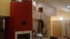
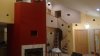
3. If you actually see your White, Gray and Beige patches as those colors, you most likely photographed them with the same problems described in #1 and #2, above, and/or your monitor is severely out of calibration. (As first hinted at by Mr.Tom). On my top of the line monitor, color calibrated just yesterday, your color patches actually are three variants of beige. Not even close to white, gray and beige.
If you want to use a photographic approach to simulating how an interior will look, hire a pro who specializes in architectural interiors to photograph it for you. OTOH, an easier and much less costly approach is to do what PGalangArt suggested and just buy a few paint samples and see how it will actually look on your own walls, with your own eyes, thereby completely eliminating the sources of error mentioned above.
Good luck with your project!
Tom M


") I just think the white blends in with the forum background. To see the color on the image file, it appears you need to right click and do save as and the color name is on the file.
I just think the white blends in with the forum background. To see the color on the image file, it appears you need to right click and do save as and the color name is on the file.
