What's new
Photoshop Gurus Forum

Welcome to Photoshop Gurus forum. Register a free account today to become a member! It's completely free. Once signed in, you'll enjoy an ad-free experience and be able to participate on this site by adding your own topics and posts, as well as connect with other members through your own private inbox!

Making a newspaper advert, text clarity advice needed


plainman007

Member
Messages
19
Likes
0
Hi,

I made a newspaper advt of 8x7cms. I worked on a actual size @ 600dpi file. The result looks extremely clear and the text is very legible, but when it turned out on the newsprint the text dulled down as if swallowed by the solid black bg it was on. The design isn't very busy or anything. Its just solid black bg with pure white text on it. Im using photoshop CS4. I rendered to a high res jpg and converted to a pdf (since the newspaper wanted it as pdf) and delivered it. The pdf also was razor sharp even at 500%. But yet in print the white text was as if it thinned down and thereby looked dull and incomprehensible.

Any help on what i should do will be greatly appreciated please.

Thanks
 

Tom Mann

Guru
Messages
7,223
Likes
4,343
Various things could have contributed to this, eg, details of the CMYK profile u used (compared to what the printer needed / expected), line screen frequency compared to your ppi, etc.. If u could provide a very high resolution scan of a single letter or two of the printed version (so we can easily see individual half tone dots), as well as the same area of your original PSD and PDF files, we could possibly diagnose it. Without these, the best anyone can do is try to make informed guesses.

Tom M

PS - please also include a scan of some good looking text or advertisement on the same printed page (with exactly the same scan settings), as well as a normal resolution scan of the entire printed page, or, at least, most of it.
 

dv8_fx

Retired Administrator
Messages
13,761
Likes
4,789
Hi there....

Could you describe the material of the newsprint? If you can upload a scan of the actual newsprint and your work sample, maybe we can see what caused it.

I find 600 dpi a bit over the top, tho. I'd usually use between 150 to 300 dpi in creating Ad designs

There could be various reasons why this happened. It may be caused by the material used for the print , your artwork or a combination of the 2.

The print process may also be blamed. Most especially with off-set printing.


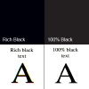
It could have also been the black you used on your artwork.....

richvs100black.png

Which one did you use?
 

plainman007

Member
Messages
19
Likes
0
Hi Guys,

Thanks for all your inputs. I regret i dont have access to such high powered scanners etc. Also i dont know if i set rich black or 100% black. But i do remember that in the CMYK color swatch i had set 100% for all four. The ads all came out pretty dull in lettering. I have finally switched the design to pure white with black lettering and hoping that this weeks release turns out right.
 

Tom Mann

Guru
Messages
7,223
Likes
4,343
In case you encounter this problem again and are interested, you don't need an exotic, high end scanner to resolve individual dots from an offset press. All you need is around 600 dpi or better. A $96 Epson v550 from Amazon will do what you need, as will almost any other scanner ever made. All you need is 600 dpi or better. The Epson, for example, goes up to 6400 dpi (ie, 10 times what you need).

Cheers,

Tom M
 

Top