What's new
Photoshop Gurus Forum

Welcome to Photoshop Gurus forum. Register a free account today to become a member! It's completely free. Once signed in, you'll enjoy an ad-free experience and be able to participate on this site by adding your own topics and posts, as well as connect with other members through your own private inbox!

Experiment with light


Status
Not open for further replies.

Eggy

Retired Moderator
Messages
5,313
Likes
5,085
I was always fascinated by light as like in classic painting so today, as an exercise, I tried something out.
I just used five pictures and staged the two persons (my wife (not happy) and me) to have the correct position in regard to the boat.
I had to dodge and burn a lot since the sun is setting at the horizon.
 

Attachments

  • 01.jpg
    01.jpg
    3.5 MB · Views: 15
  • 02.jpg
    02.jpg
    1.8 MB · Views: 14

ibclare

Queen Bee
Messages
11,034
Likes
4,638
Nice composition. You picked a challenging manipulation to make. How much experience do you have in Photoshop?

I don't know if you would like a critique as you didn't say so. But here are some at a glance observations.

Your people need to have a color balance/saturation/curves adjustment to bring them into the soft range of color of the boat and sky. At least I would do that rather than ramp up the rest of the colors.

There are no shadows from your wife onto the boat so she is floating there. She needs anchoring (no pun intended).

The cutout on yourself and your wife are pretty well done. COngratulations as that can be a real challenge.

Overall, I like it. It just is at that point where the work of bringing it all together starts. Let us know what kind of help you might need with that. If you want our help. :mrgreen:
 
Last edited:

Eggy

Retired Moderator
Messages
5,313
Likes
5,085
Thanks ibclare,
First, I'm using Photoshop about one year. Before that I used CorelDraw (version X3 but started long ago with version 3). But there is no way to compare CorelDraw and Photoshop.
I'm totaly open for critique, the only way to learn and improve, so don't hold back.
The cutout from the persons were easy using a 20 mp camera (5184 x 3888) but when added to a standard HD wallpaper background (1920 x1080) there was loss of detail.
Mind you, I was in for a quick exercise in how light wraps arround the edges of objects/persons.
I did noticed the missing shadow but only after having posted my message. That has been fixed.
Later today I will work on this project and be back with an updated picture.
 

Eggy

Retired Moderator
Messages
5,313
Likes
5,085
Here is an update.
I decreased the saturation to match more the background.
Let me please know what I can do more.
 

Attachments

  • 03.png
    03.png
    15.6 MB · Views: 13

MrToM

Guru
Messages
3,595
Likes
3,321
Very nice Eggy...

..but shouldn't you be sat at the pointed end? (I know all the correct nautical terminology! LOL)

Regards.
MrTom.
 

IamSam

Administrator
Staff member
Administrator
Messages
22,754
Likes
13,268
I agree, the rowboat is backwards. Based on the white foaming in the water from the oar strokes, the rower is rowing towards the viewer. Rowing against the flat surface of the transom would be difficult and cause the boat to wobble from side to side. Also, the boats draft is too shallow, it would be sitting a bit deeper in the water. For me, the lighting is off. The shadows are too saturated.
 

Eggy

Retired Moderator
Messages
5,313
Likes
5,085
@ Mr Tom: Well well, at least someone noticed the wrong position. When I started composing after taking the photo's I saw it too but my wife refused to go back outside to redo the photo's. And honestly, I was too lazy to search for an old wooden rowboat in the right position and resolution.

@ IamSam: I'll try to desaturate the boat and persons to see the differance.
 
Messages
4,145
Likes
6,072
That's a good idea for a composite, and your work is very nice.

Unfortunately, even more errors have shown than the already mentioned. The image of the boat and the image of the BG do not match. The boat was photographed about 2 meters above the water surface, but the BG was photographed from the top deck of a cruise ship. This is probably the reason that it looks as if your boat would fly. And therefore it seems too big in the picture.


I would suggest you to start over with new images. Maybe I'll find some images who fit together.


This is a well-intentioned and positive critique of me. It can help you to improve your Photoshop skills.
 

MrToM

Guru
Messages
3,595
Likes
3,321
On a more productive note, from me that is, just a couple of further observations:

1. Working in 32bit is fine, but for display purposes, such as on here, 8bit is more than enough....15M for a file is a tad overkill.
2. Fairly obvious...hopefully.

boat_01.png

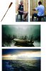
3. When compositing images one thing is often overlooked, and that's blending with the background.
If you look closely at the BG you'll not see any sharp transitions in colour, everything blends together. When you add your elements you also need to blend them with the BG, the collar on your shirt and the end of your sleeve are good examples of how they are very sharp in comparison to the BG.(Or check out the oar in the above image...see how sharp it is compared to the sea?)

As a side note check out the 'solid' patches of blue colour on the back of your shirt.....would you see that in an untouched photo?

You can tackle this in several ways depending on when you remember to do it..LOL.
When masking you can add a 'feather' edge to the mask, this will have the effect of blending into the BG...or...
If you prefer to keep a sharp edge until you're done you can then, on a new layer and with 'Blur Tool' set to 'This Layer and Below' gently go around all the edges with the 'Blur Tool' and a small, soft brush.

It may not sound like much but sometimes its the little things that make a big difference.

Regards.
MrTom.
 
Last edited:

IamSam

Administrator
Staff member
Administrator
Messages
22,754
Likes
13,268
Chris said:
This is a well-intentioned and positive critique of me. It can help you to improve your Photoshop skills.
As are all of our critiques.

The scene is mostly back lit. (forgot an arrow on the back of he right arm) The strong lighting indicated by the red arrows suggest an alternate light source from directly above and behind.
The areas indicated by the green arrows would be shaded.
The oar would also be shaded slightly due to the angle of light source and the boat.

Screen Shot 2014-07-29 at 1.02.57 PM.png
 
Last edited:

Eggy

Retired Moderator
Messages
5,313
Likes
5,085
@ chrisdesign, IamSam and Mr Tom:

Thank you for the critique and comments.
I do not have any problem at all with critics. The reason I'm here is to learn from my mistakes and I thank everybody for pointing me those errors.
Photoshop is like painting. You have to master compositon and technique.
Everytime I have a idea in my head maybe I'm to eager to start the project and maybe to focusted on the techniques to use (I don't master them yet) therefore to neglect the composition.
Well, again I learned and I will go on posting projects to improve both technique and composition.
This one I will start over with the right items.

Again thank you all

PS: am I the only one having trouble when typing a comment? (missing letters when keys do not respond)
 

IamSam

Administrator
Staff member
Administrator
Messages
22,754
Likes
13,268
I've not had many problems with the typing, but I know the site is suffering some minor and frequent freezes. These may be what's affecting your typing.
 

MrToM

Guru
Messages
3,595
Likes
3,321
PS: am I the only one having trouble when typing a comment?

I have trouble too.
I usually get somebody's knickers in a twist when I comment, unintentionally I hasten to add.......You big stinky bum bum!

Regards.
MrTom.
 

Eggy

Retired Moderator
Messages
5,313
Likes
5,085
I've not had many problems with the typing, but I know the site is suffering some minor and frequent freezes. These may be what's affecting your typing.

OK, good to know.
Usely I use IE11 but when I use Chrome I don't have the stutter...
 
Last edited:
Messages
4,145
Likes
6,072
Try with these images if you like. (I made a very rough draft for you.)

Lake and Rowboat.jpg

mountain-pond.jpg

boat_03_by_cyborgsuzystock.jpg
 
Last edited:

Eggy

Retired Moderator
Messages
5,313
Likes
5,085
Here's an update with the pictures provided by Chris.
I used 'lightlines' (a very good idea from IamSam) in a backgroundcopy to help me place lightness and shadow.
Because of the quietness of the watersurface this was even more challenging.
I had to add wakedisturbance, a little bowwave and waterwrinckles being pushed forwards.
Well now: give it to me...
 

Attachments

  • 03.jpg
    03.jpg
    1.2 MB · Views: 6

Eggy

Retired Moderator
Messages
5,313
Likes
5,085
Made some detail corrections..
(direction oar wake and sidewrinckles)
 

Attachments

  • 03.jpg
    03.jpg
    1.2 MB · Views: 13
Messages
4,145
Likes
6,072
Hi Eggy
This is a very nice job. Well done! Though a little bit too dark in the blacks. See my adjustments in the posted image detail.
I opened up the shadows and the side of the boat and the big oar. I also changed the shape of the shadow on the one oar. Then I made some minor color changes in the persons. These are my suggestions. I hope you don't mind.

03Chris.jpg
 

Eggy

Retired Moderator
Messages
5,313
Likes
5,085
Hi Chris,
I love what you did with my picture. With the backlight I tend to make the non exposed side too dark.
And honestly I didn't know what to do with the right oar and shadow.
It felt too massive or bloated almost right in the middle of the sun reflection in the water.
I'm glad you sorted that out for me.
Again, I'm here to learn and I did.
Now I'm going to apply this to my original project.

Thank you.
 
Status
Not open for further replies.

Top