What's new
Photoshop Gurus Forum

Welcome to Photoshop Gurus forum. Register a free account today to become a member! It's completely free. Once signed in, you'll enjoy an ad-free experience and be able to participate on this site by adding your own topics and posts, as well as connect with other members through your own private inbox!

First post from an amateur- Looking for advice and critique


Oddmonster

Member
Messages
8
Likes
2
Hello gentlemen and ladies of the night

I have been playing around with Photoshop for a little while, but I feel I need some constructive critique and get some good advice from people more skilled then I am. The original pictures I used are at the end of this post.

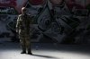
The first picture I am pretty happy about except I had to make it quite dark to feel sorta realistic. I made it using a photo of one of my friends.


alaangelnosword.jpg


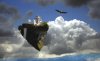
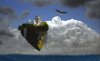
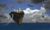
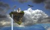
This next picture...First off I know it is very uncreative and has been done a million times, but I made it just to try and see what I could do. I feel there is no depth to the picture. The floating island looks cut and pasted, and I simply cant get it to feel "real". Any advice?
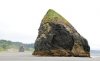
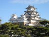


floaingtower.jpg


ORIGINALS:
 

Attachments

  • IMG_6905.jpg
    IMG_6905.jpg
    104.2 KB · Views: 10
  • 0630Atth.jpg
    0630Atth.jpg
    11 KB · Views: 26
  • 800px-Himeji_Castle_The_Keep_Towers.jpg
    800px-Himeji_Castle_The_Keep_Towers.jpg
    108.6 KB · Views: 10

SeniorS

Guru
Messages
1,747
Likes
520
Looks good.
1. I think too dark. Meaning that dark itself is okey but you should try to keep us much details you can but still beeing dark. That's very complicated.
2. Updated version is better. Water looks to straight. Not sure what can be done about it. Maube bent a little cause it "hits" the eyes. And that side of rock where water fall, i think, would look better more darker, shadowed. Probable till black under grass zone.
Something like that (thats was rough and quick):
rock.jpg

But actually i'm not best advicer :)
 

Oddmonster

Member
Messages
8
Likes
2
Looks good.
1. I think too dark. Meaning that dark itself is okey but you should try to keep us much details you can but still beeing dark. That's very complicated.
2. Updated version is better. Water looks to straight. Not sure what can be done about it. Maube bent a little cause it "hits" the eyes. And that side of rock where water fall, i think, would look better more darker, shadowed. Probable till black under grass zone.
Something like that (thats was rough and quick):


But actually i'm not best advicer :)

1. Completely agree on the complicated part.

2. Yes I was actually working on this next version which I felt was a little better
 

Attachments

  • floaingtower.jpg
    floaingtower.jpg
    215.5 KB · Views: 11

ibclare

Queen Bee
Messages
11,034
Likes
4,638
My opinions:
Here are a couple similar (but not the same -- important distinction for your artwork) compositions: http://www.photoshopgurus.com/forum/search.php?searchid=232350

You'll notice the desaturation of the islands. Of course, these are way more desaturated than what you want I'm sure, just another angle. I think that or a slight blurring for distance would help the feeling of reality. I imagine you'd like to keep the color and crispness, but I feel that might be a different kind of img. It seems to me that everything is of equal intensity, color and sharpness and that may be what doesn't feel right to me. Except for part of the clouds. They offer a contrast that's nice.

Let me say this though, I think it's very good and like the ideas, and you seem very open to suggestion and trial and error. Good show!

As SeniorS says, it's your artwork. I do like your last alternative much better. I am not sure how clear it is on your monitor but I'd like to be able to see the waterfall just a bit more clearly. I like how you resolved that. One more suggestion: consider greying the water a bit so it doesn't look like the action is sandwiched between sky and water.

On the soldier, consider trying some different kinds of adjustments than you used; make selections so you darken one area but don't overdo shadows and so on.

Just my take. Cheers, Clare
 
Last edited:

Oddmonster

Member
Messages
8
Likes
2
Thank you both for you responses. ibclare I can't open your link I get the message "Sorry - no matches. Please try some different terms"

And ya well...Listening to people smarter then you is always the best way to learn:)
 

Attachments

  • floaingtower.jpg
    floaingtower.jpg
    204.8 KB · Views: 10

ibclare

Queen Bee
Messages
11,034
Likes
4,638
yep, I should've tried it out. Do a search for turtle island. Siodre is the artist. Haven't seen her around lately. Anyway, I like what you've done. I'm glad you made the eagle bigger. I wasn't sure if he was above, behind, or in front before. I also like it that you made the water more level. Anyway, Bravo!
 

Oddmonster

Member
Messages
8
Likes
2
Yes found that Siodr art piece...Really really nice. I would have liked to see the original photos he used for the work.....I just love watching the journey and transformation.

And I must say that this morning when I woke up and looked at this thread -- Damn my first floating island picture(and the next few) sucked hard. I really stared myself blind on them.

Thank you for your feedback.

My newest iteration of the design is below. I don't know if the new technomancer tower is too much, but I feel it adds some drama to the piece.
 

Attachments

  • floaingtower.jpg
    floaingtower.jpg
    187.7 KB · Views: 10

Paul

Former Member
Messages
12,879
Likes
7,023
You have a flare for this i see mate, since altering your originals which looked good anyway, the latest is very good keep up the good work mate.
 

Oddmonster

Member
Messages
8
Likes
2
You have a flare for this i see mate, since altering your originals which looked good anyway, the latest is very good keep up the good work mate.

Thank you sir. During the making of this I sorta started getting to grips with the tools and began feeling more at home with the process, and I am feeling kinda proud of my result. Now when I have an idea of what I want, I can see some way(sometimes vague and obscured by trees) of getting that result. Before I mostly just stumbled along until I was sorta happy with the result, which could lead to some OK results, but never produced what I had in my head. Seems the age old saying "Time and practice" is still true.
 

Paul

Former Member
Messages
12,879
Likes
7,023
The words TIME - PRACTICE - PATIENCE are the hidden requirements for Photoshop usage, and a willingness to listen and learn from anyone else, even the best out there get new ideas from boards like this you know.
 

Top