What's new
Photoshop Gurus Forum

Welcome to Photoshop Gurus forum. Register a free account today to become a member! It's completely free. Once signed in, you'll enjoy an ad-free experience and be able to participate on this site by adding your own topics and posts, as well as connect with other members through your own private inbox!

Creating a path from image...


clarksbar

Active Member
Messages
25
Likes
2
I am trying to play around with CS3 Extended.

I have created many layers in a new file and created circles and text. (i know... complicated stuff there)

now, i created a "Frankenstein" hybrid logo that i want to scale and make larger. however, it is just 2 gif or png logos that i merged into one. now, when i scale the line work, it gets all dithered and looks sloppy.

what would be the best way to convert basically colored pixels into a path so they can be scaled and look like the fresh new arc's and text i created?
 
okay ;-)


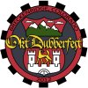
i am creating a logo for a car show that my VW club is hosting..

I used the gears from the Volkswagen KDF logo. the Shield from the Colorado State Seal, but the bottom half of the shield is the logo for Wolfsburg, Germany, home of Volkswagen.

the colors are from the Colorado state seal as well. I think i need to lighten the "seal" a bit and make the "OktDubberfest" font stand out more.


ideas and thoughts are welcome!

oktbubberfest2012-1024.jpg
 
oh yeah.. i need to flip the "2012"... i cant figure out how to do that either.. CD3 extended (windows)
 
I don't believe there is an easy way. You can make a selection and convert it to a path, but the path will follow all the imperfections. I'd duplicate the elements using paths, although it will take some time but it can be done. I did a little, it didn't take all that long:
 
ah.. okay.. thank you..

thoughts on flipping 2012? i know this should be easy... lol.

also.. thought on the logo itself?
 
If you're going to duplicate it, then you'll be doing new text. Just do the 2012 separately and warp it to fit.
 
I agree with Hawkeye about making the basic image with the shape tool, circles and squares. He did a great job; maybe he'll give it to you. Oh, there it is in high res! :mrgreen: You can find the font or similar and add it. You can also make a selection of the griffin, castle, and so on, and create a path, or us a pen tool - best option - to create one. As Hawkeye stated, it may take awhile, but it is worth it. Takes less time if you know how to use the pen tool. One of us, myself included if my day stays this slow, can make pngs for you out of the more complicated shapes.

As far as the 2012 is concerned you can create a circular path from the shapes tool and choose the path only icon on the left. When you place your test cursor where you want it, it should be right side up. If not, use the direct selection tool, the arrow on you left toolbar (the white arrow is default but the flyout menu will show you the black). Click on the path and you'll see something like the text cursor. You can use this to flip the text you created.
 
Last edited:
okay i got the text to flip.. white arrow for the win.. lol.
question.. not sure this is the right place to post this..

should the griffen be a different color than the text so OktDubberfest stands out more?

oktbubberfest2012-final copy.jpg
 
I dont think thta is the problem maybe make your stroke on the text a bit thicker or change the font slightly as it is not very clear.
 

Back
Top