What's new
Photoshop Gurus Forum

Welcome to Photoshop Gurus forum. Register a free account today to become a member! It's completely free. Once signed in, you'll enjoy an ad-free experience and be able to participate on this site by adding your own topics and posts, as well as connect with other members through your own private inbox!

What is this style called?


truffles

New Member
Messages
2
Likes
0
Hello! I've seen images like the following all over the internet and have been searching everywhere to try to figure out what this design style is called. Is there a specific name used to refer to designs that have this look? And tutorials you can point me to that can help me recreate these effects?

Specifically for the last one (the calendar-esque picture), what do you have to do to make the colors appear that way?

Thank you so much!
 

Attachments

  • 1.jpg
    1.jpg
    114.3 KB · Views: 30
  • 2.jpg
    2.jpg
    94 KB · Views: 30
  • 3.jpg
    3.jpg
    223.1 KB · Views: 30
  • 4.jpg
    4.jpg
    130.9 KB · Views: 30
  • 5.jpg
    5.jpg
    226.2 KB · Views: 30
I don't know of a particular name given to this style, but I *can* tell you that whomever designed these images was good, and that if you want to reproduce these looks, you will have to know quite a bit about Photoshop. These were not done using some magical "press-one-button" preset on some advanced Instagram-like software.

How long have you been using Photoshop? How experienced are you? Probably the easiest way to answer the 2nd is to give us an idea if you edited at least several hundred images using heavy effects processing.

Which version of PS will you be using? Do you have currently popular plugins such as NIK CEP and the Topaz suite, or are you going to try to do these from scratch?

Tom
 
Thanks for replying Tom!

I'm not familiar with any of those plugins but I would say I'm pretty "intermediate" with Photoshop. I've used it for several years and currently have CS6. I'm really just looking for a tutorial that would teach me to recreate that type of effect. Even just a rough idea of what effects to play around with. The way the colors look is what I'm going after. I don't know how to put it into words..sort of lomography-style, maybe? Though the lomography effect tutorials I've found aren't quite like these. These have a type of look to them I can't quite pinpoint..sort of aged and something else. Hope someone knows what I mean.

Thanks again
 
Just a quick comment on some of what I see. There are gradient color overlays on some, a low contrast or decrease in middle greys, and maybe some sepia toning adjustments. Some textures are used for background or overlays or clipping layers, some vignetting if it isn't already there, brush flows are varied perhaps. I'd look into watercolor brushes.

These are just some ideas. It would take experimenting to see if you could duplicate the effect. First thing I would suggest is picking one you like and working with that. There are multiple effects used and they are different from one to the other even if they have similar appearances.

As for what is it called? I'm with Tom. I don't think there's a name. Washed out is the term I would use for some of them, though that isn't the most flattering . . . pastelized, lol.
 
Google the shoppers second best friend:mrgreen:
 
Not only are the templates easy to find, but they show how the thing are put together, so you can replicate with relative ease.

I realise that not everything is easy to find with Google, but with a little bit of research, and the correct question to ask, anybody can find most things. It just confuses me when there are people who have not yet tapped into how to maximize on the internet.

It won't be too long before the internet becomes self aware, so Skynet will take over.
 
If you don't use a template, the problem you will face in trying to reproduce the looks of those images is that many individual techniques and effects went into the production of each image.

Rather than asking how to reproduce the overall look of even one of those images, I think it would be much more productive for you to separate that overall task into smaller pieces, and then develop good skills and techniques for each aspect. You should then put them together in smaller groups of skills before trying to immediately try to put them all together in one shot. Specifically, here are a few skills and techniques that come immediately to my mind:

Creating the antique tan background used in some of the images;
Creating appropriate typography;
Creating abstract, painterly backgrounds;
Masking and blending techniques;
Creating highly saturated brights in some areas;
Creating highly saturated shadows in other areas;
Creating pastel mid-tones;
Use of layer masks and layer blending modes;
Use of layer styles to accentuate some of the typography;
Brushwork and how to find and select appropriate brushes;
Simulation of realistic / appropriate shadowing and highighting;
Simulation of perspective and other 3D effects;
Edge effects;
etc.

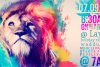
For example, one example of starting with manageable chunks of skill-building is that you might start with a normal photo of a lion and we could guide you through the process of making the shadow areas (eg, around the mouth, the tip and LHS (his) of is nose) have blue-cyan colors. Another example of a very manageable "chunk" of learning might be to come up with a suitable antique tan background with darker edges.

I realize that this systematic approach sounds like a lot of work and a lot less exciting than working on the entire image right from the start, but, in the long run, the more systematic approach will pay off handsomely because you can use those same skills on other images that you are creating.

Tom M
 

Back
Top