In a private message, @
zaizaizzja asked me how I color corrected his image. Since others may be interested in this, I'm responding in the thread instead of by PM. Unfortunately, this was such a quick fix, I didn't bother to save the PSD file or any of the intermediate steps, so my comments are from memory only.
1. When I am confronted with a situation like this, the first thing I usually do is put a "levels adjustment layer" above the image, and work my way through each of the channels, moving the (upper) left-most and right-most sliders in to the point where the histogram is about to "take off" from near zero values, such as is shown in this post:
https://www.photoshopgurus.com/foru...old-timers-post1533641714.html#post1533641714.
2. After I get the six color channel endpoints nailed down, I then return to the three central (aka, "gamma") sliders (ie, one for each color channel) and tweak the mid-level colors using these controls in this process of successive iteration to a good color appearance.
3. Steps #1 and #2 almost always result in an undesirable increases in contrast and saturation, so I typically add "brightness / contrast", and "vibrance / saturation" adjustment layers and reduce the contrast, vibrance and saturation (but not the brightness) till I get the image in the right ball park with respect to these variables.
4. If the skin tones are still too saturated in the red, I add a "Selective Color" adjustment layer, select the red channel, and move the cyan slider to the right of zero until the ruddy skin tones look reasonable.
5. If there still are color problems, I might bring out my "secret weapon", Color Mechanic, for very precise but quick adjustments of individual colors:
http://www.dl-c.com/site/products/buy-cm.php/
http://dl-c.com/Temp/downloads/Color Mechanic 2/CMReference_Manual.pdf
BTW, try to be very aware of differences in the color of the illuminating light in different areas of the image. This is often caused by mixed light sources. If I see that this is an issue in one of my pix, then I'll develop masks to separately select (say) the areas illuminated by very warm tungsten light vs the areas illuminated by my daylight color-balanced flash, and then apply the above steps separately to each of the two (or more) areas in the image to bring the areas to a common color balance, and then recombine them.
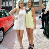
While I don't remember exactly what I used to correct your image, it was definitely along the lines described above. Not saving my adjustment layer stack is also why I'm not going to go through each of the above steps to cc the other version of the image, as you requested in one of your posts. My posting of a better cc'ed version was mostly done just to illustrate that one could actually recover decent colors, and that this would look better than that sickly Instagram-like yellow preset that was applied before you received the image.
HTH,
Tom M

") )
)