
Hello all,
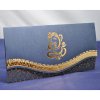
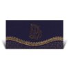
I am wondering if someone can help please? I have recently been looking at uploading some photos of my invitation cards to my website. I have looked at using my camera and also my scanner. Now although my camera quality seems to be better, I feel that using a scanner can offer better consistency (as it is much easier to align each invite - which looks much better). However, when I am scanning, some of the products seem to be a bit darker than what I would expect (especially when comparing to my camera). I have tried various settings on my scanner, but cannot seem to improve it. Is there anyway that I would be able to use Photoshop to try and achieve a more realistic colour.
I have attached two images of the same invitation card. One was taken on my camera (which shows a very good colour effect) and the other was scanned (which shows it as being very dark).
What (if any) options would anyone recommend on Photoshop for me to try and get a similar shade as the one on the camera?
Any help would be much appreciated.
Thanks in advance!
Oodya

 .... but its a start.