
Photoshop Gurus Forum
Welcome to Photoshop Gurus forum. Register a free account today to become a member! It's completely free. Once signed in, you'll enjoy an ad-free experience and be able to participate on this site by adding your own topics and posts, as well as connect with other members through your own private inbox!
You are using an out of date browser. It may not display this or other websites correctly.
You should upgrade or use an alternative browser.
You should upgrade or use an alternative browser.

ALB68
Dear Departed Guru and PSG Staff Member
- Messages
- 3,020
- Likes
- 1,332
Hi gertl,
That is a magazine cover (which by the way is probably has a copyright). You can create something similar in Photoshop by putting one image in the upper layer and one underneath and lowering the opacity of the top layer.
That is a magazine cover (which by the way is probably has a copyright). You can create something similar in Photoshop by putting one image in the upper layer and one underneath and lowering the opacity of the top layer.
Hi ALB
Thank you for the quick response. I think this is a professional work. I tried this what you say, with two layers, i changed blending mode. I tried with some filters into filter gallery too, but i had no success.
I searched by youtube but i found nothing
Thanks again
gertl
Thank you for the quick response. I think this is a professional work. I tried this what you say, with two layers, i changed blending mode. I tried with some filters into filter gallery too, but i had no success.
I searched by youtube but i found nothing
Thanks again
gertl
ALB68
Dear Departed Guru and PSG Staff Member
- Messages
- 3,020
- Likes
- 1,332
Hi ALB
Thank you for the quick response. I think this is a professional work. I tried this what you say, with two layers, i changed blending mode. I tried with some filters into filter gallery too, but i had no success.
I searched by youtube but i found nothing
Thanks again
gertl
Blending mode? did you lower the opacity? What images are you using? Post them and we will try to give you a better answer.
Edit: Yep. Requires more research. Lowering opacity loses too much
Last edited:


ALB68
Dear Departed Guru and PSG Staff Member
- Messages
- 3,020
- Likes
- 1,332
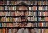
It's probably something like this. Book case layer, person layer, another book case. Layer mask on first bookcase, and one on the second, but lower the opacity of the brush on the second case. I painted with black at 100% opacity and then brought it back at 30% or so
View attachment 52230
View attachment 52230
Attachments

Last edited:
It's probably something like this. Book case layer, person layer, another book case. Layer mask on first bookcase, and one on the second, but lower the opacity of the brush on the second case. I painted with black at 100% opacity and then brought it back at 30% or so
View attachment 52230
I can't see your attach.
Last edited by a moderator:
ALB68
Dear Departed Guru and PSG Staff Member
- Messages
- 3,020
- Likes
- 1,332
Try this now
View attachment 52232
View attachment 52232
Attachments
Last edited:
It's probably something like this. Book case layer, person layer, another book case. Layer mask on first bookcase, and one on the second, but lower the opacity of the brush on the second case. I painted with black at 100% opacity and then brought it back at 30% or so
View attachment 52230
I can see now. My image looks like yours but i think this is not what we want to achieve. If you see the cover, the images have relief, while our results no.
I have to go now sorry
Thank you and i hope i see you tomorrow again
best regards
gertl
ALB68
Dear Departed Guru and PSG Staff Member
- Messages
- 3,020
- Likes
- 1,332
I can see now. My image looks like yours but i think this is not what we want to achieve. If you see the cover, the images have relief, while our results no.
I have to go now sorry
Thank you and i hope i see you tomorrow again
best regards
gertl
Hopefully that has helped you. There may also be some commercial printing tricks involved too. It is a magazine and I'm sure they have a whole staff of graphic artists working on this stuff.
Tom Mann
Guru
- Messages
- 7,223
- Likes
- 4,343
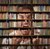
Thanks for posting that cover photo, Gertl. It's beautifully done, and reproducing that look will take a very good, observant eye, as well as considerable familiarity with more advanced features of PS such as the layer BlendIF sliders, and layer blending modes.
With respect to observation, the first thing that I noticed was that the books in the region of the face lost all of their original color and took on the color of the man's skin.
The second thing that I noticed was that in addition to the obvious color change, the books were also simplified / stylized in the area of the man. Outside of that area, they were not so stylized, but still, the contrast of the books was very well controlled -- not harsh, at all.
The third thing that I noticed was that the book shelves and dividers in the cover photo were brown, not black, as they are in the example photo that you supplied. In addition, in the cover photo example, the shelves and dividers look absolutely the same in the area of the man, as well as outside that area. This is very different from what happens to the books sitting on those shelves, so the shelving obviously must be dealt with separately from the books.
There are lots of other interesting aspects to the cover photo, but, at minimum, the above factors clearly must be taken into account for there to be any hope of reproducing this look. Clearly a simple "reduce the opacity" approach won't even come close.
So, given the above, I spend about 15 minutes playing with the samples you provided, and attached my result below. I am not happy with the result, but if, by some strange chance, you are interested in the steps I took, I'll be happy to write them up, but, be warned, there were quite a few, and I may not remember them all.
IMHO, in addition to the obvious goals mentioned above, I consider that the most important technique I used was similar to that one might take if they were simulating the pixellation of a huge sports TV screen, except that instead of a nice regular array of round or square pixels, I used the irregular shapes, sizes and placements of the books to sorta-kinda define edges to break up the image of the man's face.
I would be very interested to see how others approach this very interesting problem, especially if someone has a simpler approach that works well. (...Swiss Chris and others ... please pick up the white courtesy phone, LOL ...)
Cheers,
Tom M
Attachments
ALB68
Dear Departed Guru and PSG Staff Member
- Messages
- 3,020
- Likes
- 1,332
Thanks for posting that cover photo, Gertl. It's beautifully done, and reproducing that look will take a very good, observant eye, as well as considerable familiarity with more advanced features of PS such as the layer BlendIF sliders, and layer blending modes.
With respect to observation, the first thing that I noticed was that the books in the region of the face lost all of their original color and took on the color of the man's skin.
The second thing that I noticed was that in addition to the obvious color change, the books were also simplified / stylized in the area of the man. Outside of that area, they were not so stylized, but still, the contrast of the books was very well controlled -- not harsh, at all.
The third thing that I noticed was that the book shelves and dividers in the cover photo were brown, not black, as they are in the example photo that you supplied. In addition, in the cover photo example, the shelves and dividers look absolutely the same in the area of the man, as well as outside that area. This is very different from what happens to the books sitting on those shelves, so the shelving obviously must be dealt with separately from the books.
There are lots of other interesting aspects to the cover photo, but, at minimum, the above factors clearly must be taken into account for there to be any hope of reproducing this look. Clearly a simple "reduce the opacity" approach won't even come close.
So, given the above, I spend about 15 minutes playing with the samples you provided, and attached my result below. I am not happy with the result, but if, by some strange chance, you are interested in the steps I took, I'll be happy to write them up, but, be warned, there were quite a few, and I may not remember them all.
IMHO, in addition to the obvious goals mentioned above, I consider that the most important technique I used was similar to that one might take if they were simulating the pixellation of a huge sports TV screen, except that instead of a nice regular array of round or square pixels, I used the irregular shapes, sizes and placements of the books to sorta-kinda define edges to break up the image of the man's face.
I would be very interested to see how others approach this very interesting problem, especially if someone has a simpler approach that works well. (...Swiss Chris and others ... please pick up the white courtesy phone, LOL ...)
Cheers,
Tom M
So Tom, I bet you spent longer than 15 minutes with giving all your observations about the image. Why not take that time and write an explanation of what you did to arrive at your result? IMHO that would be far more useful and answer the OP's initial query. I, for one, would like to see your process, as I, took a very simple approach without benefit of all the knowledge you have. Thanks
- Messages
- 22,832
- Likes
- 13,287
Tom, a very nice attempt but your not there yet!
While you pointed out some of the obvious factors, there are many that you left out.
I'm still working on this effect................it's been a challenge! I have still not solved the mystery yet!
I would have thought MrTom would beat me to this one!
While you pointed out some of the obvious factors, there are many that you left out.
I'm still working on this effect................it's been a challenge! I have still not solved the mystery yet!
I would have thought MrTom would beat me to this one!
Last edited by a moderator:
Tom Mann
Guru
- Messages
- 7,223
- Likes
- 4,343
ALB68:So Tom, I bet you spent longer than 15 minutes with giving all your observations about the image. Why not take that time and write an explanation of what you did to arrive at your result? IMHO that would be far more useful and answer the OP's initial query. I, for one, would like to see your process, as I, took a very simple approach without benefit of all the knowledge you have. Thanks
Hi Larry - There are two reasons I presented some of my observations and goals, but didn't immediately discuss the actual process that I used.
The first reason is that describing a process without first describing why one is taking a particular approach is, IMHO, utterly pointless. To me, it's effectively giving someone "the fish" without telling them why they should be fishing in a particular place with a particular technique. This means that if I did what you suggested, I would have to go through a lengthy explanation of the technique PLUS cover all "why's" that I described in my previous post. This would probably increase the length of the post (and my work) by 3x, fully expecting that someone else will joint the thread with a much better approach.
IamSam - re: "not there yet" ...
Oh, I absolutely know that I'm not "there", :banghead: and it was frustrating not to be able to immediately nail this effect. I fully expect you or Chris or Mr.Tom or someone else to knock our socks off with a really good version, and probably a simpler technique, to boot. Expecting someone to surpass my intermediate result was the second reason I didn't immediately describe my process, and instead, only showed where I had gotten to early this morning before I left for work.
Let's see it, guys! We should be able to lick this one!
Cheers,
Tom M
chrisdesign
Guru
- Messages
- 4,147
- Likes
- 6,074
This is more complicated than I thought. I bow down in awe in front of the artist who did the cover of Der Spiegel.
I messed around with this image, and couldn't get close. And please don't ask how I achieved what I post here. I could not tell you.

I messed around with this image, and couldn't get close. And please don't ask how I achieved what I post here. I could not tell you.
chrisdesign
Guru
- Messages
- 4,147
- Likes
- 6,074
That's pretty close Chris! Great job!
But it's all for naught if we can't explain what we did to our OP!
Dig deep and try to explain!
I'll certainly try, though I guess I have to rebuild the image. Give me a few hours.
chrisdesign
Guru
- Messages
- 4,147
- Likes
- 6,074
1. Layer: Image of Bookshelf

2. Layer:
Duplicate of 1. Layer
Desaturate + Curves gives you a Tan Color.
Within the selection of the Angry Man I enlarged the height of the books in the shelf to get smaller black gaps, which would later dominate too much across the face.


3. Layer:
Portrait of Angry Man. Layer mode Hard Light.
Apply curves, see screenshot.

4. Layer:
Duplicate of 2. Layer
Treatment with TOPAZ Simplify Filter.
After applying the filter you have a black outline of the books. Make an inversion of the outline. It'll look now like a negative.
Layer mode Substract. Opacity 30%.
Add layer mask of Angry Man.

5. Layer:
Duplicate of Angry Man
Use Curves for contrast like screenshot.
Layer mode Multiply.

6. Layer:
Select "black parts" from the shelf of the 2. Layer.
Copy the content of the 1.Layer to a new layer and add the layer mask of the Angry Man.
Change the black color to a dark brown color.

7. Layer:
Add a new layer and construct some shelf boards with long rectangles, fill them with a brown color.

All the layers of the final image.
2. Layer:
Duplicate of 1. Layer
Desaturate + Curves gives you a Tan Color.
Within the selection of the Angry Man I enlarged the height of the books in the shelf to get smaller black gaps, which would later dominate too much across the face.
3. Layer:
Portrait of Angry Man. Layer mode Hard Light.
Apply curves, see screenshot.
4. Layer:
Duplicate of 2. Layer
Treatment with TOPAZ Simplify Filter.
After applying the filter you have a black outline of the books. Make an inversion of the outline. It'll look now like a negative.
Layer mode Substract. Opacity 30%.
Add layer mask of Angry Man.
5. Layer:
Duplicate of Angry Man
Use Curves for contrast like screenshot.
Layer mode Multiply.
6. Layer:
Select "black parts" from the shelf of the 2. Layer.
Copy the content of the 1.Layer to a new layer and add the layer mask of the Angry Man.
Change the black color to a dark brown color.
7. Layer:
Add a new layer and construct some shelf boards with long rectangles, fill them with a brown color.
All the layers of the final image.