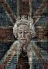
It's fantastic.
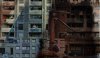
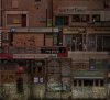
What did you do to get the sketch effect on the background buildings? It makes them look like wood or tin cartoons.
I look forward to seeing the finished product. I hope you are saving psd's of some of the states as you go. Just a thought. Anyway, don't you dare not come back and show us your final piece. After all, think of all the oohs and ahs from your colleagues in PS will shower on you.
As for critique, I'll come back and look at this more later. Just want you to bask in praise for a bit.
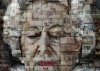
The one thing that does stand out to me is a lack of contrast and separation from the FG and BG. In other words, the Queen sits a little too flatly on the buildings. I suppose that is the intent, but I still think, since she's not a billboard (or is it?), that there should be a little more distinction (lol, no pun intended).
Maybe just a touch more highlight, especially on her face. Perhaps a small blur to the BG (but not to lose the details; it is very interesting). And keep the sharpness within her Majesty's outline. The degree of darkness over her right shoulder is a little incongrous and seems too wide. Maybe a slight shadow that extends along that side.
It is very surreal and I may be way off, especially if the flatness is what you were going for. But these are just my observations. There, lol, I critiqued it after all. But accept my praise. It is beautiful.