I have no problems with how you processed the image to B&W. IMHO, if that's what you set out to do, you displayed good craftsmanship, as did the photographer. If you set out to emulate Lee Jeffries work, from what I remember, he tends to crop much more closely and many (most) of his street people subjects are looking straight at the camera, not away from it.
That being said, there is a lot of subjectivity and opinion involved in the basic decisions to (a) take such a photo; and (b) convert it to B&W vs. leaving it in color.
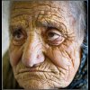
Although I don't know the relationship of the photographer to the sitter or the circumstances of the shot (eg, was it a shot of the photographer's grandmother or a street shot of a homeless woman), many photographers and critics feel that photos of old wrinkled folks can easily fall into stereotyping the subject, perhaps, even to the point of degrading / exploiting them. In addition, many would argue that these types of photos are "easy shots" taken by less experienced photographers who, for their own betterment, want to emulate well known photographers who actually are socially conscious.
In addition, conversion to a B&W with exaggerated local contrast (to exaggerate the old weathered / wrinkled look) is, IMHO, a cliche at this point. It's been overused. Every kid with a camera that thinks he's a street photographer knows how to light a subject and process the resulting file to get this look.
So, my opinion, and it's just my opinion, is a lot like Chris' -- leave it a straightforward color shot. This will impose less of your own likes and dislikes on it, and leave more of the interpretation (eg, grandma or street person) ambiguous and in the minds of the viewers.
If it were mine, about the only things I would do would be to crop more closely, goose up the colors a bit, and put a bit more light on the eyes (It's almost impossible to go wrong by doing this in a portrait).
Just my $0.02,
Tom