What's new
Photoshop Gurus Forum

Welcome to Photoshop Gurus forum. Register a free account today to become a member! It's completely free. Once signed in, you'll enjoy an ad-free experience and be able to participate on this site by adding your own topics and posts, as well as connect with other members through your own private inbox!

Clipping mask makes the text less clear


Cheah Hsun Teik

New Member
Messages
3
Likes
0
After clip masking an image to the text, the text doesn't look very clear anymore.
As the image is continuous, it makes the text looks continuous, so I can't see each letter clearly anymore. I think.
Any idea to solve this? Is it better to use the texture overlay layer effect instead? or will it be the same?
 
HI @Cheah Hsun Teik
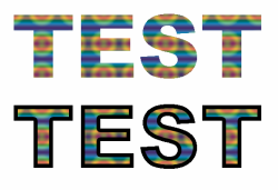
The human eye/brain sees high contrast edges. By putting fill in the text it probably reduced that contrast.
That could be helped if you added a small stroke of a contrasting color (e.g. black or white etc depending on background and fill) to increase that contrast.
The following image shows an example
Hope this helps
John Wheeler

Screen Shot 2021-05-18 at 11.07.44 AM.png
 
After clip masking an image to the text, the text doesn't look very clear anymore.
As the image is continuous, it makes the text looks continuous, so I can't see each letter clearly anymore.
Please share a screen shot of what you're referring to.
 
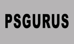
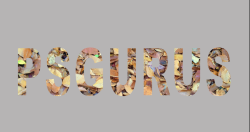
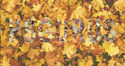
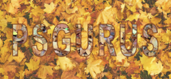
This could be dependent on what image is clipped to the text and then what background the text appears on......

Readable....
Screen Shot 2021-05-18 at 12.53.21 PM.png

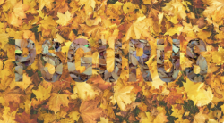
Clipped image...............harder to read......
Screen Shot 2021-05-18 at 12.53.32 PM.png

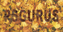
Clipped image on similar background......very hard to read....
Screen Shot 2021-05-18 at 12.53.41 PM.png

Easy.
Screen Shot 2021-05-18 at 12.56.04 PM.png

As John stated, it's about contrast.
Slight stroke to break up the content of the clipped image or to define the text.
Screen Shot 2021-05-18 at 12.59.02 PM.png

A gradient might help..... not much.
Screen Shot 2021-05-18 at 1.02.15 PM.png

Or a color fill adj layer clipped and set to multiply..
Screen Shot 2021-05-18 at 1.03.26 PM.png
 
This could be dependent on what image is clipped to the text and then what background the text appears on......

Readable....
View attachment 121099

Clipped image...............harder to read......
View attachment 121100

Clipped image on similar background......very hard to read....
View attachment 121101

Easy.
View attachment 121102

As John stated, it's about contrast.
Slight stroke to break up the content of the clipped image or to define the text.
View attachment 121103

A gradient might help..... not much.
View attachment 121104

Or a color fill adj layer clipped and set to multiply..
View attachment 121105
Yes, this is what I mean, and I've alr tried stroke, which produce the best result, but it's still not really clear.
I'll try the final method and will come back, if it still doesn't work.
You also said "This could be dependent on what image is clipped to the text and then what background the text appears on...... ", so what should be the best image to clip when creating title with clipping mask?
 
so what should be the best image to clip when creating title with clipping mask?
Great question and one only you can answer. It would be dependent upon the subject or overall theme of the composition. Something relative to the text. I would have to see what it is you're working on in order to make a suggestion.
 
I deleted what I've done cause it doesn't look nice, so I'm thinking of another design.
Ill ask again, if I still have problems.
 

Back
Top