What's new
Photoshop Gurus Forum

Welcome to Photoshop Gurus forum. Register a free account today to become a member! It's completely free. Once signed in, you'll enjoy an ad-free experience and be able to participate on this site by adding your own topics and posts, as well as connect with other members through your own private inbox!

Could use idea to improve this


ibclare

Queen Bee
Messages
11,034
Likes
4,638
I know the content of this may seem a contradiction, but it's really advice I want, :mrgreen: but I will gladly accept any and all opinions!

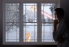
It's a just for fun image. I'm not happy with the vibrance of the figure vs. everything else. I'm also a bit stumped as to how to fix that. Reduce the vibrancy of the figure; increase that of the outside; darken the whole inside more . . . Ideas? And suggestions please as to tools, techniques, methods you think would work. Much appreciated.

(btw, please don't be upset if I don't respond to feedback for awhile. I'm on my way to bed. Cheers all!)
 

Attachments

  • DayDream.jpg
    DayDream.jpg
    860.5 KB · Views: 1
Last edited:
Maybe the light on the Cat is a bit too different from the surrounding light on the outside. Try this. Import the cat to the background and go for Image/Adjustments/Match Color.

Put an X in the little box where it says Preview. In the field at the bottom, chose the name of your background, and then adjust using the sliders until you feel it looks okay. When done click OK.
 
Whoa! I think this is amazing! I have been looking at it, and the source images, and I can´t figure out how you did it. I love what you did to the guy, how did you do that? Ok, I think the whole thing is really cool, but there is a distracting thing, and that´s the tail of that "mushroom rocket" lol, it does look a bit too solid and also kind of blurry at the same time. I think all it might need is to be faded a bit into the background? to make it a little less "stand alone"? or maybe put a low opacity gradient over the whole "outside part? like a light blue or something? well, I don´t really now how to fix things, but I would really like you to tell how you did it. :)
 
Maybe the light on the Cat is a bit too different from the surrounding light on the outside. Try this. Import the cat to the background and go for Image/Adjustments/Match Color.

Tx Fenix. I do agree about the cat. I changed it over several times. I'm going to try some different versions. The entire file is getting too big. Going to have to merge some layers. Guess I'll make a copy to do that. I'll try your idea.

Whoa! I think this is amazing! I have been looking at it, and the source images, and I can´t figure out how you did it. I love what you did to the guy, how did you do that? Ok, I think the whole thing is really cool, but there is a distracting thing, and that´s the tail of that "mushroom rocket" lol, it does look a bit too solid and also kind of blurry at the same time. I think all it might need is to be faded a bit into the background? to make it a little less "stand alone"? or maybe put a low opacity gradient over the whole "outside part? like a light blue or something? well, I don´t really now how to fix things, but I would really like you to tell how you did it. :)

TYVM Vafann. I see what you mean about the rocket flare; I spent too much time on it and only made it worse! Not sure it was the most imaginative element to use anyway. But I decided to post regardless of how unsure I was with it. That's the idea of the forum. To make progress, gotta be open to ideas. Once I considered renting a studio with a bunch of other artists. I was doing a lot of painting in those days (no internet then; can you imagine...). Couldn't afford it though so I jut went back to school to be working around other artists. But that's why forums are so great. Community interaction creates that stimulation and growth.

As for how I did it, well some parts were pretty make shift as I worked on it and I would do them faster and better now. Of course. You did get that msg from Stric9 I think about the share psd site. There are others. Trying to remember this really easy to use one, but any will work and we can share big files that way. I could send you this one. Of course it wouldn't tell all! I used a LOT of transformations, some blurring and things that don't get recorded like layer adjustments. I rarely use image>adjustment because I want the flexibility to go back in and tweek adjustments if I want.
 
Tx Fenix. I do agree about the cat. I changed it over several times. I'm going to try some different versions. The entire file is getting too big. Going to have to merge some layers. Guess I'll make a copy to do that. I'll try your idea.


TYVM Vafann. I see what you mean about the rocket flare; I spent too much time on it and only made it worse! Not sure it was the most imaginative element to use anyway. But I decided to post regardless of how unsure I was with it. That's the idea of the forum. To make progress, gotta be open to ideas. Once I considered renting a studio with a bunch of other artists. I was doing a lot of painting in those days (no internet then; can you imagine...). Couldn't afford it though so I jut went back to school to be working around other artists. But that's why forums are so great. Community interaction creates that stimulation and growth.

As for how I did it, well some parts were pretty make shift as I worked on it and I would do them faster and better now. Of course. You did get that msg from Stric9 I think about the share psd site. There are others. Trying to remember this really easy to use one, but any will work and we can share big files that way. I could send you this one. Of course it wouldn't tell all! I used a LOT of transformations, some blurring and things that don't get recorded like layer adjustments. I rarely use image>adjustment because I want the flexibility to go back in and tweek adjustments if I want.

OK! I have been checking out that big file sharing site, but I have been given some other suggestions about other places that some think work much better. It´s such a shame that it isn´t easier than it is to share things, I´m sure a lot great work could come out of it. :)
 
Hi Clare

I Agree whit the suggestions posted before.

First of all, your artwork is great and you've come a long way, your improvement is very noticeable, please keep it up.

Also, As you may already know, and i've noticed a bit of struggling on color correction and scene blending, but don't worry that's a really difficult part of digital art, and takes some time to master some techniques.

There's some tricks that is use most of the time in my work, I've learned them by watching or reading tutorials in image manipulations around the net from many different authors.

it may seem pretty basic, but when you know how, and when to use each tool, it becomes a great and very useful way to blend different object in your scene.

- Once you got all the objects to be included in your composition, you need to make sure that your objects sharpness are in a pretty close range, that means, you cant blend a very sharp and high quality image whit a blurry low quality image, of course there's some exceptions to this rule depending on the composition subject.

- Let's move on to color correction, here there's some tools that you really want to use in order to match colors of the objects, and those tools are:

* curves, in some basic color corrections i'll work whit curves in RGB mode, this is what i call the basic curves method, but there's some times that you will need a more "advanced" method to match colors specially when working whit skin tones, very soft textures, hair, ect. In that case what i do is to change the image mode from RGB to CMYK color space, and work my curves there,
'cause in that color space you can have a lot more control over your color shades also the advantage of using and playing whit an extra channel which is "black".

* Levels, this tool is very important if you want to change lightness or darkness of the objects as you may already know, i call this tool the "day & night" slider lol, using this tool carefully you can easily match the shade mod of your individual objects in the scene.

Those are my favorites, you can still fine tune a lot more your objects color,exposure,etc whit the help of the other tools in the layer adjustments panel.

- Dodge and burn, use it when you need to increase the lightness or burn for the darkness in some areas od the objects, this + mask is an awesome combination when working whit scattered or random shadows and light reflections.

- Now this is what i do when i need to blend all the objects into the scene as one solid piece, as all the tools mentioned before this is pretty basic but very powerful thanks and Adobe for that, and this is the gradient map Image>adjustments>gradient map, whit the help of gradient maps you can set the color/blending mod of the whole composition, you can choose any gradient you can imagine, also i may recommend using gradients, or solid color fill layers, set to overlay mode choosing a neutral color shade it will help you a lot in scene blending.

* As a side note, you can also use a soft low opacity brush, and paint whit color some areas of your composition to get some colors or objects to pop out in your scene, dont forget to change your blending modes to suit your desired fx needs.

Hope this helps.


Excelent advice.

In that case what i do is to change the image mode from RGB to CMYK color space, and work my curves there, 'cause in that color space you can have a lot more control over your color shades also the advantage of using and playing whit an extra channel which is "black".

But i have to some warnings about his one.

First, you should check your Color Preferences and set it right. Meaning ICC profile and Converting Options i think is most important in this one.
Second, use it, as 1r_M4x1mu$ said, on skin tones (if it's not very art), soft textures etc. Don't use it on saturated (especially on over saturated) color areas. You may loose many details by cmyking.

Just warning. Method is very good!
 
Hi SeniorS and Sir M, I just got logged back on and saw your entries. I will have to look at them tomorrow when I can think again! In the meantime, I posted a new version of this image which addresses some of the problems, but I'll read your recommendations and see how to apply them to my work in progress. It's entered as "Took this in a New Direction" if you care to take a look. Thanks guys.
 
The issue of sharp high resolution vs. low res blurry is a big problem with this image. I am having better luck getting higher res images but I'm reluctant to pay much at this point (unemployed for the most part), and my own photos don't always get it. Still, there are tools for that, such as sharpening and gaussian blurs. I do use the blur tool. Haven't had much luck with dodge tool -- pressure seems too light and I like to use brushes at low opacity and build so this seems like overkill --unless I'm doing something wrong which would be no surprise. At any rate, I have only once calibrated for color, so I will have to look into the ICC profiles.

I tried to stand further back from this img (I have to blame part of this - cuz why blame myself, lol - on my monitor size and the d_ _ _ glossy screen which is new to me . . . and having slight vision problem, nightmare for visual person), and see what would work better. I feel I addressed some of it in the newer attempt. There are a lot of technical aspects of using tools in Photoshop and discovering that they are there, which I have got to quit avoiding. My artwork is to the point that I must learn better. This forum has been and continues to be a great source of review and recommendation.

Hugz! Thanks for the support and encouragement. PS: You are both so tolerant of those of us who struggle. Don't protest, I know you're still learning, blah, blah, blah. But you have patience and empathy and I admire that.
 

Back
Top