What's new
Photoshop Gurus Forum

Welcome to Photoshop Gurus forum. Register a free account today to become a member! It's completely free. Once signed in, you'll enjoy an ad-free experience and be able to participate on this site by adding your own topics and posts, as well as connect with other members through your own private inbox!

Paid Easy font fix ($5)


Status
Not open for further replies.

liqliq

New Member
Messages
4
Likes
0
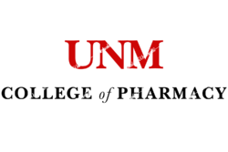
So just wanted someone to photoshop the logo "UNM College of Pharmacy" with the same exact font as the one on the coat, except done so in a straight line. It needs to be big enough for me to upload onto Medelita to order my embroidered lab coat. It's not a big tip but just something to show my appreciation. FYI, just something to show my appreciation for doing this for me. I completely ruined my lab coat, and my school charges a $60 replacement fee...so just wanted a nicer lab coat if I'm going to be spending money on a new one. Thanks.

P.S. Remember, the embroidery should be something like this:
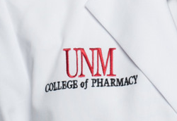
college of  pharm logo.png

See how it's crooked? Since the photo was taken at an angle...it should be straight,

Here's a picture of what I'm talking about: Also if you go to the photostream you can see more pictures of the same lab coat.

Will send you a tip through PayPal, Venmo or bitcoin...whichever you prefer. Send me your preferred method to receive payment as well only after I approve of the picture. If you can show me what you did, and how you found the right font I'd greatly appreciate that too. Thanks again.
 

Hybrus

Well-Known Member
Messages
149
Likes
32
Hello

mobile_home.jpg
 

liqliq

New Member
Messages
4
Likes
0
thank you guys both, I'm still deciding which one of your guys' I'm going to choose. They both seem on point. But I think some things might be a little off.
You guys can look at the photostream here https://www.flickr.com/photos/unmcop/with/35443665461/

The P in Pharmacy should be closer to the end of the N of UNM and the H should be directly under the M in UNM, scooted to the right a little.
 

liqliq

New Member
Messages
4
Likes
0
it should all be aligned. so I think the UNM part should be a lot bigger or taller...or both.
 

liqliq

New Member
Messages
4
Likes
0

maybe this is a better picture...also, I'm going to pay both of you guys for helping me. that's very kind of you. I just need it to be exactly the same. and who ever gets it spot on I'll throw a few extra.
 

Aakshat

Power User
Messages
307
Likes
200
Is your college that strict about labcoats.?
Maybe you can borrow someones labcoat lay it flat and take a good picture of it or scan it, and send to embroidery service.
 

polarwoc

Guru
Messages
1,576
Likes
1,421
Let us know if this suits your application. The image is downsized to 25% of its original resolution, which is 6000 X 4000.
1513-UNM@0,25x.png
 

polarwoc

Guru
Messages
1,576
Likes
1,421
This is the way I approached it:
Looked around for the logo and came across this one.
Used that image and visited www.fontsquirrel.com which allows you to upload images or links and helps you identify fonts.
I zeroed in on "Baskerville" and its variations to achieve the above font.

Like @Aakshat suggested, if you borrow someone's coat, lay it flat and get a better quality photo, it helps in identification better.
 
Status
Not open for further replies.

Top