arunonline
Member
- Messages
- 17
- Likes
- 1
Welcome to Photoshop Gurus forum. Register a free account today to become a member! It's completely free. Once signed in, you'll enjoy an ad-free experience and be able to participate on this site by adding your own topics and posts, as well as connect with other members through your own private inbox!


This is a rather easy effect to create but it's fairly involved. I would suggest that you spend time watching and creating ALL of these video tutorials for practice! https://www.youtube.com/results?search_query=Photoshop+infographics
Don't just watch these tutorials, do them.
I will give a basic run down of one way the effect can be created. I will not go into all the details, you will have to ask about specifics.
Create a background.
Create your banner. I added a layer style with a paper pattern overlay.
I also added a darker gradient on the right side.
View attachment 82010
Use your guidelines to create a grid.
View attachment 82011
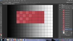
Using the grid, create the Light Red squares.
View attachment 82012
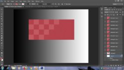
The rest is about re-selecting squares and adding shading.
Shading for the dark squares.
View attachment 82013
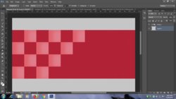
Shading for the Light Red squares.
View attachment 82014
Drop shadows.
View attachment 82015
Finally a shadow for the banner.
View attachment 82016
And lastly, add the text.
View attachment 82017


 Found lots of useful & interesting designs. Yes, i know i have to do & do & do to b perfect. 2 new designs per day is my target.
Not a good idea. Guidelines are one of the best assistants you can have while making infographics, you need to learn how to use them.I didnt get the grid idea of yours. So, i skipped that.


Consider that I also used a layer style with a pattern overlay to simulate the paper texture.
View attachment 82211
View attachment 82212
Sir,Consider that I also used a layer style with a pattern overlay to simulate the paper texture.
View attachment 82211
View attachment 82212
That looks much better.
For some reason your corners are not touching so there are still some alignment issues.
View attachment 82319
Can you post a screenshot of how you are adding the light red squares to the red layer?
No need for you to do this. You don't need my certification to continue your work. You can see the same things I see so there's no need to show your work here for any kind of approval.So, I thought i should forward the half done work & thought of continuing after your certification.


No need for you to do this. You don't need my certification to continue your work. You can see the same things I see so there's no need to show your work here for any kind of approval.
As you should be able to see for yourself, several of your squares are out of alignment.....
View attachment 82616
Now just to clarify, I would not use a grid (even though it should work) I use guidelines.
Are you using math to create the rectangle and squares? Let's try something different! Let's not use any grid or guidelines!
If I use a rectangle that is 1600px wide and 600px height.....
View attachment 82618
View attachment 82617
.........then I need to figure out the smaller squares size. I know that I want 4 squares from top to bottom.
600px divided by 4 = 150px
So I need for my smaller squares to be 150px x 150px
I also know that I will need 10 squares.
Once you have one square just duplicate that square as many times as needed!
View attachment 82619
View attachment 82620
Duplicate 3 more squares (Cmd/cntrl + J)
Align the first row........
View attachment 82621
Select the two that need to be moved, use your Move Tool and and align them......
View attachment 82622
View attachment 82623
Continue this until your done.
Perfect alignment!
View attachment 82624
I will repeat, you don't need my certification to continue your work. You can see the same things I see so there's no need to show your work here for any kind of approval.If its right, i will go to the remaining steps.
I will repeat, you don't need my certification to continue your work. You can see the same things I see so there's no need to show your work here for any kind of approval.
Does it look good to you?
I understand that you are a beginner. So the point is that we have gone over all the required information and techniques that you need to complete this info graphic to this step. You should now know what to look for at this stage. You no longer need me to show you if you have something off. You should be able to look at your own work and determine (based on what you've learned here) what if anything is incorrect. If everything looks right and aligned, then move on to the next step. If you have trouble with the next step, I will help you out.Sir, im just a beginner in photoshop. So, whats the point in doing works which are not done the way it should be. Thats why im asking whether i have done it correctly. & i dont have any other assistance. Thats why im here in this forum.
This is up to you. If you have closely inspected your work, done the best you can do, and your happy with the result, then you can move on. As I stated above, you have all the required information and techniques that you need to complete this info graphic to this step. If you see something that you want to change, then change it and make it right for you.i know its not perfect what i have done.
Your going to be disappointed. None of us are perfect. We just have to be happy with what we have created.have to try it again again inorder to be perfect.