thebestcpu
Guru
- Messages
- 2,994
- Likes
- 2,760
Having done some work on Gradients recently, I wanted to understand how the Smoothness and Method Options change the Gradient's characteristics.
Smoothness can go from 0% to 100%. The Method option has three settings: Classic, Perceptual, and Linear.
Using Smoothness limits of 0 and 100 gives six total options to consider.
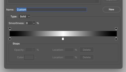
To make the explanation simple, I created a B&W gradient that goes from Black up to White halfway through the Gradient and then back to black and the end of the Gradient.
Here are the Color Stops when looking in the Gradient Editor.

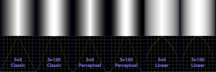
Side by side below, I show the resulting gradients on top with the six combinations of settings with a graph of the gray level across the Gradient in graph form (extracted from the Gradient).
Here are my basic observations for the settings.
At the far left is Smoothness = 0 and Method = Classic (the only Method available before PS 2022)
This mode is precisely linear, yet at the peak, the appearance appears to have a bright band. The optical illusion is natural to our eyes.
The optical illusion is the main reason to have the Smoothness Slider. With Smoothness at a higher level, as seen in the following Gradient, the bright band disappears. All it took was making the change in brightness smoother. Eliminating the optical illusion makes a higher Smoothness setting desirable in many situations.
Note in the options, where Smoothness=0, there still is a small band in the middle independent of the Method used.
That covers the impact of the Smoothness slider.
If you look at the two gradients drawn with the Perceptual Method, there is a pull-in of the blacks, similar to a gamma function shape pulling down the blacks more than whites. For me, visually, the Perceptual mode makes the 50% gray point on both sides of the triangle about halfway through the ramping up in brightness and about halfway back to Black. In some ways, this gives it a more balanced look.
If you look at the two gradients drawn with the Linear Method, there is a bulging out of the whites, which, when also using the Smoothness setting of 100, makes a very smooth-looking gradient.
So which one you use depends on your needs.
I hope this summary and visuals will help others as it helped me better choose which of the six options to use under different circumstances.
John Wheeler

Smoothness can go from 0% to 100%. The Method option has three settings: Classic, Perceptual, and Linear.
Using Smoothness limits of 0 and 100 gives six total options to consider.
To make the explanation simple, I created a B&W gradient that goes from Black up to White halfway through the Gradient and then back to black and the end of the Gradient.
Here are the Color Stops when looking in the Gradient Editor.

Side by side below, I show the resulting gradients on top with the six combinations of settings with a graph of the gray level across the Gradient in graph form (extracted from the Gradient).
Here are my basic observations for the settings.
At the far left is Smoothness = 0 and Method = Classic (the only Method available before PS 2022)
This mode is precisely linear, yet at the peak, the appearance appears to have a bright band. The optical illusion is natural to our eyes.
The optical illusion is the main reason to have the Smoothness Slider. With Smoothness at a higher level, as seen in the following Gradient, the bright band disappears. All it took was making the change in brightness smoother. Eliminating the optical illusion makes a higher Smoothness setting desirable in many situations.
Note in the options, where Smoothness=0, there still is a small band in the middle independent of the Method used.
That covers the impact of the Smoothness slider.
If you look at the two gradients drawn with the Perceptual Method, there is a pull-in of the blacks, similar to a gamma function shape pulling down the blacks more than whites. For me, visually, the Perceptual mode makes the 50% gray point on both sides of the triangle about halfway through the ramping up in brightness and about halfway back to Black. In some ways, this gives it a more balanced look.
If you look at the two gradients drawn with the Linear Method, there is a bulging out of the whites, which, when also using the Smoothness setting of 100, makes a very smooth-looking gradient.
So which one you use depends on your needs.
I hope this summary and visuals will help others as it helped me better choose which of the six options to use under different circumstances.
John Wheeler

