
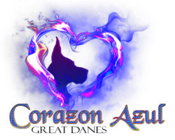
I am very new to photoshop and am creating a logo for my kennel. I have this design done and I am liking the layout, but I need to render the color different. I used a logo mockup that created this same design using grays and silvers with an embossed look. How can I get this look on the logo itself? I attached the psd files of the mockup I used, I tried to replicate it but can't figure it out. Thank you for your help
Photoshop Gurus Forum
Welcome to Photoshop Gurus forum. Register a free account today to become a member! It's completely free. Once signed in, you'll enjoy an ad-free experience and be able to participate on this site by adding your own topics and posts, as well as connect with other members through your own private inbox!
You are using an out of date browser. It may not display this or other websites correctly.
You should upgrade or use an alternative browser.
You should upgrade or use an alternative browser.
Specific Need help with logo
- Thread starter tlm75
- Start date


Here, by "Logo" do you mean the text?How can I get this look on the logo itself?
Summarising your request, do you want the same effect on the text as what appears on the picture?
on the text and the dog/heartHere, by "Logo" do you mean the text?
Summarising your request, do you want the same effect on the text as what appears on the picture?
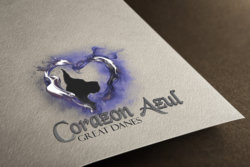
ORIGINAL is marked below is the original Logo1mockup with the embossed look and color differences is the target. I realize the 'mockup' was just to show what it would look like on an embossed card but I love those colors and since I used a drag and drop template I am confused as to how to get the effect on the flat logo
Attachments
Nxxl
Well-Known Member
- Messages
- 199
- Likes
- 180
As for the text, you can create a new layer and clip it onto the "Corazon Azul" Layer. Fill the new Layer with black color over the text and change its blending mode to "Saturation"

As for the Dog Silhouette, double click on the "Gradient Overlay" Effect and it'll open up the Menu.
Change the Gradient overlay to the one that I have marked with the Red Box and adjust the scale accordingly. Make sure you check the "Reverse" box, so that black is on top, gray is towards the bottom.

As for the other part of the image, I'm still trying to figure out how to accomplish that. Tried several effects and what not. Will get back to you shortly, unless someone else manages to figure it out before me.
As for the Dog Silhouette, double click on the "Gradient Overlay" Effect and it'll open up the Menu.
Change the Gradient overlay to the one that I have marked with the Red Box and adjust the scale accordingly. Make sure you check the "Reverse" box, so that black is on top, gray is towards the bottom.
As for the other part of the image, I'm still trying to figure out how to accomplish that. Tried several effects and what not. Will get back to you shortly, unless someone else manages to figure it out before me.
I tried to attach the mockup template so you could their actions but it is too large. I can email it, or it can be found as a free download here https://www.graphicwallet.com/shop/gold-silver-foil-letterpress-logo-mockup-black-fire/ Thank you so much for all of your help!!
o.robles
Well-Known Member
- Messages
- 174
- Likes
- 177
What I can figure is you are trying to have an embossed look for the whole logo " heart flames " as well? so It looks like it's embossed on the paper?
Because the type of logo and the flames you are using they won't look good embossed as it will create this " stroke " effect around the flames and would look un-natural. I seen something like this before on a business card where parts of the flames where embossed to give it a raised look and texture .
Because the type of logo and the flames you are using they won't look good embossed as it will create this " stroke " effect around the flames and would look un-natural. I seen something like this before on a business card where parts of the flames where embossed to give it a raised look and texture .