What's new
Photoshop Gurus Forum

Welcome to Photoshop Gurus forum. Register a free account today to become a member! It's completely free. Once signed in, you'll enjoy an ad-free experience and be able to participate on this site by adding your own topics and posts, as well as connect with other members through your own private inbox!

Photo Retouching Help...


SolidBrowser

Well-Known Member
Messages
46
Likes
5
I have this old photo of my grandpa and I am working on retouching it, but to colourize his uniform is hard because every time I get a uniform colour off the internet to colourize it, when I paint onto the photo I guess it doesn't show up the colour maybe because its too black or what>? Also how do you guys think I'm doing to far?
View attachment 26208View attachment 26209
 
Maybe select the uniform and decrease the levels on it. You can then paint with black on the filter mask to reveal more of the lines and shadows. Then when you apply a color layer, and be sure it is on a separate layer, experiment with layer blend modes: color, soft light, hard light, vivid, normal with decreased layer opacity . . .

I am sure you will receive further advice from those who do more recoloring than I do, so hang in there.

Here is a quick colorization:

Made a layer filled with olive green painted on at 100%, layer set to soft light and copied. Then I set this to 45% to bring down the intensity. A deeper green to begin with might have negated necessity for copied layer but hard to guage color need till you set blend mode. Cane always experiment right then.

Made another layer set to color with a tan and decreased opacity. Again, the right color chosen the first time might be all you need but I find this method works just as well and maybe faster.

Hmmm, I haven't calibrated my new monitor so the colors look different. Like way too vivid green on the new monitor. But this is the idea.

green coat.PNG
 
Last edited:
I've found that re-coloring grainy / weathered / high contrast old photos can be difficult because you are trying to use the same color (ie, hue + saturation) to the full range of tonal values from dark to light, whereas, in the real world, there would likely be different hues and saturation values in the shadows than in the highlight areas. In such cases, I do my best to reduce the obvious artifacts, then I apply color with a gradient map, not just a solid color adjustment layer or a photo filter adjustment layer.

If I get a chance, I'll demo what I mean later tonight or tmmrw.

Tom M
 
Here's a quick stab using the general approach I outlined above, ie, first fix tonality and noise problems, then re-color with a gradient map fill. To get it looking good, I also wound up adding a small quantity ( ~ 25%) of a simple "colorize" fill using a hue/sat adjustment layer.

For reference, I also included a fairly high quality, modern image of the same general type of jacket. Since we are re-coloring an old photo, I aimed for more muted colors than the modern image, but having it available for comparison gave me something to shoot for.

If you want more details, just ask.

Tom M
 

Attachments

  • SCAN0084-01_ps01a-01_698px_hi-desat-akvis_jacket-02.jpg
    SCAN0084-01_ps01a-01_698px_hi-desat-akvis_jacket-02.jpg
    263.3 KB · Views: 57
  • 191618_ts-hi_quality_modern_image-xnv-698px_hi.jpg
    191618_ts-hi_quality_modern_image-xnv-698px_hi.jpg
    149.4 KB · Views: 54
... and to take it a bit further, I used the same general approach on all the other areas in the image.

T

PS - Sorry, but I just didn't have the ommph or the time to deal with the cracks and spots that are all over the image. Separate techniques are needed to deal with them and that would be a different demo.
 

Attachments

  • SCAN0084-01_ps04a-01_698px_hi-desat-grad_maps-vign_borders-01.jpg
    SCAN0084-01_ps04a-01_698px_hi-desat-grad_maps-vign_borders-01.jpg
    233 KB · Views: 58
Great work Tom!

Good idea on the reference material as well............................the jacket guys, seriously.
 
Thanks for the help! I am having problems understanding.. So your saying to use a real world photo to colour it like the one above, because the jacket and other things have different colour, so don't just use a vector colour or one colour from the picker to colourize it? And how did you do the gradient map fill to colourize it... I am sorry but I am trying my best to understand but its hard for me... Are you saying my filter is not realistic or what?? Very sorry, I know your trying to help... Could you try to explain it to me in smaller words or something lol..:confused:
 
Thanks, I kind of understand now.. I think...
So They are saying its hard to add colour to a photo that has dark and light parts, and blending modes to these colours can make the colour more saturated ex; linear burn. So what you can do is make a layer stack of colours, set the modes to a mode that fits the image ex; linear bruin, colour, darken, and colour parts of the image with different colour tons ex; darker colour for the shaded spots... and paint on the layer masks to add the colour... this is what the first guy is showing with his colour stacks right? I am tying hard to figure this out.... I don't know why I am struggling so hard on this but can you please make sure I am understanding this right?:)
 
Hi folks - Sorry. I didn't mean to gloss over the explanation of how I performed the coloration, but I have had way too many cases in which I have gone to the trouble of writing out all the details of a photoshop procedure and the OP never re-appeared or had the courtesy to simply say, "thank you".

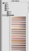
That being said, unfortunately, it would take more time than I have to describe how to setup and use gradient maps in general terms, let alone applying them to re-colorizing. Probably the best way to get a handle on how they are used in colorizing is probably to look at how a commercial colorization software package, AKVIS's Coloriage uses them. Look at all the color gradient maps shown on the RHS of this screen grab from "Coloriage":
http://akvis.com/scripts/img.php?img=/img/screenshots/coloriage-screenshot-1.jpg

I was delighted when I recently learned that a piece of commercial software was using the same technique that I had been using for years.

You will learn a lot more about gradient map colorizing if you download the trial version of Coloriage and try several different gradient maps on one of your own images.

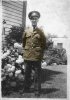
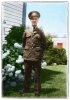
Gradient maps are certainly not the only way to provide increased realism when colorizing an image. An approach that I used years ago before I switched to gradient maps was to set up luminosity masks for different areas of the image and then use them to selectively color the darks, mids and lights in each of the major colored areas of the image, eg, the grass, the fabric, the far leaves, the skin, the leaves of the hydrangea, the sky, etc. In fact, the luminosity mask procedure is nothing more than a very tedious, manual version of a gradient map. :-(

No matter which method you use, the key ingredient is a very good eye for color (and often, some eyedropper measurements) to establish just how the color (ie, hue and saturation) varies with brightness for a particular type of object. That's another reason why I always try to find a reference image to work from. However, realize that the procedure is never as simple as merely taking the eyedropper to the corresponding object on the reference image and then painting that color in the image you are trying to colorize.


Another important aspect of re-coloring an image is, as I said earlier in this thread, to control both the overall and local contrast as well as the contrast inadvertently induced by noise. B & W images can get away with high contrast. However if you are trying to achieve a realistic color look, you've got to control contrast. Often this means nothing more than moving the clarity slider in ACR to negative values, and/or adding considerable noise reduction in ACR. I did exactly that in this image.

Sometimes, ACR-only adjustments will not be enough. To produce an credible color image one often needs even more reduction of local contrast. I'll often use a light dose of PS's "Glamor Glow" filter for this. I did exactly that in this image.

I've got to run, but I'll try to continue the description tmmrw.

Cheers,

Tom M
 
"Coloriage and try several different gradient maps on one of your own images.

Gradient maps are certainly not the only way to provide increased realism when colorizing an image."

This "coloriage" seems to make a good starting point for colouring but from that screen shot does nothing for skin tones. They should be built up from at least 4 separate colour tones to build depth and shape to a face...
 
"This "coloriage" seems to make a good starting point for colouring but from that screen shot does nothing for skin tones...."

That particular screen shot only showed a small part of their library of gradient maps. Attached is a screen shot showing some of their gradient maps for Caucasian skin tones.

That being said, I completely agree with you that if you want good quality results, such software only provides a starting point. In fact, I just discovered AKVIS's Coloriage a week or so ago, but did not use it for my demo in this thread. Instead, I manually constructed masks, my own gradient maps, multiple layers with considerable use of the blendIF sliders on most of the layers, color tweaks to areas using hue/sat adjustment layers, etc.

It is because of all the manual adjustment techniques that I am finding it difficult to write up a detailed explanation of exactly what I did. It would take me vastly more time to write it up than actually do the work.

T
 

Attachments

  • coloriage-skin_tones-some_of_their_gradient_maps.jpg
    coloriage-skin_tones-some_of_their_gradient_maps.jpg
    59.9 KB · Views: 33
Thanks for the help, I would just like to use Photoshop to retouch photos. Anyways, I guess I need to learn what generally are gradient maps and control the contrast... I used a picture of grass and masked it on the picture to where the grass is so instead of colouring it with just one colour I used a sample of grass and used the colour blending option that probably has a lot of more colours, but it does nothing for the shadows and highlights... So I could use gradient maps as well as eye dropper and the masks to create a good looking retouched image? To make the cloning process much faster I created the filter, noise, dusts and specks, but that creates noise so I guess thats not really what its for? So I should adjust the levels and contrast for this image also?
I am really happy that this forum that i recently joined is really good! I will be using this a lot of my path of photoshop, and tutorials...
 
I learned PS in school on PS5 with a 5.5 at home from a CD my friend gave me. I purchased an iMac and a copy of PS6 in 2000. I can learn from this thread Solid. I've got a lot to learn, so move over and get behind me in line! :rofl:
 

Back
Top