What's new
Photoshop Gurus Forum

Welcome to Photoshop Gurus forum. Register a free account today to become a member! It's completely free. Once signed in, you'll enjoy an ad-free experience and be able to participate on this site by adding your own topics and posts, as well as connect with other members through your own private inbox!

Changing Logo from Black to White causing Pixelation


Messages
24
Likes
2
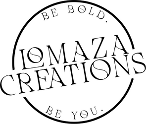
Good afternoon. I've attached a copy of my company's logo and for some reason, every time I change the logo from black to white, it becomes pixelated.

I've used Gaussian Blue and Curves to try an eliminate the pixels, but I wasn't sure if there was another way to do this to make it "cleaner?"

Any recommendations would be greatly appreciated.

Thank you

Large Shirt Logo - Black.png

Large Shirt Logo - White.png
 
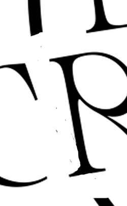
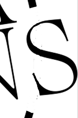
Your sample image seems to be pixelated as black, so naturally it would also be pixelated as white. Do you have the original vector based document that it should have been created in? Do you have the original PSD that this seems to have been made with? Do you know what font this is?

Screen Shot 2025-10-31 at 3.24.37 PM.png Screen Shot 2025-10-31 at 3.24.43 PM.png
 
Yes, it is definitely pixelated in black but when I print it on a shirt, the pixels do not show at all. It’s only when I change the color to white. It's so odd. I've attached the original PSD file, and the font name is called Mollen Fancyla. I'm open to any recommendations you might have. Thanks again
 

Attachments

Thanks for the reply. The PSD file you provided is not layered. Do you have the original that has a circle layer and a separate font layer?

If not, that's fine! The quickest and easiest way would be to recreate the logo using vector shapes and font.
 
No problem.

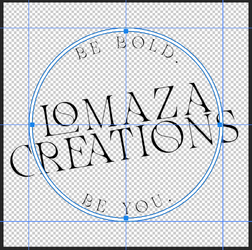
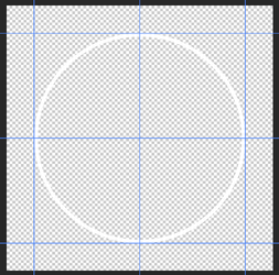
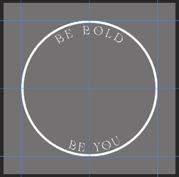
For starters, just align the old logo, set guides, then use the Ellipse Tool (vector based) to create the outside of the circle. Then, on the same shape layer, use the Ellipse Tool again set to "Exclude overlapping Shapes" to remove the center.

Like this...
Screen Shot 2025-10-31 at 3.51.07 PM.png
Screen Shot 2025-10-31 at 3.54.08 PM.png
 
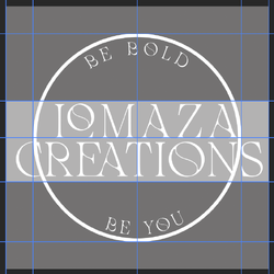
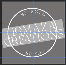
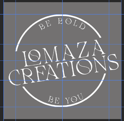
Next, on a new layer I created a white rectangle using the "Rectangle Tool". I then lowered it's opacity. Then I added two font layers (matching the original sample) sized, spaced, and positioned. I then grouped these layers, rotated the group, turned off the rectangle layer, selected the circle layer, added a layer mask, used the rectangle layer to create a selection, then filled the layer mask with black to mask out the circle.

Screen Shot 2025-10-31 at 4.28.30 PM.png
Screen Shot 2025-10-31 at 4.30.08 PM.png
Screen Shot 2025-10-31 at 4.31.17 PM.png
 
By adding a clipped solid color fill layer to the group, you can make the font and circle any color you like.......

Screen Shot 2025-10-31 at 4.46.03 PM.png
Screen Shot 2025-10-31 at 4.47.02 PM.png
 
Thank you so very much! I’m so thankful for this community. I’ve come a long way since last year and that’s because of the detailed content throughout this forum. Iamsam, you’re the best.
 
You're very welcome!

There could be a way of salvaging your original sample image, say with trace in Illustrator, or converting it to a path in Ps and adjusting, but re-creating the logo would still probably be the easiest way to work out this issue.
 
There is a way to salvage the image yet the cleanest result is starting from a vector image. I will post later on how to recover this image (not too hard) yet I think you issue may not be in inverting the image, yet rather in the absorption of alot of ink on the T shirt rather than a much smaller amount of ink when using your original image. Here is something I found online. Not having printed shirts myself, I cannot attest to the information yet it seems to make sense:

Printing Black vs. Inverted Image on T-Shirts

1. Ink Type and White Underbase When printing black on a light shirt,
the ink sits directly on the fabric and absorbs evenly, resulting in
crisp edges. When printing white or light ink on a dark shirt, a
white underbase is usually laid down first so colors appear opaque.
This extra layer can slightly bleed or spread, especially at edges,
creating roughness.

2. Fabric Absorption Differences Light shirts absorb dark ink better
than dark shirts handle white ink. Dark fabrics are often pretreated
to help white ink bond, but this pretreatment can cause uneven
absorption or halos around fine details.

3. Contrast and Optical Perception Even with the same print resolution,
a light edge on dark fabric looks rougher than a dark edge on light
fabric. Our eyes perceive high-contrast transitions as sharper,
exaggerating imperfections.

4. Transfer vs. Direct Print If using iron-on or sublimation transfer:

- Dark-shirt transfers use a solid opaque film with a white backing.
The film’s cut edges can appear rough.
- Light-shirt transfers embed the image directly in the fabric, so
edges appear smoother.

5. Possible Fixes

- Use a higher-resolution or vector edge for the inverted design.
- If printing direct-to-garment (DTG), reduce the white underbase
choke so it doesn’t extend beyond the color layer.
- Apply pretreatment evenly and sparingly.
- Trim closer on transfer prints or use a laser-cut mask.
- Slightly soften the edge in your artwork (0.2–0.5 px blur or halo in
shirt color).

In summary, inverted prints look rougher mainly due to the white
underbase, pretreatment, and visual contrast effects. Adjusting these
can significantly improve edge smoothness.

Just a few things to consider
John Wheeler

(I will post a process to clean up your image as well later on)
 
To reiterate, the most effective solution is to use Text (vector) and shapes (vector) to recreate the logo from scratch. Keeping it in vector form when you enlarge or reduce before it is eventually rasterized will give you the cleanest edges.

Now, for making the existing logo a bit cleaner.

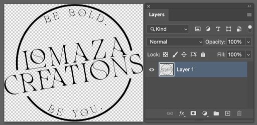
The PNG file format is nice as it has four channels, RGB and A for alpha or transparency.
Your starting image is shown below, along with the Layer stack.
Screenshot 2025-11-01 at 4.01.25 PM.jpg

The first step is to separate out the alpha/transparency channel to a Layer Mask. That is done with the command Layer > Layer Mask > From Transparency. The overall image is the same yet you can see from the Layer thumbnails that they are separate.
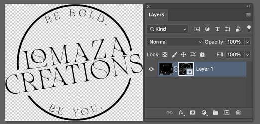
Screenshot 2025-11-01 at 4.01.48 PM.jpg

To look at the RGB channel by itself, all you do is right-click on the Layer Mask and choose Disable Layer Mask. What I found unusual was all the strange patterns left in the RGB portion of the document.
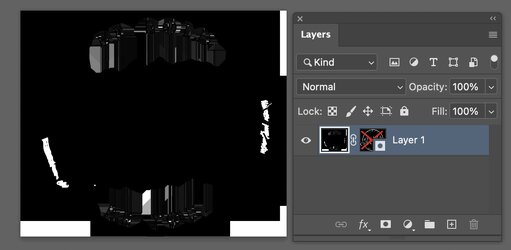
Screenshot 2025-11-01 at 12.21.54 PM.jpg

To view just the Layer Mask or alpha channel of the image, simply use Option + click on the Layer Mask thumbnail (Alt + click on a PC). This is the inverse of the logo. What it means is that everywhere it is white, it is Opaque, and what will show is that portion of the RGB image. For the fully black area, those are 100 % transparent and what will show is what is in the Layer below ths Layer (e.g. white if the background is white)

Screenshot 2025-11-01 at 4.04.02 PM.jpg

Notably, the transparency primarily determines the logo, and there is no reason for the RGB channels to be anything but black.
So the first step is to click on the RGB or Image thumbnail in the Layer panel and fill the Image with all Black. This dramatically simplifies how to proceed and correct the image.
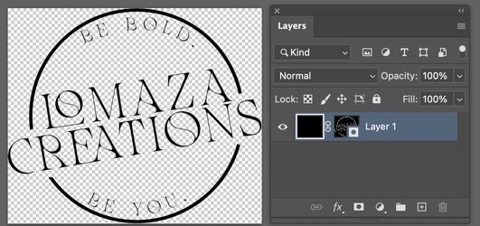
Screenshot 2025-11-01 at 4.20.45 PM.jpg

Now zooming in to the lower right corner "U" and edge circle, you can notice both the roughness of the edge circle and that the "U" is also quite rough and actually many portions that have no solid black in them and are quite transparent. The following steps will show how to clean this up.
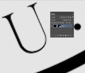
Screenshot 2025-11-01 at 4.23.15 PM.jpg

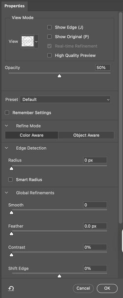
Your right click on the Layer Mask and choose Select and Mask. You will get the panel in the second image below.
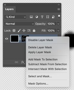
Screenshot 2025-11-01 at 4.25.52 PM.jpg

Screenshot 2025-11-01 at 4.27.27 PM.jpg

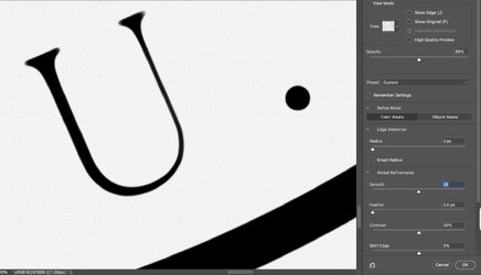
You have many options in this panel. In the view option near the top dropdown, I selected "On White." For the contrast sliders, I used 50%, and for the smoothness slider, I chose 50. As you can see, this firmed up the solid portion of the letter and also made the edges quite a bit smoother. There is a tradeoff as higher numbers of smoothness will make some of the sharp points on the text smoother as well. You adjust the sliders to achieve the desired result you want.
Screenshot 2025-11-01 at 4.28.51 PM.jpg

Returning to the overall image, the logo remains the same in this backed-up view, and now you can look for other issues that came with the Logo. Since we will be making changes to the Layer Mask only, and not the RGB image (which should remain all black), click again on Opt + click on the Layer Mask to open it for viewing and editing.

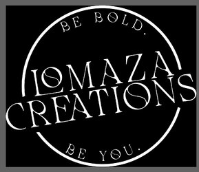
When starting with the original image, there was some image "noise" where the large containing circle was broken for the text. With the settings I had, I did not find any to correct, yet you may with a different set of settings with Select and Mask. If you do, for white slivers you would paint with black and if you and any black slivers, you would paint with white.
Screenshot 2025-11-01 at 4.48.20 PM.jpg

Hope this helps
John Wheeler
 

Back
Top