Yeah - sorry - it was hard to explain very well. My image sequence above is very basic.
Step 1: Cull the images and add the students names to the metadata of all the files in Lightroom.
Step 2: Use a Photoshop batch action to:
- open all the culled images from a directory
- add an alignment overlay
- save as a PSD image to a working directory (retaining the metadata)
Step 3: manually open 10 or 20 images at a time and resize and position each portrait layer so the faces are properly located in the overlay - close and save (I wish I could just do the positioning reliably in-camera and skips steps 2-4 altogether...!)
Step 4: Use a Photoshop batch action to:
- reopen each image from the working directory
- remove the positioning overlay
- resave the now-properly-positioned image (still retaining the metadata)
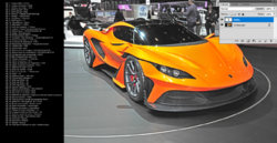
(Step 2-4 results in the 2nd image above - "Orig File manually sized to fit overlay")
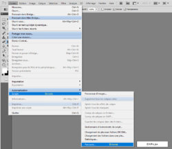
Desired Step 5: Run a script to:
- open the working image
- apply button overlay layer(s)
- replace text in let's call it "firstname" layer with text in image metadata
- [sometimes - depending on design] replace text in "lastname" layer with text in image metadata
- save the new working image with all layers (to facilitate edits/corrections as necessary)
Step 6: Run Image Processing script to resave all finished buttons as flattened JPGs in a new directory.
CAVEAT: I wonder the best way to handle lengths of names - i.e. Ian vs. Anjola-Oluwa...? Easy if the text is straight to just make it centered. But most buttons look better with curved text, in which case, I design it for about 12 letters, then add spaces before and after short names to center them so the curve remains usable.
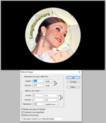
The final images are saved as jpgs, with the black around it. The reason for this is that to the best way to make the buttons is to simply have them printed as 4x6s at a photo lab (way cheaper than inkjet). Then they are cut out either with a die press, or a circle cutter, and then fitted into a die machine to crimp the button backing and cover. The outside remains a dark color so that if the button is cut or mounted slightly off center, there is not a white partial circle showing near or on the edge of the button. I do not just leave an open bleed around it because the buttons are aligned for cut manually, so some sort of guideline is necessary.
I am not at my vision workstation, so I can't load a PSD with the text layers right at this time - but I can later if it might help you figure out the process. (I can do actions, but I am clueless to scripts...)
Here are some example buttons, and a banner:


