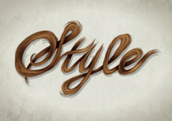
Tutorial Author: Sharon Milne
Posted online @: http://vector.tutsplus.com/tutorials/text-effects/vector-hair-typography/
Edited by Forum Moderator to give proper link and proper credit for tutorial
- Program: Adobe Illustrator CS5
- Difficulty: Intermediate
- Estimated Completion Time: 2 hours
I love creating portraits in vector but what I love even more, is doing wild and crazy hair styles. It was suggested to me recently to try crossing over the techniques of creating hair into typography and I just had to rise to that challenge!
So in today’s tutorial, I’m going to show you how I created this stylish piece of hair typography in Adobe Illustrator CS5. I’ve also finished it off with a quick aged coloring giving it a vintage design feel. So let’s get stuck in…
Step 1So in today’s tutorial, I’m going to show you how I created this stylish piece of hair typography in Adobe Illustrator CS5. I’ve also finished it off with a quick aged coloring giving it a vintage design feel. So let’s get stuck in…
When the concept was first suggested to me to create a piece of typography with hair, I straight away considered what sort of style to do it in. Whichever I decided on, it would influence what style of typeface I was going to use. I opted for long flowing locks, therefore a script/cursive typeface would be the best.
The next thing to consider is what sort of word to use. If you think about how hair behaves, it’s not the sort of material which can create sharp angles of say the letters: M, N, V, W or Z. How exactly would you illustrate letters with dots, such as an “i” or “j”? So the requirements would need to be a word which was full of loops and curves and if possible, linked to hair and possibly vector art?
There was the possibility of “Brush”, which would tick all the boxes however a capital “B” would have a slight problem with a sharp angle. It’s then decided… the word “Style”. The hunt for a lovely basic script typeface begins with my very basic collection!
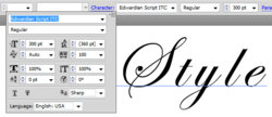
I opted for “Edwardian Script ITC” as I rather liked the way the “S” coiled. This would look great in hair. I used the Type Tool (T) to add the text to my canvas and changed the Font Size to 300pt. I then adjusted the Tracking to 100 (the space between the letters). Without adding space between the letters, it wouldn’t give much space for the hair.
Step 2The next thing to consider is what sort of word to use. If you think about how hair behaves, it’s not the sort of material which can create sharp angles of say the letters: M, N, V, W or Z. How exactly would you illustrate letters with dots, such as an “i” or “j”? So the requirements would need to be a word which was full of loops and curves and if possible, linked to hair and possibly vector art?
There was the possibility of “Brush”, which would tick all the boxes however a capital “B” would have a slight problem with a sharp angle. It’s then decided… the word “Style”. The hunt for a lovely basic script typeface begins with my very basic collection!
I opted for “Edwardian Script ITC” as I rather liked the way the “S” coiled. This would look great in hair. I used the Type Tool (T) to add the text to my canvas and changed the Font Size to 300pt. I then adjusted the Tracking to 100 (the space between the letters). Without adding space between the letters, it wouldn’t give much space for the hair.

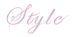
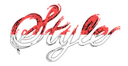
I’ve reduced the Opacity of the text to 10% and used it as a template to begin drawing the base shapes for the hair. I’m going to draw the strokes in the way I’d actually write out the letters, then I’ll know later on how the hair would be over and under lapping each other. I’ve used a 10pt Stroke Weight and Profile “Width Profile 1″.
If you’re not using AI CS5, you can create the same shapes as Art Brushes via this tutorial. For all the strands of hair, I used the Paintbrush Tool (B), however I do use a graphics tablet (Wacom Bamboo A5). If you’re doing all this with a mouse, I do recommend doing the strands with the Pen Tool (P) as you’ll have a lot more control over the curves.
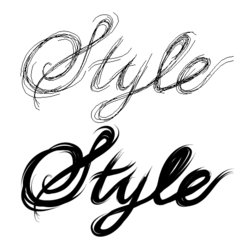
After you’ve drawn the initial strokes, build upon it with further strokes. Keep the strokes flowing in the same direction. Allow the strokes around the corners to fray and separate to give more of a free flowing style and to give the impression that it is hair.
Step 3If you’re not using AI CS5, you can create the same shapes as Art Brushes via this tutorial. For all the strands of hair, I used the Paintbrush Tool (B), however I do use a graphics tablet (Wacom Bamboo A5). If you’re doing all this with a mouse, I do recommend doing the strands with the Pen Tool (P) as you’ll have a lot more control over the curves.

After you’ve drawn the initial strokes, build upon it with further strokes. Keep the strokes flowing in the same direction. Allow the strokes around the corners to fray and separate to give more of a free flowing style and to give the impression that it is hair.

Select All of the stokes (Command + A) and go to Object > Expand Appearance to change the strokes to shapes with a fill. Then select Unite in the Pathfinder panel. You’ll notice you may have several shapes rather than just the one. If this happens you’ll need to create a Compound Path by Selecting All of your shapes (Command + A) and then going to Object > Compound Path > Make (Command + 8).
Step 4
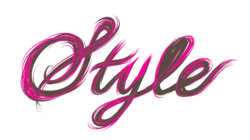
As much as we’d love our hair to be nice and smooth, in reality it isn’t. So I’m going to add some fly away hairs from the letters at a smaller stroke weight of 3pt. I’ll also Expand these lines and Unite them to the base. In addition, change the fill color to a medium gray-brown (C=55, M=60, Y=65, K=40).
Step 5
Step 4
As much as we’d love our hair to be nice and smooth, in reality it isn’t. So I’m going to add some fly away hairs from the letters at a smaller stroke weight of 3pt. I’ll also Expand these lines and Unite them to the base. In addition, change the fill color to a medium gray-brown (C=55, M=60, Y=65, K=40).

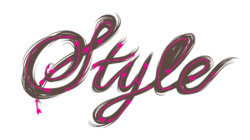
Now back to remembering how I wrote the letters and which direction the strokes flowed. From this I can work out which areas will overlap where. I’ve represented this with arrows below:
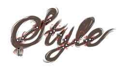
Using the base color brown (C=55, M=60, Y=65, K=40), I created a transparent linear gradient and drew shapes to show the shadow cast from the overlapping hair. These are then set at Blending Mode Multiply with Opacity 100%. Once done, Group up all the gradient shapes (Command + G).
Step 6
Using the base color brown (C=55, M=60, Y=65, K=40), I created a transparent linear gradient and drew shapes to show the shadow cast from the overlapping hair. These are then set at Blending Mode Multiply with Opacity 100%. Once done, Group up all the gradient shapes (Command + G).

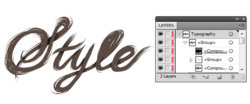
Duplicate the “style” base shape and then use this with the gradient group to create a Clipping Mask (Command + 7). I’ve also dragged and dropped the original base shape below the gradients to keep them all in one group.
Step 7
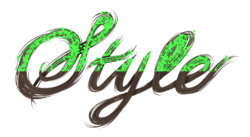
This is where the fun begins and that’s beginning to build up on the shading by drawing the strands of hair one by one. First of all, draw strands all over the bases, remembering to go with the grain of the hair. Use a lighter shade of brown as the stroke color (C=50, M=50, Y=60, K=25) with Width Profile 1, 3pt Stroke Weight set to Blending Mode Multiply, and Opacity 30%. Once done, Group the strands (Command + G) and drag and drop into the Clipping Mask group.
Don’t worry if some of the strokes overlap each other. Due to the Blending Mode and Opacity, it will create more natural looking darker areas of the hair, which you can later use for placing highlights and hair in shade. With this in mind, let’s talk highlights in the next step.
Step 8Don’t worry if some of the strokes overlap each other. Due to the Blending Mode and Opacity, it will create more natural looking darker areas of the hair, which you can later use for placing highlights and hair in shade. With this in mind, let’s talk highlights in the next step.

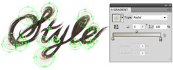
We know where there will be shadows and that’s around the areas where the hair is overlapping. Typically with hair, where it bends is where the shine is at its most intense. I’m going to create a light brown transparent radial gradient (C=25, M=25, Y=40, K=0) and use it as a fill with the Ellipse Tool (L) to draw several circles on the bends of the hair as shown below. The circles will be set to Blending Mode Overlay and Opacity 15%. Then group them Grouped up (Command + G) and placed in the Clipping Mask group.

Last edited by a moderator:
