SyedSaqibRuman
Member
- Messages
- 7
- Likes
- 0
Welcome to Photoshop Gurus forum. Register a free account today to become a member! It's completely free. Once signed in, you'll enjoy an ad-free experience and be able to participate on this site by adding your own topics and posts, as well as connect with other members through your own private inbox!
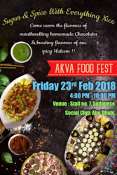
thank you for your response from next time onwards i'll keep that in mindLooks good, my advice would be, dont to use shadows in every text, simple is better and maybe get rid of the egg looking dish with the lemmons.
Cheers!
")
Thank you for pointing me out that, those are sweet sprinklers and i make sure that ill correct themAlso the colored short sticks (don't know what it is) in the bottom right corner are way too bright and distracting and not natural due to the absence of a shadow.
Thank you for your response ill change it right nowLooks good.
How would it look if you moved the Blue and Green text so that it didn't cover any of the dishes?
Looks good, my advice would be, dont to use shadows in every text, simple is better and maybe get rid of the egg looking dish with the lemmons.
Cheers!
Also the colored short sticks (don't know what it is) in the bottom right corner are way too bright and distracting and not natural due to the absence of a shadow.
guys what about the fonts?Looks good.
How would it look if you moved the Blue and Green text so that it didn't cover any of the dishes?


 @IamSam can you please suggest me which background is best suited for this poster.
I think you did a good job.Since this is my first poster so I need some Feedback and suggestions, i am completely newbie for this so really need some reviews for my poster. Any one please, i would really appreciate it. Thank you