DylanDagger
New Member
- Messages
- 3
- Likes
- 0
Hello all,
I was a member of these boards 10 years ago then stopped playing with Photoshop for a while and just getting back into it, I was never great but half decent. I used to be able to look at something and have a fair idea how to replicate that effect.
Generally I would do parody of movie posters etc and would play with the text to change it
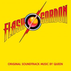
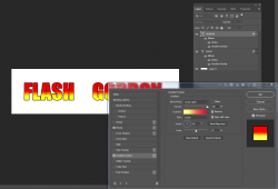
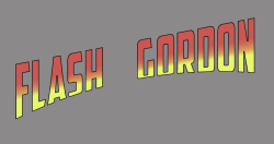
Attached I have the Queen Album cover for Flash Gordon - what i have been able to do is;
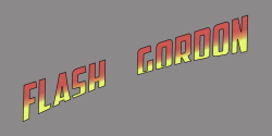
-Download the 'Splash Gordon' Font
-Type out the words
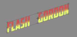
-Use the colour gradient (but when I tilt the text the gradient messes up?)
What I am facing challenges with is;
-The height of the text looks more longer and slimmer than normal - what is the tool or technique for doing this Iv forgottent
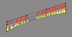
-How to get correct Warp Text button to achieve the curve of Flash Gordon where the letters start large, get smaller then large again, in an upward curve but without the letters tilting. I can do a basic curve but the letters are slanted?
Not sure which option and combo it is Arch, Arc Lower, Arc Bulge, Shell, Flag etc then the combo of Bend, Horizontal and Vertical distortion - the more I play with the options the further away from the original I get haha
Not sure if I am making sense but any help would be greatly appreciated - thank you all again for any contribution or steer me in the right direction with my learning
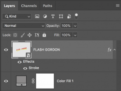
*Also is this effect best achieved by having the words FLASH and GORDON as two seperate layers and manipulate individually, or is it best to do one layer with spacing in between the two words?
Thank You
Dylan
