What's new
Photoshop Gurus Forum

Welcome to Photoshop Gurus forum. Register a free account today to become a member! It's completely free. Once signed in, you'll enjoy an ad-free experience and be able to participate on this site by adding your own topics and posts, as well as connect with other members through your own private inbox!

Specific EPA graphic edit


Erika

Member
Messages
9
Likes
0
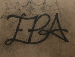
You guys were so awesome with the last one! I have another graphic for same company. It’s just the letters EPA and I think it’s looks pretty good just wondering if anyone would change it or if everyone can tell what letters they are. Just looking for another point of view even though I really like it. Any suggestions or adjustments are appreciated! Thank you 😊

8B8ACD6E-1487-42FF-ABC0-1FE9BA8C1B33.jpeg
 
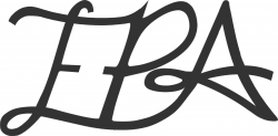
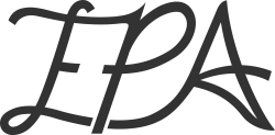
To me, it's a little unclear whether the first letter is E or F. Hypothetically, I could imagine using the same logo if it were FPA. Since you already told us it's EPA, my brain goes there first, but maybe you could try showing this to several people and don't tell them what the letters are. See what they say.

I tried playing around with this to see if I could make the E more obvious, but I came up empty. In fact, by the time I was done the first letter started looking like T, so I actually made the problem worse. Logos aren't really my thing.

Rich
 
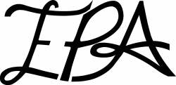
another try ... provided visual separation in some of the letters to make the "P" standout; also removed the circular flourish to the left of the "A" because it made the "P" look like a "B". Just a thought.EPA.png
 

Back
Top