What's new
Photoshop Gurus Forum

Welcome to Photoshop Gurus forum. Register a free account today to become a member! It's completely free. Once signed in, you'll enjoy an ad-free experience and be able to participate on this site by adding your own topics and posts, as well as connect with other members through your own private inbox!

Specific Space Jam Logo Edit #7


Status
Not open for further replies.

Agley143

New Member
Messages
3
Likes
5
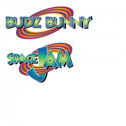
I am looking to recreate the SpaceJam logo for a customer. I have a silhouette and I am usually pretty good at editing or recreating something but this project has me literally pulling my hair out trying to figure out. I would like to add the words "Budz Bunny" into the ring. Is it possible to have one of the letters coming through the ring like the J? Not sure which letter could go through in the wording.

logo.png
 
Last edited:

IamSam

Administrator
Staff member
Administrator
Messages
22,721
Likes
13,258
I am looking to recreate the SpaceJam logo for a customer.
Personally, I'm not to keen on the idea of doing this for you since you have stated this is for one of your customers.

However, I'm totally willing to offer any advice I can in helping you to do this for yourself. In the meantime here are some previous edit requests that might offer you some ideas for letter placement.


Agley143

New Member
Messages
3
Likes
5
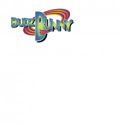
Thank you IAMSAM! If you can offer advice for me to do on my own that would be great and really appreciated. I saw the post you sent to me but they all involved still using the letter J or the word Jam still in the design. I figured out the ring and the font but I am having trouble with the layering of the letters on one another (I have to adjust the shadowing too) And which letter I should put through the loop without it looking funny. I've uploaded what I have done so far. Thank you again!

NewBudz.jpg
 

IamSam

Administrator
Staff member
Administrator
Messages
22,721
Likes
13,258
And which letter I should put through the loop without it looking funny.

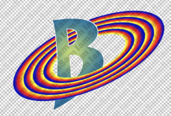
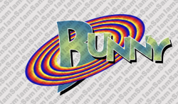
Well, I think the letter B would be the most appropriate and consistent with the logo. Enlarge the B. Convert the type (B only) to a shape. Use the Pen Tool to shape it more like the original logos J and then place it inside the rings. Note how the J is behind the A and the M.

Maybe something like this...
Screen Shot 2020-09-01 at 10.38.15 PM.png
Screen Shot 2020-09-02 at 1.54.54 PM.png

Also note that all the letters in the original logo are separately rotated and at different heights. They're not uniform. The second set of letters (AM) are larger than SPACE. So UNNY needs to be larger type.
 

IamSam

Administrator
Staff member
Administrator
Messages
22,721
Likes
13,258
I just noticed this..............the drop shadow of the letters in the original logo do not appear on the letters they overlap.

Original
Screen Shot 2020-09-02 at 1.58.09 PM.png

Yours
Screen Shot 2020-09-02 at 1.58.04 PM copy.png

You probably used a layer style drop shadow. You need to create a new layer below the letters, make a selection of all the letters, fill with black. Move into position with the Move Tool.
 
Status
Not open for further replies.

Top