- Messages
- 3,357
- Likes
- 3,093
If you want a deeper (waist deep only) understanding of Photoshop RGB Luminosity the info below "may" be helpful.
The following image was created with two simple Layers set to Lighter Blend Mode which is one of the Luminosity based Layer Blend Modes
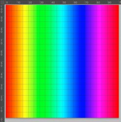
 xxxxxxxxxxxThe bottom Layer is an exact Color Spectrum Gradient from Left to Right.
 xxxxxxxxxx
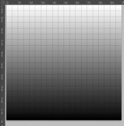
The upper Layer (set to Lighter Blend) is an exact grayscale gradient from bottom to top:
and here is the resulting image:
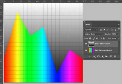
Nice colorful mountain range yet many may be scratching their heads so a little more detail is in order.
RGB Luminosity is a simple equation that combines each of the three color channels into one grayscale value via the following equation and Excel Table"
 The range of color values for this equation and result is from 0 to 1 for each channel which corresponds to the 8 bit values of 0 to 255.
I have also included the resulting Luminosity values (in the left column) for the fully saturated Primary and Secondary colors.
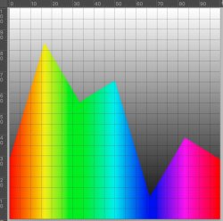
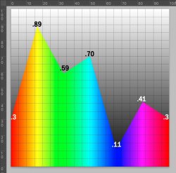
If you look at the Luminosity of the Rainbow gradient by using the Luminosity Blend against any totally grayscale image (no color) as one Layer below, you get the following luminosity with different weighting so yellow area of the gradient is the highest Luminosity at .89 gray value and the blue area of gradient is the lowest Luminosity at .11 gray value
 Each color gets a
What the Lighter Color Blend does is evaluate the RGB luminosity for each pixel of both Layers and picks the higher luminosity pixel.
The Luminosity of the vertical grayscale image is just the grayscale image itself as all channels since R=G=B.
Show the color mountain range image shows that each fully saturated color has:
- a different luminosity
- Above the max luminosity of the color (color dependent), then the Blend chooses the grayscale gradient
- The Luminosity changes linear between the primary and secondary colors
- And the peaks at each of the primary and secondary colors match the values calculated in the Excel Table above (check against the percent scale ruler)
- It gives you a feel which color will win out in the Blend over other colors (the ones with a higher peak):
I hope these little tidbits help in the basic understanding of Photshop RGB Luminosity and some insight into how he Luminosity based Blends work.
Questions are welcome as I know even if it is clear to me, I may have made only as clear as mud to others
John Wheeler
As ad added edit, I have included a zip file with the enclosed PSD file for those who want direct access to play with it or try different blends
The following image was created with two simple Layers set to Lighter Blend Mode which is one of the Luminosity based Layer Blend Modes
 xxxxxxxxxxxThe bottom Layer is an exact Color Spectrum Gradient from Left to Right.
 xxxxxxxxxx
The upper Layer (set to Lighter Blend) is an exact grayscale gradient from bottom to top:

and here is the resulting image:

Nice colorful mountain range yet many may be scratching their heads so a little more detail is in order.
RGB Luminosity is a simple equation that combines each of the three color channels into one grayscale value via the following equation and Excel Table"
 The range of color values for this equation and result is from 0 to 1 for each channel which corresponds to the 8 bit values of 0 to 255.
I have also included the resulting Luminosity values (in the left column) for the fully saturated Primary and Secondary colors.
If you look at the Luminosity of the Rainbow gradient by using the Luminosity Blend against any totally grayscale image (no color) as one Layer below, you get the following luminosity with different weighting so yellow area of the gradient is the highest Luminosity at .89 gray value and the blue area of gradient is the lowest Luminosity at .11 gray value
 Each color gets a
What the Lighter Color Blend does is evaluate the RGB luminosity for each pixel of both Layers and picks the higher luminosity pixel.
The Luminosity of the vertical grayscale image is just the grayscale image itself as all channels since R=G=B.
Show the color mountain range image shows that each fully saturated color has:
- a different luminosity
- Above the max luminosity of the color (color dependent), then the Blend chooses the grayscale gradient
- The Luminosity changes linear between the primary and secondary colors
- And the peaks at each of the primary and secondary colors match the values calculated in the Excel Table above (check against the percent scale ruler)
- It gives you a feel which color will win out in the Blend over other colors (the ones with a higher peak):

I hope these little tidbits help in the basic understanding of Photshop RGB Luminosity and some insight into how he Luminosity based Blends work.
Questions are welcome as I know even if it is clear to me, I may have made only as clear as mud to others

John Wheeler
As ad added edit, I have included a zip file with the enclosed PSD file for those who want direct access to play with it or try different blends
Attachments
Last edited:

