Photoshop Gurus Forum
Welcome to Photoshop Gurus forum. Register a free account today to become a member! It's completely free. Once signed in, you'll enjoy an ad-free experience and be able to participate on this site by adding your own topics and posts, as well as connect with other members through your own private inbox!
You are using an out of date browser. It may not display this or other websites correctly.
You should upgrade or use an alternative browser.
You should upgrade or use an alternative browser.
Xbox
- Thread starter Marcus
- Start date
- Messages
- 24,263
- Likes
- 13,738
Here are some possible suggestions that you may or may not consider. Not trying to tell you how you want it to look, just adding a few tips on making the controller look more "believable".
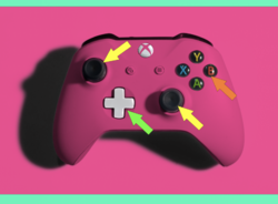
1. Green Arrow - As stated above, adding or preserving the native shadows and shading adds to a more realistic appearance. The white was achieved with a Levels Adj layer.
2. Yellow arrows - In your version, these were not selected and masked. They have a strong "pinkish" tint. Selecting an masking the control sticks preserves the original color.
3. Orange arrow - In your version, the buttons were not selected and masked. They also have a strong "pinkish" tint. Selecting and masking these buttons preserves their native colors.
4. Due to time, I did not take the time to mask our the "white" edges top and bottom as you did. I have no preferences on how it looks, only the white should appear as natural as the other buttons.

okay thanks a lot for your suggestion, will definitly work on itHello and welcome. Nice work and thanks for sharing.
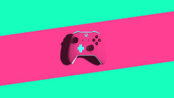
Not much to say other than because you left out the shadows, this control button looks one dimensional compared to the original.
View attachment 128321
View attachment 128322
i was thinking of adding the shadows, but i didnt know in which direction should i put and how far should i keep, thats why i didnt do it. thanks alot for pointing out my mistakes!!!Here are some possible suggestions that you may or may not consider. Not trying to tell you how you want it to look, just adding a few tips on making the controller look more "believable".
1. Green Arrow - As stated above, adding or preserving the native shadows and shading adds to a more realistic appearance. The white was achieved with a Levels Adj layer.
2. Yellow arrows - In your version, these were not selected and masked. They have a strong "pinkish" tint. Selecting an masking the control sticks preserves the original color.
3. Orange arrow - In your version, the buttons were not selected and masked. They also have a strong "pinkish" tint. Selecting and masking these buttons preserves their native colors.
4. Due to time, I did not take the time to mask our the "white" edges top and bottom as you did. I have no preferences on how it looks, only the white should appear as natural as the other buttons.
View attachment 128334
- Messages
- 24,263
- Likes
- 13,738
Hey Marcus, sorry I missed your reply!
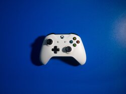
The main difference between our images is that I left the original shadow/button recess, and you didn't. I also made my buttons white and not blue, But that can easily be changed!
Original
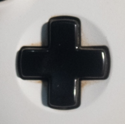
Yours
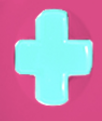
Mine
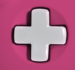
Not exact, but blue.
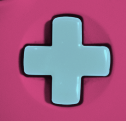
There's really no direction choice to be made, it was just a matter of leaving the shadows/button recess around the button.i was thinking of adding the shadows, but i didnt know in which direction should i put and how far should i keep, thats why i didnt do it.
The main difference between our images is that I left the original shadow/button recess, and you didn't. I also made my buttons white and not blue, But that can easily be changed!
Original

Yours

Mine

Not exact, but blue.

Not mistakes!!! I was just pointing out areas that could be improved! There's nothing wrong with your original work!thanks alot for pointing out my mistakes!!!

