What's new
Photoshop Gurus Forum

Welcome to Photoshop Gurus forum. Register a free account today to become a member! It's completely free. Once signed in, you'll enjoy an ad-free experience and be able to participate on this site by adding your own topics and posts, as well as connect with other members through your own private inbox!

Advice on ps painting techniques?


jovintsm

Member
Messages
6
Likes
2
Hi all,

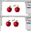
My first digital painting - halfway done.
I need some ps painting advices regarding the leaf
and the texture of the apple itself.

Fill in dark green first? and then do the veins?
or vice versa? i've been playing around with the leaf
for about an hour.. still trying to figure it out. any advice
would be greatly appreciated!
 

Attachments

  • 1234apple.jpg
    1234apple.jpg
    29.8 KB · Views: 27
Hi jovintsm,

I would block in the leaf with the darkest colors first and then work to the lightest colors, highlights last.

Looking great! Remember to post the final product in this thread when your done!
 
I think a great technique with this type of work is to play around with reflections. It lets you add the most subtle details that people may not realize at first glance, but overall make the image more realistic.

For example, you could paint a rough digital painting of a kitchen scene. Then warp this to fit onto the apple, being more visible in the well-lit portion of the fruit. Then you make it such a low opacity it's barely visible, but does help to add variance and depth to the surface.

I hope this helps!
 
This looks great! I know you may not be done yet, but the edges of the apple are a bit hard.
 
One thing bugging me, the leaf - maybe lower it a little so it sits just inside the apples falling in by stem section, at the minute it looks like it's just hanging on the edge, great design though.
 
Hi IamSam & Paul,

Something like this? Used the eraser tool with light opacity to soften to edges.
It does look a tad bit more realistic. About that leaf.. lowered it. but something
still seems to be off. colours used too bright i guess? what'd you think?


apple7.jpg
appleonlyy.jpg
 
Yeah it looks like a mint leaf rather than a apple leaf, maybe shade one side or give a quick burn to the edges or something?
 
Yes, the edges look much better! On the leaf and along with what Paul said, notice in the reference image the top half and the right side of the lower half is a shade darker.
 

Back
Top