What's new
Photoshop Gurus Forum

Welcome to Photoshop Gurus forum. Register a free account today to become a member! It's completely free. Once signed in, you'll enjoy an ad-free experience and be able to participate on this site by adding your own topics and posts, as well as connect with other members through your own private inbox!

My latest typographic work


SSO

Member
Messages
15
Likes
3
I'm new here and I feel that to introduce myself properly I should show you, the forum, some of my most recent work. This will be in the typographic category, since this is almost the only thing I have access to at the moment. I will probably make a new thread with some of my other stuff at a later time, so until then this will have to do ;)

Please tell me what you think, it will be much appreciated!
//SSO

GETYOURGUN1.jpg
 

Attachments

  • 4 on 4.jpg
    4 on 4.jpg
    192.8 KB · Views: 2
  • flyer #3.jpg
    flyer #3.jpg
    602.6 KB · Views: 1
  • firetruck-2.jpg
    firetruck-2.jpg
    126.3 KB · Views: 0
  • webdesign 2012 begge.jpg
    webdesign 2012 begge.jpg
    244.6 KB · Views: 1
Ok,

1, 4, and 5.............for me...........are hard to read! I don't like having to take the time to stop and try to figure out what it says! Their graphics do not relate to the text, even the "Fire Truck" one!

Practice! Practice! Practice!
 
Ok,

1, 4, and 5.............for me...........are hard to read! I don't like having to take the time to stop and try to figure out what it says! Their graphics do not relate to the text, even the "Fire Truck" one!

Practice! Practice! Practice!

Valid point. The first one is for a danish post-punk band, so I thought that the psychedelic design was proper to use, not necessarily making it easy to read for the audience, but on the other hand making a strong impression of the style of music played by the band.
Same thing about the firetruck design, yet in a more modern 'setting'.
Number 5 is a flyer for an event called 'RapSlam Battles', which is a mix of poetry slam and freestyle rap battles. My thought on it was to create something modern and grafitti-ish that could relate to the urban setting of rap battles. It was never used, so I guess I can see your point on that one.

My goal when designing typographic art is to create something that is visually unique, and that challenges the person looking at it because the words may not be spelled out clearly, making it sort of an 'achievement' being able to see what it actually says. I have made other more obvious pieces, but these are made for the purpose of impressing the looker in a sort of 'wow-that-must-have-taken-a-long-time-to-make' kind of way.
I have attached a thumbnail of such a piece, showing the 'opposite' side of the sort of typographic work I have been making through the time. The piece is a couple of years old, yet it is one of my favourite ones. I had it printed in a scale of what I think is A1 (I'm not sure, I have no knowledge of printing, but it's my best guess...) Feel free to tell me what you think of it!

//SSO

 
I have to agree with IamSam. If the viewer has to take too much time to determine what it is he is seeing and reading, the effect is lost.

The alpha-numeric glyphs should be fairly recognizable on first glance. Items 1, 4 and 5 require too much time to study to be effective at all. Take item 5, for example. If the viewer did not know better, the image was supposed to be a fireball, yet the glyphs do not say that. The word truck appears to be misused and the viewer would never relate the word nor look for it in that image.

Edit: The Simon work is fine for the digital realm, but some of the others do not work so well here. If you were to hang the Fire Truck or Get Your Gun images on large canvases in a fine art gallery, viewers would be willing and able to appreciate the abstract nature and the purposeful use of these abstracts by studying the image up close and then from afar. You simply don't get the same effect on a computer screen.
 
Last edited:
I'm liking the RAP SLAM BATTLE and the neg space perspective one..

Others are just to hard to read. Stick at it mate.
 
Thank you for your response!

@Crotale
The firetruck thing was originally meant to be printed on a 24" drumhead, and then I thought it would be an idea to make a design familiar to it which could be printed on a poster or a t-shirt. I follow you on the misuse of 'truck', but I think that as a band name Firetruck is more 'rock 'n' roll' and appropriate than Fireball, considering the genre of music. So originally the flames and drippings are not supposed to be in the piece, and the purpose of it being the same as the 'Get Your Gun' design - being printed on a large drumhead or as a vinyl cover. Don't misunderstand me, I see your point and I will have it in the back of my head for future designs.

Overall I think I will just 'defend' myself/the designs above by saying that almost every piece I make are made for the purpose of being printed in a large scale, meaning that the viewer will not be looking at it on a computer monitor, but in a more physical sense.

Again; thank you for the response and the constructive feedback!
//SSO
 
Since the prosecution brought up the subject of the fire truck, lol, I have one comment to the defense on its readability. I have trouble distinguishing the word truck. Perhaps if it were masked and some of the negative space within the letters were enlarged, I could make out the word better. The "R" looks like an "A;" the "C" looks like I don't know what; and the "K" looks like and "N." Just my take.
 
Keeping the thread alive!
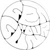
I just remembered a design I made for at collective of dancehall-musicians in Denmark. Their name is Ungmand Sound, meaning something like Youth Sound or Young Man Sound - it's not very 'transelate-able'. Anyway, the main idea was to make a typographic design looking like a vinyl, since the vinyl is a very used media in this music genre. This is the result, please tell me if this is more/less readable and what you think of this one:


Back
Top