What's new
Photoshop Gurus Forum

Welcome to Photoshop Gurus forum. Register a free account today to become a member! It's completely free. Once signed in, you'll enjoy an ad-free experience and be able to participate on this site by adding your own topics and posts, as well as connect with other members through your own private inbox!

Would love some feedback on a musician logo


Ekmeh

Active Member
Messages
33
Likes
1
Hi all,

I make electronic music, mainly experimental stuff, a bit alternative. I'm not much of a graphics designer and unfortunately I don't own AI, but I have a copy of Photoshop and gave it a try anyway.
My artist name is T-MO, I tried to play a bit with those letters and this is what I came up with so far:
T-MO_Logo.png
It doesn't have to be too clear that the letter TMO are in it so that's not an issue but I think it looks a bit like a gender symbol which could be a bit confusing. Anyway, any feedback/tips is highly appreciated!
 

Argos

Guru
Messages
3,455
Likes
5,240
It's hard to give advice on this kind of personal/artistic stuff, I can give you my opinion and what my first impression was...
My first impression was more of an alien symbol than music, after knowing the acronym and looking at the webpage, looks good on it but you can clearly see the T and O but not the M.

Cheers!
 

Ekmeh

Active Member
Messages
33
Likes
1
It's hard to give advice on this kind of personal/artistic stuff, I can give you my opinion and what my first impression was...
My first impression was more of an alien symbol than music, after knowing the acronym and looking at the webpage, looks good on it but you can clearly see the T and O but not the M.

Cheers!

Thanks for the feedback. I think my music is quite alien too ;)

I agree that the M is not really visible anymore. I started with the letters in a thin font and rasterized it (probably a bad idea for a logo?) and started cutting/cropping/moving stuff around. Any ideas how I could make the "M" more apparent?
 

IamSam

Administrator
Staff member
Administrator
Messages
22,721
Likes
13,258
Like David, I can only offer opinions.

This looks more like a symbol to me than it does a logo. I think this looks more like the name TOM with a confusing inverted patriarchal cross. This does not read TMO for me, the letters are out of order. Had I not known there was an M, I would not have understood the symbol until I saw it with a name. I would never associate this symbol with music.

A logo should be easy to read and understand. It should stand alone without guesswork.
 

Ekmeh

Active Member
Messages
33
Likes
1
Like David, I can only offer opinions.

This looks more like a symbol to me than it does a logo. I think this looks more like the name TOM with a confusing inverted patriarchal cross. This does not read TMO for me, the letters are out of order. Had I not known there was an M, I would not have understood the symbol until I saw it with a name. I would never associate this symbol with music.

A logo should be easy to read and understand. It should stand alone without guesswork.

Thanks for the feedback, I agree that it looks more like a symbol in a way. But if I look at other musician logo's it's usually either just their artist name in a cool font or it's like a symbol, some examples: Mod edit: Please upload images directly to the forum.

(Venus Theory) you can't really make up what these logo's actually say either without knowing their names I think. I had a soundcloud link in the OP (which got removed?) where you can also see that the full name is visible aswell. But making the "M" more obvious is something I want to do but not sure how. It's just a concept though so maybe I'll just start over!
 

kaffee

Member
Messages
10
Likes
3
Symbol, logo, icon—these words may be confusing to others but these days, are either interchangeable or allowable in the realm of identity.

I would venture to say that it sometimes is not the tool (AI, Ps, etc.) that matters in logo creation at the start but what you want conveyed or what, ultimately, you want represented by your logo that should drive the creation of its form in the first place.

You may have gotten down pat on what you want or not want, ie. that your name "T-MO" doesn't have to be clearly "seen" and is, therefore, "not an issue" — Nike, for example.
Then again, there is that the logo itself has to (apparently) represent your being an experimental musician. I first saw the form as a bare-bone kind of drum set, to be honest, until you mentioned that it takes on a form that may symbolize gender types.

That said, a logo has to also be successfully conveyed across cultures and societies, beliefs and belief systems and such.

What I think you may need to look into as well, is how this image looks in the smallest rendition (these days, it may be as a 16px x 16px icon) and a large one (HD projected LCD monitor on an arena), with and without background; how will it stand up against other musician's (or other) logos, etc.—there's a long laundry list of Q&A's in logo creation/process one goes through before "getting it right," so to speak: answers to your mission/vision/values, your objectives, intended audience/market and so forth.
Posting it here for feedback is among those, too.

Hope this short reply helps. Cheers :)
 

IamSam

Administrator
Staff member
Administrator
Messages
22,721
Likes
13,258
I agree that it looks more like a symbol in a way. But if I look at other musician logo's it's usually either just their artist name in a cool font or it's like a symbol,
Symbol or logo? Both have been used. I'm not as concerned with what moniker we use as much as I'm concerned about what or how it represents your brand. As long as it's recognized and associated with your music it should be fine. As I stated above, I simply did not see T-MO in your symbol.

you can't really make up what these logo's actually say either without knowing their names I think.
I agree for the most part. This may be dictated more by fame and popularity than anything else. Letters are fine representations as long as they appear in some order. Large to smaller lettering tends to offer some presence of order in which it's to be read. While others are still from left to right.

Who's this? (rhetorical)
brand.gif

And this?
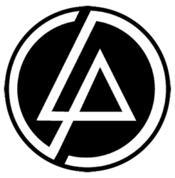
linkin-park-logo-music-band.png

Symbols are fine...............for me they should be somewhat recognizable though. Just my 2 cents.
 

Liberty1976

Well-Known Member
Messages
85
Likes
58
Hi all,

I make electronic music, mainly experimental stuff, a bit alternative. I'm not much of a graphics designer and unfortunately I don't own AI, but I have a copy of Photoshop and gave it a try anyway.
My artist name is T-MO, I tried to play a bit with those letters and this is what I came up with so far:
View attachment 101056
It doesn't have to be too clear that the letter TMO are in it so that's not an issue but I think it looks a bit like a gender symbol which could be a bit confusing. Anyway, any feedback/tips is highly appreciated!


Its very creative but it looks more like a crop circle than a logo.

I would not have guessed that it represents letters without an explanation.

It would be great if it represented something secretive.
 

Top