Photoshop Gurus Forum
Welcome to Photoshop Gurus forum. Register a free account today to become a member! It's completely free. Once signed in, you'll enjoy an ad-free experience and be able to participate on this site by adding your own topics and posts, as well as connect with other members through your own private inbox!
You are using an out of date browser. It may not display this or other websites correctly.
You should upgrade or use an alternative browser.
You should upgrade or use an alternative browser.
- Messages
- 4,270
- Likes
- 6,330
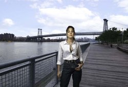
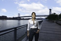
Your composite looks good. Colors, contrast and lighting is ok.
But you posted a resized version of your work.
Therefore it is impossible to give feedback concerning the quality of blending in the person and the sky.
But you posted a resized version of your work.
Therefore it is impossible to give feedback concerning the quality of blending in the person and the sky.
Overall, I like it. She is convincingly in the scene. Can you explain in more detail what you did with the gradient map? I'm not quite following how that enters into it.
By brightening the background and replacing the sky, you made the image look like broad daylight. But we can still see the interior lights of the boat, and the streetlamp on the right still looks lit.
By brightening the background and replacing the sky, you made the image look like broad daylight. But we can still see the interior lights of the boat, and the streetlamp on the right still looks lit.
- Messages
- 3,354
- Likes
- 3,092
Just a couple comments @Possum169
The masking is great and looks realistic
The model has a lighting source that is to the upper left with shadows that shown on the right side as the viewer sees the model. Yet the background has virtually no shadows and those that I can see are extremely soft. The sky is nice in the background yet the scene implies that the foreground would have had to be shielded from the sun. Therefore the lighting on the model does not match the scene in my opinion.
Just my opinion of course.
John Wheeler
Im having issues uploading my files. Ill work it outYour composite looks good. Colors, contrast and lighting is ok.
But you posted a resized version of your work.
Therefore it is impossible to give feedback concerning the quality of blending in the person and the sky.
I created a gradient map to match the colors in the scene to the light on the model. Is there a better way? Thanks for the feedback.Overall, I like it. She is convincingly in the scene. Can you explain in more detail what you did with the gradient map? I'm not quite following how that enters into it.
By brightening the background and replacing the sky, you made the image look like broad daylight. But we can still see the interior lights of the boat, and the streetlamp on the right still looks lit.
- Messages
- 2,693
- Likes
- 3,129
No expert here...and I don't play one on YouTube.
But...there's always a but...there were a few things that struck me when I took a closer look:
1) There's a black fringe around the lady that you can fix in your masking;
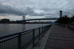
2) The background is too bright for the figure - just doesn't fit in for me. I think with a curves adjustment, bring the background down so it looks more like dusk rather than daylight.
3) There's also something to be said for the bridge going thru her head and I would try to edit that out if you like the overall composition.
Just a few thoughts - a quick interpretation is below.
- Jeff
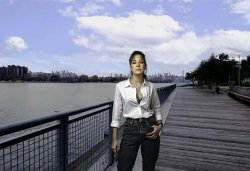

Yes the lighting direction is off. I can use a better matching background or create a uniformed light source. Hows the color grading for the model?Just a couple comments @Possum169
The masking is great and looks realistic
The model has a lighting source that is to the upper left with shadows that shown on the right side as the viewer sees the model. Yet the background has virtually no shadows and those that I can see are extremely soft. The sky is nice in the background yet the scene implies that the foreground would have had to be shielded from the sun. Therefore the lighting on the model does not match the scene in my opinion.
Just my opinion of course.
John Wheeler
Good stuff. The scene was originally dusk so the observations are right. Ill pay closer attention to the detail and look to tweek the model mask. Thanks!No expert here...and I don't play one on YouTube.
But...there's always a but...there were a few things that struck me when I took a closer look:
1) There's a black fringe around the lady that you can fix in your masking;
2) The background is too bright for the figure - just doesn't fit in for me. I think with a curves adjustment, bring the background down so it looks more like dusk rather than daylight.
3) There's also something to be said for the bridge going thru her head and I would try to edit that out if you like the overall composition.
Just a few thoughts - a quick interpretation is below.
- Jeff
View attachment 120556
- Messages
- 3,354
- Likes
- 3,092
Yes the lighting direction is off. I can use a better matching background or create a uniformed light source. Hows the color grading for the model?
The color grading looks great to me.
- Messages
- 2,693
- Likes
- 3,129
Agree with @thebestcpu - color grading looks really great. Maybe that's why I'm seeing such a contrast with the background...Yes the lighting direction is off. I can use a better matching background or create a uniformed light source. Hows the color grading for the model?
- Jeff
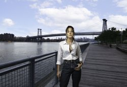
1) There is some work yet to be done with regards to cutting out the model from the background. But, if your focus is more on composition rather than the cut out, ignore this point.
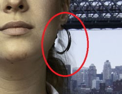
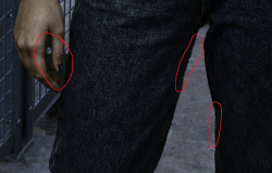
2) I see a Greenish tinge in the face of the model.

That is in contrast with the background, which is more Bluish. This means either the B/G has to change or the tinge on the model's skin. I was unable to check the colours on PS, I am going by plain sight.
Besides them, I have to appreciate the challenge you have undertaken with a bright model and a darkish background to make a terrific composite.


2) I see a Greenish tinge in the face of the model.

That is in contrast with the background, which is more Bluish. This means either the B/G has to change or the tinge on the model's skin. I was unable to check the colours on PS, I am going by plain sight.
Besides them, I have to appreciate the challenge you have undertaken with a bright model and a darkish background to make a terrific composite.
Ray Guselli
Well-Known Member
- Messages
- 66
- Likes
- 116
Very Nice. Thanks for sharing this. Help me see other possibilities.My try...
My idea was to try to match background colour to model; so went for a dusk feel with sunset etc...
Not sure if it works but fun trying.
Best wishes Ray
View attachment 122576
Ray Guselli
Well-Known Member
- Messages
- 66
- Likes
- 116
Thank you Possum 169....Very Nice. Thanks for sharing this. Help me see other possibilities.
Really appreciate the opportunity to try and a difficult task because of the different colours and lighting...
Very best wishes Ray

