What's new
Photoshop Gurus Forum

Welcome to Photoshop Gurus forum. Register a free account today to become a member! It's completely free. Once signed in, you'll enjoy an ad-free experience and be able to participate on this site by adding your own topics and posts, as well as connect with other members through your own private inbox!

CMYK is HORRIBLE! I need a Pantone color.


What the Heck

Well-Known Member
Messages
46
Likes
3
Hello, Everyone. I am beyond frustrated.

I'll just say it. Whoever designed and standardized the CMYK color system should be hunted down, shot, and drawn and quartered. It is just horrific.

I have a logo that is a bright neon/fluorescent green. It is Pantone color 39ff14. (Please see the color swatches below.)

I've been talking to printers for years. Not only does CMYK not have an equivalent;. they can't even come close. I mean, it's laughable.

Which leads to my question. I am attempting to print something close to what I need from a standard HP inkjet, and of course the results are dismal and abject. Short of hiring an expensive Pantone printing house, is there any conversion software or adjustments to trick my CMYK printer into printing a color that gets close to what I need?


It's just absurd how bad CMYK is. How in God's green early did this become an industry standard?

Thank You,
WTH
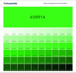
39ff14_color_shades.jpg
 
Last edited:

JeffK

Guru
Messages
2,497
Likes
2,898
A CMYK equivalent is just that - an equivalent to the dedicated PMS/pantone color. Some colors can be broken down to CMYK and match well - some colors don't match at all.
In the printing process, if you wanted a flourescent color, you would print that color as a spot PMS color. From my experience, inks like day-glos and flourescents cannot be reproduced as CMYK tints and that is not a fault of the matching system. It's just not optically possible. Any vendor that says they can even get close, is not being honest with you.

Spot colors, any spot color if you want an exact match, are a bit pricier to print since you need a separate plate to print with. Logos are critical - I always advised clients to print their logos in spot PMS colors if they want a consistent match across ongoing print projects. Especially if they're being printed in different shops.

Don't frustrate yourself further. Print it as a spot color at a print shop. I don't believe there's a way to do it on a typical CMYK inject.

- Jeff
 

What the Heck

Well-Known Member
Messages
46
Likes
3
Good feedback, Jeff. I'm leaning toward a local pro shop doing this.

Question, and please excuse my ignorance. Is it worth exploring any high-end color laser printing to do this in-house? Are there some color laser printers that would come close? I assume the answer is no, but since you're very conversant in this area I thought I'd ask.

Thanks,
WTH
 

JeffK

Guru
Messages
2,497
Likes
2,898
You're still printing in CMYK. So no, I don't think you'll get the flourescent color you're looking for.

I don't know your press run - but if it's a relatively small run, try to find a shop that specializes in short run work. If you're very lucky, you might even find a shop with flourescent ink on hand. If not, they'll custom order it for you. Check also online.

One more tip - more than likely, you'll have to print on a coated sheet. If you choose uncoated, the color may die back.

Good luck with this- art is a struggle...but an honorable one. 🙂

- Jeff
 

thebestcpu

Guru
Messages
2,994
Likes
2,760
Hi @What the Heck
I agree with @JeffK about spot colors and even then not sure what is available yet should be much closer to your needs.

I am assuming when you are referring to you particular color of interest, that when you mention "florescent" that you are not actually referring to a printer ink that will absorb radiation (e.g. ultraviolet) and then emit back out in a particular color. I assume you are talking about the characteristic of highly saturated.

Just to separate out issues, CMYK is just a color mode just as RGB and Lab. In each of those modes one also needs to pick a particular color space as in RGB the most common are sRGB, Adobe RGB, and ProPhoto RGB. CMYK has many different color spaces as well and nothing precludes very saturated colors with the right color space.

In fact note that when you use RGB printers and send RGB information to them, their internal engine converts that information to drive the inks they use which are typcially Cyan, Yellow, Magenta, Black and variations of those inks so basically CMYK inks.

The color gamut that is possible on paper depends on the ink that is used, the paper used, the printers capabilities with the paper and ink and as well the illumination under which you observe the end result.

The #1 issue is that you have choose a color that is out-of-gamut for the vast majority or printers and inks on the market. I will show that visually below.

The image shows a 3D graph of Lab colors which contains and extremely wide range of colors.
Your particular color of hex 39ff14 is an sRGB code that puts it in the very out rims of the sRGB color space as shown by the arrow. The wireframe shown if the volume gamut of sRGB.
The inner solid volume is the gamut of a Canon 1000 printer gamut using Ultra Pro Gloss 2.0 paper which together is quite a large gamut.
Even with that, your desired color is quite a ways out of gamut.

Easiest solution - pick a color that is in gamut for a given printer, ink, paper combination. This does not have to do with RGB vs CMYK. Asking for a specific spot color would be worth trying yet note it still has to be paired with the right paper as well.

Hope this helps some
John Wheeler

Out-of-gamut-color.jpg
 

JeffK

Guru
Messages
2,497
Likes
2,898
Just to add to what @thebestcpu said above - to really get a sense of what the printed (ink on paper) color looks like, get to a Pantone swatch book. These are quite expensive so I wouldn't recommend you buy one unless you were using it on a daily basis. But if you visit with a printer, tell him/her what you're trying to accomplish and they'll show you the books with the PMS spectrum that will have your fluorescent green. This system was built so that any printer could get that particular PMS color using the formula Pantone provides.

The books also show the colors on both an uncoated and coated paper stock - which translates to offset and gloss. The difference in color can be minimal or striking depending on how that ink dries on that particular stock. On uncoated paper, the ink dries by absorption which is why it tends to die back. On coated papers, the ink sits up on the sheet and dries by oxidation. Technical I know but throw that at your printer when you meet him and he'll give you some respect. :)

Instead of trying to understand gamuts and such, go see the actual ink color printed on paper/board in the pantone guide at your printer. Walk into any printer - tell him you have a job you want to print (which you do) but you're having trouble visualizing the color. They'll be glad to help.

Don't try to visualize your color on a screen - and expect that's the exact way your color will show. Think hard copy.

Hope this helps.

- Jeff
 

JeffK

Guru
Messages
2,497
Likes
2,898
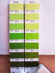
So now that I've got my engine rolling - went into the garage and dug out my old Pantone books.
Just to show you the difference between uncoated and coated sheets, here are the same pms colors side-by-side on different substrates:

pantone swatches 2.jpg

This is NOT for color - this is just to show you how the ink color shifts going from uncoated (U) to coated (C) papers.
If you look at the formula next to the pantone numbers for the same PMS, they're exactly the same. Just the difference in how the color shows on the different stocks.

Just checked on the Pantone site and they also have pastel and neon colors - the neon greens might be what you're looking for.

So just to emphasize the point - look at the colors as they would actually print - the swatch books would be most helpful in accomplishing that.

- Jeff
 

What the Heck

Well-Known Member
Messages
46
Likes
3
Folks, these are all great ideas and suggestions. I have an urgent need for a very small quantity right now, so I'm creating and printing them at home for the time being. I'll have more time to futz with it in about two week.

My wife likes the CMYK green that's being printed off our regular HP inkjet more than I do. It's sort of a forest green, whereas I definitely want something in the lime / fluorescent range.

BTW, I became intrigued by design philosophy and such, and really kind of inspired, reading about what a maniac Steve Jobs was for colors and design in general. Did you know he struggled with choosing from more than 2000 different shades of white for the color of the first Apple computer. I'm' not nearly that bad. If you get a chance, the Walter Isaacson book is a wonderful read. I've read it twice and am about due for a third time through. He gave Isaacson full access and really kind of decided on a warts-and-approach, perhaps especially near the end when he knew his time was short. His family was not happy about some of the revelations, but even in death Steve always got his way.

I've also read a lot of about the German Bauhaus school of design and found it really resonated with me. Something about that German approach to engineering and their philosophy of function vs form is so alluring to me. The Porsche 911, for instance, is my all-time favorite production car in the world. I told my wife that this will be my retirement gift.

Back to Pantone. Sorry for the digression.

Jeff, thanks for digging out and posting those Pantone swatches. Case in point: That forth one down, the Pantone 375U vs 375C is almost exactly what I'm dealing with; in fact the two different shades are not that far afiield of my dilemma. Make a lot of sense. For my application in this one marketing situation, most people in my industry use uncoated card stock, but I'll have to do more research. It appears coated stock would get me closer to the color I want, at least when working in the CYMK realm. Thanks again, Jeff.

ThebestCPU, thank you as well for your erudition and insights into all these color issues. I'm learning a great deal from you folks, which is always fun for me. Thanks for taking the time to post that 3-D color image.

Hey, Guys, a Thought. I'm thinking of order 1000 stickers about one inch in diameter with a transparent background and having our logo printed on those stickers from a Pantone printing house. I think that might also get me part of the way of where I need to be.

Thank You,
Scott
 

JeffK

Guru
Messages
2,497
Likes
2,898
More clearly it's form follows function. I only know that one - and deeply - because of the years I worked in custom packaging and structural design. The partner/creative director of the shop would always repeat that phrase when we were trying to develop a design for a client who really didn't have a clear idea of what they wanted. And even if they did, what that particular design ended up being (form) was dictated by what it was supposed to do (function). My corollary to that was a variation of the simple questions I always asked my clients - what are you building and why are you building it that way.
These are fascinating practical and philosophical questions that I love getting into.

That being said - I have two book recommendations for you:
Shop Class as Soul Craft by Matthew B. Crawford and Zen and the Art of Motorcycle Maintenance by Robert M. Pirsig.

Both are explorations of creativity, intuition, philosophy, and systems of work. I read Pirsig's book in my twenties - I still have it on my nightstand although I won't admit how many years. :cheesygrin:

Best of luck and success in your graphic development - will always be glad to revisit and renew the conversation.

- Jeff
 

What the Heck

Well-Known Member
Messages
46
Likes
3
More clearly it's form follows function. I only know that one - and deeply - because of the years I worked in custom packaging and structural design. The partner/creative director of the shop would always repeat that phrase when we were trying to develop a design for a client who really didn't have a clear idea of what they wanted. And even if they did, what that particular design ended up being (form) was dictated by what it was supposed to do (function). My corollary to that was a variation of the simple questions I always asked my clients - what are you building and why are you building it that way.
These are fascinating practical and philosophical questions that I love getting into.

That being said - I have two book recommendations for you:
Shop Class as Soul Craft by Matthew B. Crawford and Zen and the Art of Motorcycle Maintenance by Robert M. Pirsig.

Both are explorations of creativity, intuition, philosophy, and systems of work. I read Pirsig's book in my twenties - I still have it on my nightstand although I won't admit how many years. :cheesygrin:

Best of luck and success in your graphic development - will always be glad to revisit and renew the conversation.

- Jeff
Yes, thanks for correcting me on that. Form does indeed follow function.

Funny, I teach Freshman Comp, and you get all these high school students who were trained to write the dreaded "five paragraph essay" -- you know, intro, body-body-body, conclusion. It's sometimes very difficult to explain to them that the content inside the box (the function) is more important than the box (the form).

I also read the Pirsig book in my twenties but I confess that it didn't resonate at the time. However, that was a troubled time in my life when I was looking outside myself for answers only I could provide. In writing instruction, check out the famous books WRITING DOWN THE BONES and also WRITING FROM WILD MIND by Natalie Goldberg. She comes from the Zen tradition and incorporates a lot of that into what she calls "writing practice." There's this wonderful piece of advice she gives that is so important. She says (I'm paraphasing), "If you encounter something in your writing that is painful, move TOWARD it, because it has a lot of energy." The Eastern philosophy about moving toward suffering and embracing it rather than turning tail and running has helped me immensely in my life. I'm not a practicioner per se, but it just makes a lot of sense. Another great Buddhist writer is Pema Chodron, esp her famous book WHEN THINGS FALL APART. She comes out of the Tibetan tradition but has a similar saying: "Lean into the sharp points." She talks a lot about welcoming suffering because it is a great opportunity for growth. God, I hate that woman.

See Ya,
WTH
 

Top