storygineer
New Member
- Messages
- 2
- Likes
- 0
I posted an introduction thread here if you wanted a little backstory to why this is the only type of art I have to post right now. Please offer any criticism and advice you have!! Also, if you're feeling very helpful, go to the thread I just linked so you can see where I mention what I'm most eager to learn and do--things on my own, make things without having to steal images from online.
Anyhow, here goes...

1. A pretty basic one. The name the girl wanted was Julia, and the quote she wanted was, "Just keep swimming." All I probably did was alter the color of the image a little, add the text and try to make it pretty, then give it a very simple but pretty border.

2. Also very basic, but I like this one because I was trying to start to do "more" than have just basic signatures for people. I added the lily pads myself and the text along with the water droplets. I knew that the texture option on effects (I think that's what it's called when you double-click a layer) would help make it look dewy and like water. I probably just changed the colors a little and did the same to the pads so they'd look a little more natural and blend in and not look like they were just pasted there.
P.S. the droplets are literally just periods (.) that I pasted the same layer style to and then used CTRL+T (transform tool) to give them a more oblong (natural) shape.

3. I liked this one because of the GIF I made with the text.

4. This was my signature for awhile. I'm a lover of quotes, so I really liked this for myself--a collection of quotes and with a collage of images from some of my favorite movies at the time.

5. I always liked a very simplistic and clean style...but it makes me feel guilty because honestly all I do is type the words. It's not much for me to put the image in the text and add a shadow or outline or whatever I want. I didn't make the text; I didn't make the background; and anyone can type in the text.

6.

7. Awww... when Earth to Echo was my favorite movie!
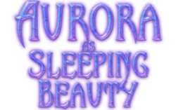
Okay... this is likely my proudest work ever! I didn't make the font, but I edited the text FROM SCRATCH all on my own. That's why I'm so proud of it. I love how I was able to make the text look so magical and crystal-like and have this magical, mystical glow to it... I was very, very proud of the end result. I actually didn't even have a process down, and I think my history was too much experimenting for me to look back to replicate.
8.
The closest I ever got was the image below, and then a failed attempt to replicate it on other text that I seem to have given up on:
9.
10. lol ew compared to the others :X that's why I think I gave up

11. This was supposed to be AHS (American Horror Story) themed. I think my niche was probably pretty text because that was all I could really do well.

12. Okay, so I liked this one a lot! I actually cut Belle out from some other image, probably transparent, but the background? It was too small, but it was too good to give up. I mirrored it twice and tried to just make it seem like it wasn't mirrored by having Belle cover up the obviously duplicated vines of flowers, and then I edited the main stained glass in the middle and gave it an outer glow so it kinda capitalizes on that. This is a gif, by the way, where the second part of the quote fades in and out. There's also a very thin black border. I used to do bevel borders, then inner glow borders with light, but I took a big fancy to a simple 1-stroke border inside because it's so clean-looking.

13. I low-key hate this one because all I did was type in my friend's username, LadyM, and just put an image in the text. Besides that, I added effects and then made it a GIF where it fades in and out. I feel like the real appeals are the font and even the image inside the text. That's what makes me a little sad--that I'm only good or okay at my work when I'm leeching off of something else that is 600% awesome already.

14. This is just another basic signature, similar to the very first I posted. It's like the generic or model signature--username/title, subtext/quote, background, and image. I think I played around with contour to make the text have that colorful effect.

15. The border here is a soft bevel. I don't know if you can see it because it's so fine, but I actually used this technique I learned from a YouTube video! I was bored and wanted something new, and I learned how to use the pen tool to create curves/curved lines and then editing them to look like light trials or just anything pretty and line-like. Part of the tutorial was learning how to make it look like it goes behind an image...which wasn't much of a trick lol, it was just erasing the part in front of the image. I made one set of text an image layer and erased parts of it so the very fine curliness in the letters look like they hook onto the name, not looking like they overlap and that text was just stuck on there.
This is all I'd like to post. This is probably all of my favorites and best work, honestly. Everything else is slightly generic and not as good. Or, well, I have a few more stuff, but this should probably be enough. I'd appreciate any and all feedback, criticism, advice, ratings, blah blah!!
P.S. At the end of all this, I realized I should maybe number the images if it makes it easier to grade or respond to.
Anyhow, here goes...

1. A pretty basic one. The name the girl wanted was Julia, and the quote she wanted was, "Just keep swimming." All I probably did was alter the color of the image a little, add the text and try to make it pretty, then give it a very simple but pretty border.

2. Also very basic, but I like this one because I was trying to start to do "more" than have just basic signatures for people. I added the lily pads myself and the text along with the water droplets. I knew that the texture option on effects (I think that's what it's called when you double-click a layer) would help make it look dewy and like water. I probably just changed the colors a little and did the same to the pads so they'd look a little more natural and blend in and not look like they were just pasted there.
P.S. the droplets are literally just periods (.) that I pasted the same layer style to and then used CTRL+T (transform tool) to give them a more oblong (natural) shape.

3. I liked this one because of the GIF I made with the text.

4. This was my signature for awhile. I'm a lover of quotes, so I really liked this for myself--a collection of quotes and with a collage of images from some of my favorite movies at the time.

5. I always liked a very simplistic and clean style...but it makes me feel guilty because honestly all I do is type the words. It's not much for me to put the image in the text and add a shadow or outline or whatever I want. I didn't make the text; I didn't make the background; and anyone can type in the text.

6.

7. Awww... when Earth to Echo was my favorite movie!
Okay... this is likely my proudest work ever! I didn't make the font, but I edited the text FROM SCRATCH all on my own. That's why I'm so proud of it. I love how I was able to make the text look so magical and crystal-like and have this magical, mystical glow to it... I was very, very proud of the end result. I actually didn't even have a process down, and I think my history was too much experimenting for me to look back to replicate.

8.
The closest I ever got was the image below, and then a failed attempt to replicate it on other text that I seem to have given up on:

9.

10. lol ew compared to the others :X that's why I think I gave up

11. This was supposed to be AHS (American Horror Story) themed. I think my niche was probably pretty text because that was all I could really do well.

12. Okay, so I liked this one a lot! I actually cut Belle out from some other image, probably transparent, but the background? It was too small, but it was too good to give up. I mirrored it twice and tried to just make it seem like it wasn't mirrored by having Belle cover up the obviously duplicated vines of flowers, and then I edited the main stained glass in the middle and gave it an outer glow so it kinda capitalizes on that. This is a gif, by the way, where the second part of the quote fades in and out. There's also a very thin black border. I used to do bevel borders, then inner glow borders with light, but I took a big fancy to a simple 1-stroke border inside because it's so clean-looking.

13. I low-key hate this one because all I did was type in my friend's username, LadyM, and just put an image in the text. Besides that, I added effects and then made it a GIF where it fades in and out. I feel like the real appeals are the font and even the image inside the text. That's what makes me a little sad--that I'm only good or okay at my work when I'm leeching off of something else that is 600% awesome already.

14. This is just another basic signature, similar to the very first I posted. It's like the generic or model signature--username/title, subtext/quote, background, and image. I think I played around with contour to make the text have that colorful effect.

15. The border here is a soft bevel. I don't know if you can see it because it's so fine, but I actually used this technique I learned from a YouTube video! I was bored and wanted something new, and I learned how to use the pen tool to create curves/curved lines and then editing them to look like light trials or just anything pretty and line-like. Part of the tutorial was learning how to make it look like it goes behind an image...which wasn't much of a trick lol, it was just erasing the part in front of the image. I made one set of text an image layer and erased parts of it so the very fine curliness in the letters look like they hook onto the name, not looking like they overlap and that text was just stuck on there.
This is all I'd like to post. This is probably all of my favorites and best work, honestly. Everything else is slightly generic and not as good. Or, well, I have a few more stuff, but this should probably be enough. I'd appreciate any and all feedback, criticism, advice, ratings, blah blah!!
P.S. At the end of all this, I realized I should maybe number the images if it makes it easier to grade or respond to.
