Photoshop Gurus Forum
Welcome to Photoshop Gurus forum. Register a free account today to become a member! It's completely free. Once signed in, you'll enjoy an ad-free experience and be able to participate on this site by adding your own topics and posts, as well as connect with other members through your own private inbox!
You are using an out of date browser. It may not display this or other websites correctly.
You should upgrade or use an alternative browser.
You should upgrade or use an alternative browser.
Specific Adjusting brightness after color correction
- Thread starter persius
- Start date
thebestcpu
Guru
- Messages
- 2,997
- Likes
- 2,766
Hi @persius
Some printing experts are on this forum, yet I will throw in my thoughts.
- You should review with soft proofing as the darks on printing are typically not quite as dark as on your monitor
You mention brightening the image, and depending on how you change the tone, the result will be different. With Photoshop, you can raise the blacks without impacting the high-end whites.
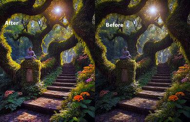
- Also, the surrounding tone of the image has an impact. You should set yours to mid-gray and not all-white for viewing. Here are three comparison screenshots with different screen backgrounds that have not been changed to the actual image. The one with the white background will look darker, and the one with the black background will make the image appear lighter.
These are just some things to keep in mind, and I hope this is helpful
John Wheeler


Hi John
Thank you for taking time to reply. I understand what you are saying and it makes sense. I keep thinking back to three images I worked on which looked great on my screen, but, when I sent it out to be professionally printed, one of them came back very dark with all the details washed out. Now that I think about it I don't know if it was something that I did (or failed to do), or, if it was the printer who messed up that one image.
This image that I included in my post I am pleased with but I feel it should be slightly brighter with a small adjustment to increase the intensity of the colors. I think I keep reminding myself of the print I mentioned above and I'm a little hesitant to send this one out fearing it will look bad as well. I simply want to ensure the print will be as close to what I see on my monitor. My Photoshop skills don't compare with yours but I am trying to make all the necessary adjustments before having it printed and not end up losing money by going back numerous times before getting it just right.
In conclusion (keeping in mind that I welcome your advice). if I increase the brightness and adjust the colors to make them stand out a little more, will that work?
Thank you.
Derek
I have no particular expertise about printing, but I can share an observation. For many years, a friend and I collaborated on an annual music CD. I did all the CD cover artwork in Photoshop and for the first several years I was always disappointed in the printed version. It always looked dull and drab and not as good as on my monitor. Then I realized that setting the color space is a critical step. Once I figured that out, I became much happier with the actual printed CDs.

- For viewing images digitally on a screen, the color space of sRGB is generally the correct setting.
- However, for physical printing, the Adobe RGB 1998 color space is preferred.
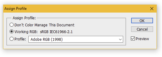
- Open your image and go to Edit>Assign Profile. You will see the pop-up window below, where you should select Adobe RGB 1998 for images intended to be printed.

thebestcpu
Guru
- Messages
- 2,997
- Likes
- 2,766
Hi @persius / DerekHi John
Thank you for taking time to reply. I understand what you are saying and it makes sense. I keep thinking back to three images I worked on which looked great on my screen, but, when I sent it out to be professionally printed, one of them came back very dark with all the details washed out. Now that I think about it I don't know if it was something that I did (or failed to do), or, if it was the printer who messed up that one image.
This image that I included in my post I am pleased with but I feel it should be slightly brighter with a small adjustment to increase the intensity of the colors. I think I keep reminding myself of the print I mentioned above and I'm a little hesitant to send this one out fearing it will look bad as well. I simply want to ensure the print will be as close to what I see on my monitor. My Photoshop skills don't compare with yours but I am trying to make all the necessary adjustments before having it printed and not end up losing money by going back numerous times before getting it just right.
In conclusion (keeping in mind that I welcome your advice). if I increase the brightness and adjust the colors to make them stand out a little more, will that work?
Thank you.
Derek
I don't know your background, so hard to know how best to respond, so I am taking it a bit at a time in my response. If this is too much or too little, feel free to let me know.
I understand your question, and anyone doing post-processing and printing understands the pitfalls of getting it right.
Everyone wants to get what they see on their screen when printing, or WYSIWYG. (What you see is what you get.).
Getting this match requires a Color-Managed Workflow. There are several aspects, yet a basic approach will also help achieve this objective for most images.
That would be to
- have your monitor set to sRGB mode (most modern monitors have this mode). It should be a monitor that supports the sRGB gamut.
- keep your monitor at a relatively low brightness (not cranked up bright)
- edit in sRGB (I believe you are)
- save the image in sRGB (you supplied the image in sRGB)
- print with a company that uses sRGB (most printers accept sRGB as the default)
Usually, setting brightness via a hardware device is most accurate, yet using the approach at this website could help you get close via just software: https://www.makeuseof.com/tag/5-online-tools-calibrate-monitor/
Even with the above, it might take a couple of passes at the printer to tune in what you want. To reduce the cost, you could test prints on smaller print sizes before committing to larger prints.
Going to the next level of WYSIWYG requires a hardware calibration device from companies such as Calibrite or Datacolor to get accurate calibration and profiling of your monitor and then softproofing with the printer profile for the printer in question. These extra steps are usually most important if you print very saturated colors or use broader color scales (spaces) such as Adobe RGB or ProPhoto RGB. I will try the first recommendations and see if that works well for you.
Using such hardware devices, proper calibration/profiling of the monitor, and soft proofing have allowed me to almost always get what I expect from printing.
I know this answer was much longer than the question, but I hope this gives you a start. Other links could also be provided if you are interested in learning more. Rest assured, everyone who goes through this is trying to get the right colors and brightness from monitor to printer.
I hope this helps, yet if this misses the base in being too complicated or leaves you with questions, just comment and ask away.
John Wheeler
Hi. Using CMYK is understood and not the issue for me. Preparing the image for print so that the colors and shadows are correct, that is the issue.For priting is always better to work with CMYK mode, cyan, magenta, yellow, and key (black) because those are the colours a print works.
in Photoshop go to image/mode and change rgb for cmyk
Hi @persius / Derek
I don't know your background, so hard to know how best to respond, so I am taking it a bit at a time in my response. If this is too much or too little, feel free to let me know.
I understand your question, and anyone doing post-processing and printing understands the pitfalls of getting it right.
Everyone wants to get what they see on their screen when printing, or WYSIWYG. (What you see is what you get.).
Getting this match requires a Color-Managed Workflow. There are several aspects, yet a basic approach will also help achieve this objective for most images.
That would be to
- have your monitor set to sRGB mode (most modern monitors have this mode). It should be a monitor that supports the sRGB gamut.
- keep your monitor at a relatively low brightness (not cranked up bright)
- edit in sRGB (I believe you are)
- save the image in sRGB (you supplied the image in sRGB)
- print with a company that uses sRGB (most printers accept sRGB as the default)
Usually, setting brightness via a hardware device is most accurate, yet using the approach at this website could help you get close via just software: https://www.makeuseof.com/tag/5-online-tools-calibrate-monitor/
Even with the above, it might take a couple of passes at the printer to tune in what you want. To reduce the cost, you could test prints on smaller print sizes before committing to larger prints.
Going to the next level of WYSIWYG requires a hardware calibration device from companies such as Calibrite or Datacolor to get accurate calibration and profiling of your monitor and then softproofing with the printer profile for the printer in question. These extra steps are usually most important if you print very saturated colors or use broader color scales (spaces) such as Adobe RGB or ProPhoto RGB. I will try the first recommendations and see if that works well for you.
Using such hardware devices, proper calibration/profiling of the monitor, and soft proofing have allowed me to almost always get what I expect from printing.
I know this answer was much longer than the question, but I hope this gives you a start. Other links could also be provided if you are interested in learning more. Rest assured, everyone who goes through this is trying to get the right colors and brightness from monitor to printer.
I hope this helps, yet if this misses the base in being too complicated or leaves you with questions, just comment and ask away.
John Wheeler
Thanks again for replying. I'll be running through your checklist later and see what happens with the printer. I suppose there is a touch of risk involved at all times but that's just how it is.


