What's new
Photoshop Gurus Forum

Welcome to Photoshop Gurus forum. Register a free account today to become a member! It's completely free. Once signed in, you'll enjoy an ad-free experience and be able to participate on this site by adding your own topics and posts, as well as connect with other members through your own private inbox!

Bevel and Emboss effect?


Leszek

New Member
Messages
4
Likes
0
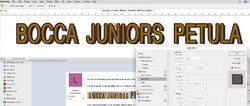
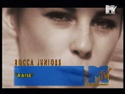
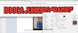
I'm new to Photoshop and recently came across a few old TV graphics, which I would like to try myself on my software.

I've been pretty much spending hours to replicate this with no effect. Please have a look at the images - apologies for bad quality as I said they had been captured from the 80s TV.

Bocca Juniors.pngpetula.jpg

The most problematic is the 'shadow' sitting within U, N and S letters. I used so many combinations and my results are nowhere near to the original ones…

Does anyone have any ideas how to achieve this effect?

Thanks,

Les
 

nurgle

Well-Known Member
Messages
181
Likes
39
Hi, I use type and drop shadows all the time to re-typset old ads.
to try andunderstand you problem, as I see it you are commenting on the dark fill within the letter "U".?

if so, to me it looks like your drop shadow does not move far enough, as most drop shadows are on a 'diofanl' angle. but if you wish to get rid of the deep fillet, simply duplicate the layer, hide the upper layer then Render the lower layer and retouch it out.

or you can

1 add a very small 1 pixel outer glow to the text.that would overlay slightly and stop the 'dark canyon' effect in those letter.

2 set the text to a thicker font, of make a faux Bold text and set the outline to be on the inside of the text.

have tried to simulate below. but I have ofset my shadow downward slightly so the problem with the "U" does not show. there is one other problem;em that does show up and that is the filling in of letters that almost appear to over lap. I will try and may a screen shot of how to fix that.

any letter that has diagonal elements will alway be problematic in the.

below you could try and offset the shadow my moving in downward more. either by fiddling with the onset or sores, or by simply zooming in and physically moving the shadow also, by clicking on it with the Move tool. (The multi arrowheaded thing" at the top of tool menu bar,

regards, Sandy

Screen Shot 2022-06-19 at 22.05.28pm.jpg
 
Last edited:

nurgle

Well-Known Member
Messages
181
Likes
39
I did not space muleteer in my quick attempt to answer above.

there are other ways to space the letter such as kerning individual letter by placing the cursor between letter that over lap and adjusting the space between all the letter letter as below which affect all the text.
Solution 1.jpg

or doing individual letters as below.

if that is not clear I am happy to try and answer more.

regards

Sandy

Solution 2.jpg
 

nurgle

Well-Known Member
Messages
181
Likes
39
of course there is always the source of tube for great photoshop lectures on almost anything and tons go 'bevel & emboss"

regards

Sandy
 

IamSam

Administrator
Staff member
Administrator
Messages
22,721
Likes
13,258
The most problematic is the 'shadow' sitting within U, N and S letters. I used so many combinations and my results are nowhere near to the original ones…
OK.......just so I'm clear, you are trying to recreate the "filled" (what you call shadows) look of the text as shown by the red arrows below????

Bocca Juniors copy.png
 

Leszek

New Member
Messages
4
Likes
0
Thanks for replies!

Sandy I appreciate your help, but I'm looking for something else I think. Your text has outline all around the letters, which I'm not after.

IamSam- yes, more likely. You can see there is some kind of emboss at the top and bottom of each letter, but not around it. And there are also black bits filled in some cases...
 

nurgle

Well-Known Member
Messages
181
Likes
39
is this the embossing.?
embossing does not outline or stroke as in the examples... clear images would help.
for the outline you hav etc one a stroke as well. you can't as yet emboss the stroke.

that would require you to first stroke the image then render the layer then emboss the layer.

and the fillets that fill in the gap in the U are handled by the Drop Shadow... section of the same effect dialog box getting rid of those is in th eagle of the shadows which appear to be almost horizontal, from what I can make out.

or use a thinner version of the font.?

before the 2022 flood, my library of photoshop books contained a massive book, solely dedicated to every iteration of effects on just this one dialog box... several hundred pages...
wish I could remember the name.

Sandy


Screen Shot 2022-06-20 at 03.02.16am.jpgScreen Shot 2022-06-20 at 03.02.32am.jpgScreen Shot 2022-06-20 at 03.03.29am.jpgScreen Shot 2022-06-20 at 03.03.07am.jpg
 
Last edited:

IamSam

Administrator
Staff member
Administrator
Messages
22,721
Likes
13,258
OK.......is this small PNG that you provided as a sample the only example you have?

You can see there is some kind of emboss at the top and bottom of each letter, but not around it. And there are also black bits filled in some cases.
This may be the "Highlight" you are seeing at the top and bottom and not an actual Bevel and Emboss..........it's really hard to tell from such a small sample.
Let me work on a sample to see if it's what you want.

Also, it would be great if you posted some of your attempts...............you never know, it can be revealing!
 

nurgle

Well-Known Member
Messages
181
Likes
39
from what I see above, I don't see any embossing. but I see stroked text. making the stroke too wide or adding an offset horizontal shadow would have A SIMILAR effect.
BUT that depends upon the Font... the font is the key here.

embossing even in PILLOW mode does not put the outline ?Stroke around text as in that example.

you mentioned shadows and that is a different part of the special effect dialog box.

try finding it on FontSquirrel, a web sit for identifying fonts.

as some fonts stroke differently
Screen Shot 2022-06-20 at 04.30.52am.jpgScreen Shot 2022-06-20 at 04.30.04am.jpgScreen Shot 2022-06-20 at 04.33.34am.jpg

.

or render and fill with the paint bucket.
 
Last edited:

nurgle

Well-Known Member
Messages
181
Likes
39
wht you may be seeing in that 'halo' effect internally in the text may may be simply TV haloing.
 

IamSam

Administrator
Staff member
Administrator
Messages
22,721
Likes
13,258
how did you do the filling inside the fonts?
Well, I cheated the effect. I wasn't sure if this was what you are looking for............you did not answer. The actual tricky part was the text with highlights on both top and bottom!

For the fill........

I added two guidelines, then used the Rectangular Marquis Tool to make selection above, below, and center behind the text layer in order to constrain at least one edge of the effect.
I then used the Brush Tool to carefully fill in the font as it appeared in the sample image.

New layer below text layer.
Bottom Selection
Screen Shot 2022-06-21 at 9.24.16 AM.png

Fill with brush
Screen Shot 2022-06-21 at 9.24.25 AM.png

New layer below text layer.
Top Selection
Screen Shot 2022-06-21 at 9.24.48 AM.png

Fill
Screen Shot 2022-06-21 at 9.25.39 AM.png

New layer below text layer.
Middle Selection
Screen Shot 2022-06-21 at 9.26.01 AM.png

Fill
Screen Shot 2022-06-21 at 9.26.11 AM.png

Brush stroke layers with the text layer turned off
Screen Shot 2022-06-21 at 9.37.25 AM.png

There may be an easier way to "cheat" this effect, maybe someone else will have some ideas.
 

Top