What's new
Photoshop Gurus Forum

Welcome to Photoshop Gurus forum. Register a free account today to become a member! It's completely free. Once signed in, you'll enjoy an ad-free experience and be able to participate on this site by adding your own topics and posts, as well as connect with other members through your own private inbox!

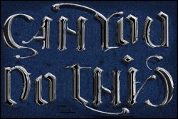
'Can You Do This' Ambigram


ex_teacher

Guru
Messages
569
Likes
1,179
So this is basically a combination of ‘Challenge’ and ‘Show Your Work’…. maybe ‘Show and Tell’.

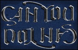
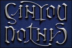
This “Can You Do This’ graphic is an ambigram. Various versions were created in Corel Draw and/or Illustrator and passed to Photoshop for a background and layer style. And there are a lot of versions. Ambigram design dictates the need to be read, right side up or upside down or some other type of symmetry. Done well, it should be legible and look like it was an effortless design by the artist. In this case the viewer can attest to how legible it is but I assure you it is not effortless, at least for me. If you have spare time, you might want to create your own ambigram(s) and if not, here are two variants of what I found to be a very interesting project.

These are strictly speaking pseudo-ambigrams in that the directional lighting causes the two halves to lose symmetry because both are lit from a single light source. Basically I like the look of these chrome/pewter-like bevel and emboss, technicalities be damned.
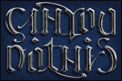
CanYouDoThis_17b_FIN_Chrome2_web.jpg

CanYouDoThis_22h-2_FIN pewter_web.jpg
 

JeffK

Guru
Messages
2,486
Likes
2,890
Very nice work! I do prefer that first one - more of a liquid metallic look. Nice visual flow.
Only thing is I couldn't make out the message - if you didn't tell me what it said I would have just looked at it as a group of metallic strokes.
Of course, once you told me what it says, I can't unsee it! :cheesygrin:
- Jeff
 

polarwoc

Guru
Messages
1,576
Likes
1,421
That is very well conceptualised and executed. Surely that would have taken a few days of hard work to get that result. The first one looks like Mercury - Terminator 2 style.

With the second one, the shadows are too dark to the extent that they do not looks like shadows but black paint.
 

ex_teacher

Guru
Messages
569
Likes
1,179
Very nice work! I do prefer that first one - more of a liquid metallic look. Nice visual flow.
Only thing is I couldn't make out the message - if you didn't tell me what it said I would have just looked at it as a group of metallic strokes.
Of course, once you told me what it says, I can't unsee it! :cheesygrin:
- Jeff
You are very correct. It’s difficult to read until you see it, and then you can’t un-see it. I’ve worked on this for a long, long time. I go back to the last iteration after a while with fresh eyes and come up with the latest brainstorm of how to make it more obviously legible. And then there’s one more unreadable variant. <SIGH>

The Chrome version was an experiment…just because. And its my favorite, not because its more legible, but because I like the graphic flow. And that gave me the idea to ‘cheat’ and try to use directional lighting to change how we view the shapes when rotated 180 degrees. The ‘Pewter’ variant is beveled to accentuate lighting changes. That and some tweaks makes the design more readable, or so I think. Still this fundamental design direction is doomed no matter how legible the letters are. There needs to be visual space between the ‘N’ in ‘CAN’ and the ‘Y’ shape in ‘YOU’, while there needs to be the perception of more visual space between the ‘O’ and the ’T’ shapes when rotated. I’m sure that can be accomplished... just not by me.
 

ex_teacher

Guru
Messages
569
Likes
1,179
That is very well conceptualised and executed. Surely that would have taken a few days of hard work to get that result. The first one looks like Mercury - Terminator 2 style.

With the second one, the shadows are too dark to the extent that they do not looks like shadows but black paint.
I’ve always thought of it as chrome-like but ‘Mercury’ is a much better description and that fluid-like look is why I like that version best. Thanks for the insight.

And while Chrome (nay Mercury) always(?) has black floating shapes, the softer sheen of those metallic shapes in the second one would have shadows not black paint as you put it. One more iteration coming, even though I promised to stop. LOL
 

JeffK

Guru
Messages
2,486
Likes
2,890
Still this fundamental design direction is doomed no matter how legible the letters are. There needs to be visual space between the ‘N’ in ‘CAN’ and the ‘Y’ shape in ‘YOU’, while there needs to be the perception of more visual space between the ‘O’ and the ’T’ shapes when rotated. I’m sure that can be accomplished... just not by me.

I'm not type expert but I think you're only just a few typographical steps away. You're right about the spacing - you need to give the eye/brain a visual chance to separate the words. The glyphs are also a bit confusing - some drawing the eye away from the letter until it loses its meaning.

Just me fooling around quickly just to create a different visual:

CanYouDoThis edited.jpg
 

ex_teacher

Guru
Messages
569
Likes
1,179
Welcome to the perplexing world of Ambigrams.

What you've done is definitely more readable. Getting rid of the drop shadow works very well, I think. However your changes in the letters aren't symmetrical which is the fundamental aspect of an Ambigram. I admittedly cheated on the lighting but kept the 180 degree shape symmetry intact. Below I've taken the liberty of flipping your 'can you' and it kills its ability to read the 'T' and the 'I' in 'do this. Its a slippery slope because a change to one aspect of the design often adversely affects the readability of its symmetrical counterpart.

Getting rid of the drop shadow is slick. Thanks

CanYou.jpg
 

Top