What's new
Photoshop Gurus Forum

Welcome to Photoshop Gurus forum. Register a free account today to become a member! It's completely free. Once signed in, you'll enjoy an ad-free experience and be able to participate on this site by adding your own topics and posts, as well as connect with other members through your own private inbox!

Challenge 15 - Fantasy


Status
Not open for further replies.
i think it is the layer being copied lol that flashes , control alt shift and e works everytime but control alt e works only on some layers anyway good tips

ive been mucking around here for a while and cant remember reading it but i dont read every post i guess either
 
edit: you posted while I was typing.

Merging

  • Merge Layers: Command-E (select two or more layers first)
  • Merge Layers to New Layer: Command-Option-E (select two or more layers first)
  • Merge Visible: Command-Shift-E
  • Merge All Visible to New Layer: Command-Shift-Option-E
 
Last edited:
stocks used
 

Attachments

  • Krummi_1 as Smart Object-1.jpg
    Krummi_1 as Smart Object-1.jpg
    307.1 KB · Views: 54
  • 01109800.jpg
    01109800.jpg
    153.8 KB · Views: 52
  • web blossoms.jpg
    web blossoms.jpg
    244.4 KB · Views: 52
  • 1022pw_1.jpg
    1022pw_1.jpg
    83.4 KB · Views: 47
  • 1369276940195954086.jpg
    1369276940195954086.jpg
    145.6 KB · Views: 47
  • london_workshop_by_emilysoto-d6mry35.jpg
    london_workshop_by_emilysoto-d6mry35.jpg
    166.2 KB · Views: 45
Last edited:
egosbar, really nice one. I like the way you masked the cherry tree. A few imperfections you could work on a bit with that mask, but overall, very impressive! If I were fixing it up, I would just clone a few blossoms at the end of some of the branches that start to go over the girl.
 
done , should of picked that up myself , got too train the eye more lol , anything else that you see that im missing , looking closer at the light source the cross should have shadow on the right edge would you agree?

ive put the shadows in and left it up for comparison , its the little things that make the difference for sure , now im looking closer the watch also has a touch of light on the wrong edge
 
Last edited:
egosbar;1533657491 looking closer at the light source the cross should have shadow on the right edge would you agree? [/QUOTE said:
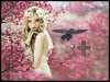
I am not sure which of these your refer to? The first one is the latest? If so, then I agree, your shadows are OK since the light is from above and left for the most part. The model kinda breaks the rules, but hey, it's a fantasy.

I wish it were higher resolution. I think that is the part of the problem with cloning and so on. Did you make it at a higher res?

I still think that the "blossoms meet model" area could use work, but that is just me. I made an image of the piece. In the circle area I cloned the grey on her arm. In the small square I replaced some of the darkness of the branch. I assume you used a mask so that would be easy. Then in the larger rectangle area, I cloned more blossoms - I thought the branch ends looked funky disappearing into her as they did. I chose blossoms for sharpness as her arm is not blurred out. Anyway ... just food for thought.

Like I said and everyone else, it's really nice.

blossom.png
 
wow a lot of these are really good. is there a website that youre all getting these great stocks from? or just google images?
 
thanks clare , ill look at these points , yes the top image is the one i think the cross has the right shadows , the bottom one was the first i posted

a question about resolution , i have i think 300dpi set , what should i be doing the original in if i want too print a 20 inch? and will they display on the web properly ?
 
Last edited:
ok nothing special here but i wanted to at least contribute. keep in mind im still a newbie.
 

Attachments

  • fantasycastle.png
    fantasycastle.png
    11.3 MB · Views: 5
what are some mastering effects i could use to sharpen that all up? cause "sharpen" doesnt really do it for me. and what im looking for is that final effect that makes eveything stand up more clearly and make it look like an actual fantasy picture.
 
i think it needs softening too look more like a fantasy , good effort though you have the base of a good image , you can try the blend modes , id make a new layer copy and concentrate on getting a part of the image the way you want it then put it under the top layer you already have , add a layer mask and paint with black that area too reveal it , this way you can adjust certain areas , imo there is too much contrast going on and the image looks too sharp , the light on the girls face is too harsh for that light i think , try adding some smoke or fog etc might be another idea , if your not happy keep asking questions here and we can all try too help you master a new technique

one of the most useful techniques i learned was layer masking ,for example if you just want the eyes of someone sharp you can sharpen the whole image disregard whats happening to everything but the eyes then put that layer copy under your your previous top layer and just paint back in the sharp eyes leaving the rest unchanged.
 
Last edited:
what are some mastering effects i could use to sharpen that all up? cause "sharpen" doesnt really do it for me. and what im looking for is that final effect that makes eveything stand up more clearly and make it look like an actual fantasy picture.

Your creation is very good chrisjames...I really like it, except the sun looks a bit strange to me.
Because of the lightsource coming from the sky, I would think the girl should be a bit darker. That would improve the fantasy atmosphere considerably.

Your "sharpness problem" can be solved partly if you reduce your original image to 1200 pixel, then sharpen it before posting it .
 
thanks guys. chris, when you said reduce to 1200 pixel how would i do that? and what am i actually reducing the width length? im not sure here
 
Status
Not open for further replies.

Back
Top