What's new
Photoshop Gurus Forum

Welcome to Photoshop Gurus forum. Register a free account today to become a member! It's completely free. Once signed in, you'll enjoy an ad-free experience and be able to participate on this site by adding your own topics and posts, as well as connect with other members through your own private inbox!

Could someone point me in right direction please


kkklmpk1066

Member
Messages
20
Likes
5
Hey..

So am back after a break down.. hoping Photoshop can help me heal! Busy mind n Al that...

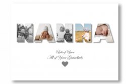
Anyway had an amazing support from friends so I want to make them thank u gifts.. I saw a pictures of the word family with pictures of family members inside it?

I was wondering if there's a tutorial for this I did try searching but am not seeing what I think I need? Sorry if I've missed it

Thanks for reading

Kirsty x
 

Rich54

Guru
Messages
1,732
Likes
3,412
I think a Clipping Mask is what you're looking for. (You can also search YouTube for "place image within text".)

Here's a tutorial. The first part is a discussion of the best kinds of text to use. The part about the clipping mask starts at approximately the 5:00 mark.


kkklmpk1066

Member
Messages
20
Likes
5
Or could I make a A4 picture collage of the photos and save it and use that as the background for the word? Does that make sense xx
 

Rich54

Guru
Messages
1,732
Likes
3,412
A clipping mask is usually one image clipped to another image, so it would be best if you first made a collage of all your people and then save that as one Photoshop layer to be clipped to a text layer.
But if you really need to have all the people in separate layers, there are ways of making that happen.
 

Rich54

Guru
Messages
1,732
Likes
3,412
sorry for being a pain xx

Ask all the questions you want. That's what this forum is for.

For the example you posted, I think the easiest way to do it is one letter at a time:
  • If you want to use the word FAMILY, then first make the letter F in its own layer. Choose the font size and any other special effects you want for the text (drop shadow, etc.).
  • Now copy the text layer to a new layer and change it to the letter A. The font size, drop shadow, etc. will all be consistent because you copied from the original F. Use the Move tool to manually space the A to the right of the letter F. That's the downside of this method: you will need to space your letters by eye rather than using the features in the Text tool.
  • Keep copying the text, one letter at a time, until you've spelled the word FAMILY.
  • You will now follow the tutorial to create six separate clipping masks. Grab your image #1, place it above the layer for letter F, and clip it to the letter F. Repeat this process for the remaining five letters.
If you're confused, I can make a quick mock-up and attach a Photoshop file here so that you can see how it works.

Rich
 

IamSam

Administrator
Staff member
Administrator
Messages
22,721
Likes
13,258
While waiting for Rich's mock-up, here's a quick demo of one simple technique I threw together. There are other ways to do this as well.

I did not block out the lettering, that would be another demo if needed.
Example: The hole of the A is blocked out. This depends on the font you choose or manually blocking out the letters.
Screen Shot 2020-10-31 at 8.21.26 AM.png

Screen Shot 2020-10-31 at 8.23.15 AM.png
Screen Shot 2020-10-31 at 8.22.34 AM.png
 

Rich54

Guru
Messages
1,732
Likes
3,412
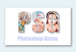
Yes, IamSam's example is exactly what I did here. I used the word FAMILY and filled each letter with a person. (I don't know about your family, but my family is comprised entirely of supermodels and Hollywood actresses.) The Photoshop file is attached below.

Family.jpg
 

Attachments

  • Family.psd
    5 MB · Views: 3

Rich54

Guru
Messages
1,732
Likes
3,412
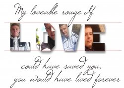
Love works better than Family because LOVE has a lot of wide letters that give you more room inside. When you say that it's not right, can you be more specific about what you don't like?

I see a few "errors" in your text.
  • If you look below, I drew two red guidelines on your project. This seems to show that the letters are all different heights and are not aligned with each other. Once you decide on the font size, I think it's better if you make them all the same, and then you can use the alignment controls to get them all exactly level with each other.
  • Also, your drop shadows all seem a little different. Some of them have feathered edges and some have hard edges, and the drop shadow on the E extends lower down than the others.
Can you tell me how you made the drop shadows? Did you use a "layer style", or did you make them by hand?

untitled.jpg
 

polarwoc

Guru
Messages
1,576
Likes
1,421
I appreciate your effort, it is terrific for a first attempt while trying to get used to PS interface.

...went for love but its just not right... can u see where i went wrong?
First thing I noticed was the different Drop Shadow settings on each letter. The O came out well, and the same settings used for O could be simply copied onto other letters.
Nextly, there is no outline as mentioned in the video - but, this is totally a personal choice if it was deliberately ignored. Since some of the images inside letters are lighter almost similar to the background, an outline would provide a good contrast, assisting in easy reading.

Persevere on the project while taking inputs and you will improve.
 

IamSam

Administrator
Staff member
Administrator
Messages
22,721
Likes
13,258
First thing I noticed was the different Drop Shadow settings on each letter.
I noticed this along with you and Rich as well. I don't think there are different settings. I think something else is going on here which is why I asked about the PSD file. The drop shadow has been either cropped or masked. The O has a normal drop shadow. If you look at the V, it has normal sides and a cropped bottom. The E has a slightly cropped side and a sharply cropped bottom. The L has both the side and the bottom more sharply cropped.
 

polarwoc

Guru
Messages
1,576
Likes
1,421
I totally agree that by seeing the PSD file of the OP, we would be able to understand exactly what the OP did and then direct her accordingly.
 

kkklmpk1066

Member
Messages
20
Likes
5
I noticed this along with you and Rich as well. I don't think there are different settings. I think something else is going on here which is why I asked about the PSD file. The drop shadow has been either cropped or masked. The O has a normal drop shadow. If you look at the V, it has normal sides and a cropped bottom. The E has a slightly cropped side and a sharply cropped bottom. The L has both the side and the bottom more sharply cropped.
Yeah I couldn't get it all to work on one page so I made the letters seperate and then cut them out n pasted them in A4 page... Am gonna try again once I've done my mammy duties lol
 

Top