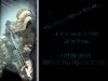
Just my quick take. The first thing I notice is the harsh vertical line, ok, not quite vertical. Now it probably is meant as a wall, but it is distracting. I think if you played with the glow round your soldier, both behind and to the front right side of him, you'd get more depth. Right now that glow is so tight it looks cartoonish. If it's an outward glow play with the settings to soften and increase it.
Maybe even add some subtle color behind him. The edge where he is leaning could also be drawn forward, or given some depth and perspective, made more visible, so that it is easier to see right away that it is a corner, apparantly on a structure. How about some effects on the right side of the black text area. You could layer some kind of wall texture above it on the right side of the layer and bleed it slowly into the text.
If you're interested and have questions as to what I meant, please ask. Gotta go walk the dog and some other stuff for a couple hours, then I'll be back in my work space (physical and mental)
OK, just came back and now I'm focused on the text. There's something off about the way it comes so close to the edge of the black, especially the diagonal text and the bottom row. I also think a bolder, thicker font - you can even increase the size of this one with layer effects - would be more effective, leaving the hazy font like you have it on the diagonal, bolder in the middle, then more so on the bottom, going from ghostly to more corporal. You might also consider punched out type if you do use a texture or color on the black area. So, no more input till you have your comments.


 but i'll remember that for next time.
 )
)