What's new
Photoshop Gurus Forum

Welcome to Photoshop Gurus forum. Register a free account today to become a member! It's completely free. Once signed in, you'll enjoy an ad-free experience and be able to participate on this site by adding your own topics and posts, as well as connect with other members through your own private inbox!

Creating a Colour HUD


Alexandria

Well-Known Member
Messages
93
Likes
8
I am creating a colour HUD and would like to use all the colours in the sample, but when I put them on the desired buttons (round), especially the light colours are not accurate. There are 2 highlights on every button. I didn't create those buttons but I don't know how to keep the form of the button with the colours of the sample (Square). IO attached the .psd. Help appreciated :)

Colour HUD copy.png
 

Attachments

  • Colour HUD.psd
    727 KB · Views: 3
I believe the color inaccuracy results from the first highlight layer, the one with a gradient overlay layer style set to Linear Dodge (Add). If you open the Layer Styles window of that highlight layer and change the blend mode to Luminosity, I think you'll have better results.

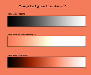
Here is a comparison of Linear Dodge (Add) vs. Luminosity:
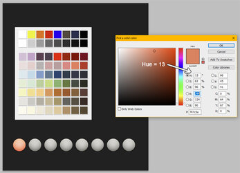
If you open the color picker for your orange button's base color, it has a Hue setting of 13 (see white arrow). The Hue is the color "family" of that particular orange, which is what you want to preserve.

Hue Variations2.jpg


The image below has a background with this same orange color (Hue = 13). Below that, I have three black-to-white gradients set to three different blend modes.
  • Open the Color Picker. While it is open, use the eyedropper tool to sample various points in these last two gradients. Observe the value for Hue as you do so.
  • When you sample colors across the gradient set to Linear Dodge (Add), you will see that the Hue value moves all over the place. Huge variation in Hue across the middle of that gradient.
  • However, when you sample colors in the gradient set to Luminosity, the Hue stays very constant across the range of the gradient. There are slight fluctuations but all very close to the desired value of 13.

Hue Variations.jpg
 
Hi @Alexandria
I will assume that all you want is the pure desired color in the button and nothing else. I will show the step by step on how to achieve that:

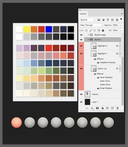
First each button is a group that when expanded consist of three Layers. I have expanded the Layer for the first button on the left.

Screenshot 2023-10-25 at 2.28.06 PM.jpg

Each of the steps below is removing all the adjustments and leaving just the pure color of the button.

First, turn off the visibility of the top two of the three Layers in the first button group as shown:

Screenshot 2023-10-25 at 2.28.56 PM.jpg


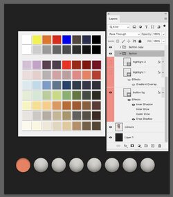
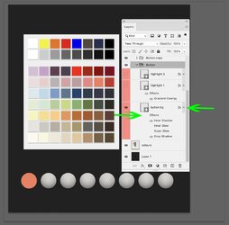
In this next image, if you do not see the Layer Effects expanded below the Layer thumbnail, click on the dropdown arrow indicated by the right green arrow in the image below.
Once the Layer Effects is expanded, click on the viisility "eye" icon for the Effects with location shown by the left green arrow.
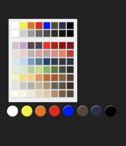
At this point you should have no added effects on the button and just the pure color.

Screenshot 2023-10-25 at 2.34.16 PM.jpg

If this is what you want, the above steps should do it for you.
If not clear, just ask away
John Wheeler
 
Thank you John, that is what I want but I also want to preserve the "round" look, like a sphere or "something" around the edge, not making it look so flat. With the darker colours, it is not a problem but with the lighter ones, it is "terrible :)
 
I believe the color inaccuracy results from the first highlight layer, the one with a gradient overlay layer style set to Linear Dodge (Add). If you open the Layer Styles window of that highlight layer and change the blend mode to Luminosity, I think you'll have better results.

Here is a comparison of Linear Dodge (Add) vs. Luminosity:
If you open the color picker for your orange button's base color, it has a Hue setting of 13 (see white arrow). The Hue is the color "family" of that particular orange, which is what you want to preserve.

View attachment 140550


The image below has a background with this same orange color (Hue = 13). Below that, I have three black-to-white gradients set to three different blend modes.
  • Open the Color Picker. While it is open, use the eyedropper tool to sample various points in these last two gradients. Observe the value for Hue as you do so.
  • When you sample colors across the gradient set to Linear Dodge (Add), you will see that the Hue value moves all over the place. Huge variation in Hue across the middle of that gradient.
  • However, when you sample colors in the gradient set to Luminosity, the Hue stays very constant across the range of the gradient. There are slight fluctuations but all very close to the desired value of 13.

View attachment 140551
I will try and work with the blending options and still see if I can keep the sphere-shaped button, ty :)
 
I will try and work with the blending options and still see if I can keep the sphere-shaped button, ty :)

If you want to keep the spherical 3D effect, then there needs to be dark and light shading that necessarily affects the "flat" base color. But if you follow my suggestion, everything will remain in the same Hue family and the colors will look more correct vs. the color swatches.

In that same gradient overlay layer style, the layer style itself has an opacity setting. Once you change it to Luminousity, you can also experiment with the opacity setting to get slightly altered 3D spherical effects.
 
Thank you John, that is what I want but I also want to preserve the "round" look, like a sphere or "something" around the edge, not making it look so flat. With the darker colours, it is not a problem but with the lighter ones, it is "terrible :)
Hi @Alexandria
A couple questions and then some info.

Is this a template that you have purchased online?
The present template does not do a good job with the lighter colors for the buttons.

To fix that depends on what you actually want.
No matter what template colors you pick with this template, the Layer Sytles and other Layers may keep the Hue (not sure of that) yet I know it does not preserve the saturation and luminosity of a solid flat color.

So before thinking about fixes/options, it would be important to know how closely the button color needs to represent the fixed color you wanted for that button.

If you really want to have some color accuracy in the buttons, do you want if accurate at the top of the button, or at its periphery. With that info, the template would need to be re-engineered.
Note that if you made a purchase of a template, you could contact the author and explain the issue with the template and they may already have an answer.

If you would rathe just have some semblance of 3D yet if it would not have to be spherical then there are options such as a raised flat circular buttons with edges on the side.

Just trying to understand you needs so forum member can better tarte recommendations to your needs.
John Wheeler
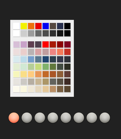
It was a free .psd template for social media icons
I would like the button to be as close as possible to that one, the colours can vary a little, but should be somewhat accurate. I feel the squares a just a bit boring.
Do you have a link to something like you suggested:

such as a raised flat circular buttons with edges on the side.
 
I believe the color inaccuracy results from the first highlight layer, the one with a gradient overlay layer style set to Linear Dodge (Add). If you open the Layer Styles window of that highlight layer and change the blend mode to Luminosity, I think you'll have better results.

Here is a comparison of Linear Dodge (Add) vs. Luminosity:
If you open the color picker for your orange button's base color, it has a Hue setting of 13 (see white arrow). The Hue is the color "family" of that particular orange, which is what you want to preserve.

View attachment 140550


The image below has a background with this same orange color (Hue = 13). Below that, I have three black-to-white gradients set to three different blend modes.
  • Open the Color Picker. While it is open, use the eyedropper tool to sample various points in these last two gradients. Observe the value for Hue as you do so.
  • When you sample colors across the gradient set to Linear Dodge (Add), you will see that the Hue value moves all over the place. Huge variation in Hue across the middle of that gradient.
  • However, when you sample colors in the gradient set to Luminosity, the Hue stays very constant across the range of the gradient. There are slight fluctuations but all very close to the desired value of 13.

View attachment 140551
I did as you suggested, unfortunately, the "colour" has a vast difference and that will lead to too many problems
Untitled-1 copy.png
 
Last edited:
The spherical appearance of the "Button" is created using shading............................this shading will always darken any color added to it.

A better option would be buttons without overall shading.
Screen Shot 2023-10-26 at 2.22.13 PM.png

You will have an exact color match between the two.
Screen Shot 2023-10-26 at 2.27.29 PM.png
 
Hi @Alexandria
@IamSam suggestion is the same as mine.
I am giving you a step by step of the approach I took (modified the PSD you sent and attached it back below). So you can use the PSD directly and the explanation should allow you to do any additional modifications as you need.

I put sample color to each of the buttons so you can see how lighter and darker buttons would look>
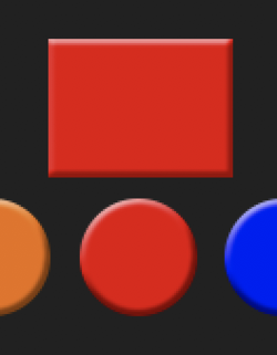
Here is the first image showing the buttons up close:

Screenshot 2023-10-26 at 3.24.57 PM.jpg

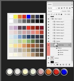
Here is a picture of the entire image including the Layer stack with the first button Layer effects expanded:

Screenshot 2023-10-26 at 3.53.52 PM.jpg

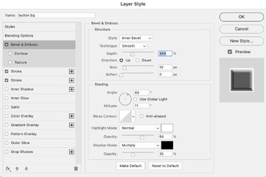
Here are the details of the settings for the Bevel and Emboss Layer Style

Screenshot 2023-10-26 at 3.54.13 PM.jpg

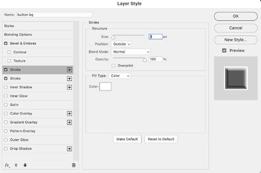
Here is the image of the first Stroke Layer Style:

Screenshot 2023-10-26 at 3.54.24 PM.jpg

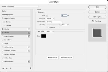
And this last image is the details of the second Stroke Layer Style:

Screenshot 2023-10-26 at 3.54.33 PM.jpg

And attached is the PSD file below. I used the same Layer Style set on all the buttons:
.
I did a test of the color with and without the Layer Styles in the middle of the button and it was the same so should be a spot on representation of the color swatch you used to set the color for the button

Hope this helps you on your project
John Wheeler
 

Attachments

  • Colour HUD.psd
    856 KB · Views: 1

Back
Top