What's new
Photoshop Gurus Forum

Welcome to Photoshop Gurus forum. Register a free account today to become a member! It's completely free. Once signed in, you'll enjoy an ad-free experience and be able to participate on this site by adding your own topics and posts, as well as connect with other members through your own private inbox!

Critic becomes Criticized!


Pepperbel

Well-Known Member
Messages
117
Likes
49
I realize I've been giving a lot of critic and not cashing in, so I'm gonna give myself a taste of my own medicine and upload something I have a personal issue with....and need help to correct.

So, criticism....let her rip!


OOOOkkkkk so basically the idea was as follows:

Use this:
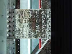
60899041db49196dc1a31764753840e430b65b1a10505.jpg

..and make something out of it......now I started with this:
roboteh.jpg


which is all made out of the source image, and was the main part of the edit (took longer than the lifespan of a beetle I'd say). However, it didn't fit right, so I advanced onto this:
biohazardu.jpg


of which only the outdoorsy bit is not made by me....so, something's wrong, I've got editor's eye cancer, so I can't find it...help?
 
Oh thats different, and goos also.
Yeah your after critique, the second image looks all stuck on - no real blend to it - still a good composition though.

The first one as my attention really, how did you achieve that shape from the original image please?
 
yea see that's what I mean....the whole console....it looks out of place, but based on the angle and where the light is coming from I can't really drop a shadow nowhere. huston? Problem?

as for the mask....lot's of fiddling (not the pervy kind), and puppet warp & free transform functions mainly, blending, shading, screaming & ripping my hair out.
 
Hi Pepperbel. You've been so kind to give me critique, I'll return the favor... if I can. :mrgreen:

I love what you've done with the "mask" created from your first image and the textures and grungy color. I think Paul is partially right about things being stuck on. The only part that strikes me this way is the foreground piece. It's uncertain if there is dimensionality; is it a wall, a tabletop? Maybe it could use some shadowing, some edges... That's one problem with critique. I don't like to give it if I can't at least put my finger on it and have a suggestion (like your editor's eye cancer). Then the blue behind the door doesn't seem right (I'm pretty sure the color came from the original img). I think it just needs to blend more gradually into the very cool floor surface you created. You have a real talent for combining texture and color, for making statements, and for infusing humor into your work. You go girl!
 
well initially I wanted it to be a stand, but somehow it's turned into a floating piece of cement :lol:

the problem I'm having is i've kind of locked myself into a "spotlight" center, where the stand is kind of being hit from all sides with light, making it difficult for me to throw a shadow anywhere. Although I never thought of eliminating one of the lights, will do that first thing in the morning, well maybe not tomorrow as its christmas, but after.

As for the blue light behind the door, I made it a little more blue because I wanted there to be contrast between outside light and inside light, however I see what you mean, and will change that, cuz it does look a bit like a kid with 2 color pencils.

So great thanks to you both, I shall try out your brilliant advices and you'll either see the result soon, or I'll be in an asylum, crying. :thumbsup:
 
Hello,

This is really good work, I love the atmosphere and detail in much of your image.

I say crack the floors, age and dirty them...and add junk scraps/left overs from survivors over time...maybe even a scrawled message or 2 on the walls (one on right is plain).

Maybe put the pin panel on the wall to right of bio hazard doors?

Great stuff!

-Stefano
 
I like the wall & pipes on the right, but taking a second look at that panel, I think it might benefit from a blur because it stands out too much. I like your idea Stefano of junk tossed around, just as an idea. I like the current floor and it's mix of gloss and texture so IDK if cracks, etc., would do it. It would be interesting to see it treated both ways, but as it is I don't think it's really out of place. Critique the critique. We could start a new game!
 
roooooiiiight, I need a break from my other project anyway cuz its got mi nickers in a bunch, so I'll give all these tips a shot now, thanks guys....show you result when I have em, if I ever do :p
 
ok sooo, I tried to follow all instructions. Ditched the stand though because it refused to obey me, so I killed it off. Made 2 versions, one more grungy, the other more shiny.

Now I know the cracks ain't perfect, I lost my patience a bit, will work more at it later, bear with me.

More importantly, is the bloody console finally part of the image??? :D
Thanks for the advice, I think it looks slightly better already

Version 1 (shiny):
redobiohazard.jpg


Version 2 (Crackers):
biohazard2.jpg
 
I like the elements of the second one but without the cracked floor. It makes it more dark and the metallic floor adds contrast. Still not sure I care for the floor even though I like it better than the grunge. But just IMHO, I would blend the brownish color in both directions and make a more smooth transition. Then I would give the anthropomorphic hanging skull guy (which I really like) a shadow on the floor so he doesn't look disconnected. The wall on the right got a lot darker. Intentional?

KIU
ha ha ha
 
In case I didn't say so, I admire the way you use the elements, chop them up, move them around. They look totally different. BTW, looking at the second img again, I do like the textured floor - probly like the other better - but it would work for me if the overall image wasn't so dark.

Toodles (in the 50s mode... chop shop challenge)

PS: Pepperbel, can I change your thread title to: Critic becomes Critiqued?!
We're not criticizing in a negative way anyway :devilish:
 
Last edited:
Yea I personally prefer it without the cracks. Makes it looks a bit more futuristic. So I shall once again try to make the orange on the floor blend in more, I think I finally know how, just stared at it for a while like a dork. :shocked:

Yea I did have a shadow for Skully, but it seems my photoshop has now decided that IT is in charge, I shall go and scold.

Dark wall WAS intentional, but I'm debating the whole darkness factor, gonna beam up the floor and see if the contrast is better with a dark or light wall.

Ps. Of course you can change the name of the thread, I'm crépe at named anyway.

Thanks for the help again.
 
Is the control panel supposed to be hovering or is it on a pipe from above, can't really make it out?
 
Nah...it should be hanging off the pipe....will work on that tomorrow as well.

Perception in art will be the death of me.
 
Because of the actual location of the hand set, it still looks like it is floating, maybe move it away from the doors edge back ground?
This is better than before though.
 
do you mean floating as in "floating"? or does it still not look like it's attached to the pipes. Because it is supposed to be suspended in air.
 
I mean floating as in 'in the air'.
If i was new to this thread i would have to look twice to realise it is supposed to be attatched to the pipe behind it, it just still looks like part of the background.
 

Back
Top