What's new
Photoshop Gurus Forum

Welcome to Photoshop Gurus forum. Register a free account today to become a member! It's completely free. Once signed in, you'll enjoy an ad-free experience and be able to participate on this site by adding your own topics and posts, as well as connect with other members through your own private inbox!

Extreme changes in color between pc and my samsung galaxy


Tepazi

Active Member
Messages
30
Likes
3
Hi, I'm a beginner on PS and I just started experimenting with logos,
I've made a simple one with a light orange background, and I've sent it by Gmail to my smartphone to see how it looks,
I have no idea why, but there are HUGE color differences in the background, what looks light orange on my PC, looks like strong, and a bit shiny orange on my smartphone...
Does anyone have an idea why is that? I'm sending a lot of photos by email from my pc to my smartphone and nothing like that ever happened...

I'm also attaching the logo here to see how it will turn out :)

Logo-Flores2.jpg
 
More than likely because the image does not have an associated profile.
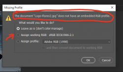
When I open it up, this is the dialog I get:

1623428053660.png

What you want is the generally accepted sRGB pofile to get some consistency between screens.

Open your image in Photoshop again. If you get this dialog box, choose the 2nd option - Assign working RGB: sRGB IEC61966-2.1.

Then resave and now try to open it in your smartphone. The colors should be very similar with some differences due to the nature of the display.

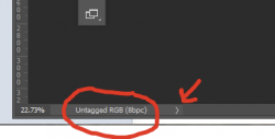
If you have it saved as a PSD file - which you should always have after an edit - check to see what imgae format it's saved in by going to the bottom left
of the document window:

1623428535309.png
If you don't see the profile, click on the arrow to the right and choose Document Profile.

To change the profile, got the top menu bar and choose Edit - Assign Profile.

Now save and you have the image with an embedded profile.

Let us know how you do.

- Jeff
 
Last edited:
To add to what @JeffK suggested.
The OLED Samsung Galaxy cell phones have about a P3 color space/scale gamut. If you image was created in P3 and the P3 scale was not included with the image, it would look lighter on your PC as when the profile is not attached to the image, it will be interpretted as sRGB (and it would be lighter).
Your logo is below and tagged as sRGB (I assigned the color space) for the left side of the image and the color on the right is more what it would look like if it was actually and image in P3 color space. Is that the difference you are seeing. If so @JeffK nailed it for you
John Wheeler

Logo-Flores2-adj.jpg
 
Hi @Tepazi
Samsung Galazy has some color settings that do automatic adjustment depending on what you are viewing. It is not perfect for all pictures.
I suggest checking the settings and turn off the automatic adjustments and see if that fixes the issue.
Just a suggestion and am providing a link for you to review
John Wheeler
https://www.samsung.com/hk_en/suppo...laxy-s8-screen-colors-turn-reddish-yellowish/
I have a Samsung and checked the display settings. Under screen mode, you can choose either Vivid or Natural. In switching between the two and viewing in a browser, there's a fairly dramatic shift in the orange color.
I would check those settings as well as working with the image profile.
Good call John!
 
you might have control over YOUR phone, but certainly no one else's.

the best you can do is have a calibrated monitor (if you're serious), and confirm on it that you're saving what you want people to see and, as suggested above, save in srgb colour space.

this sort of thing has been a nightmare in video as well - factory settings such as 'vivid' left on, and then people wondering why everything looks 'sort of wrong'...
 
Thank you everyone! this forum is really amazing...
Hi @JeffK, I did save it as a PSD also, and I just opened it on PS now and on the lower-left corner, it's saying sRGB IEC61966-2.1 (8bpc), and not untagged RGB...
 
To add to what @JeffK suggested.
The OLED Samsung Galaxy cell phones have about a P3 color space/scale gamut. If you image was created in P3 and the P3 scale was not included with the image, it would look lighter on your PC as when the profile is not attached to the image, it will be interpretted as sRGB (and it would be lighter).
Your logo is below and tagged as sRGB (I assigned the color space) for the left side of the image and the color on the right is more what it would look like if it was actually and image in P3 color space. Is that the difference you are seeing. If so @JeffK nailed it for you
John Wheeler

View attachment 121780
Yes, that's pretty much how it looks like! thanks :)
 
Thank you everyone! this forum is really amazing...
Hi @JeffK, I did save it as a PSD also, and I just opened it on PS now and on the lower-left corner, it's saying sRGB IEC61966-2.1 (8bpc), and not untagged RGB...
Now I'm confused...not an unusual condition for me. :cheesygrin:
When I downloaded the image you originally posted above, it had no associated profile. This is what I'm getting:
1623500812625.png
That's why I originally raised the issue of the profile being off.

I only raised it because this is a trap I fell into early on when working on images in this forum. Having come from a print background, our working space was always Adobe RGB, which has a fairly wide gamut, ie a greater range of color. That's matches more closely to what the final printed piece would render. But when posting images here on the web, the colors wouldn't match. I believe it was John who picked up on the issue then and I stopped changing profiles to Adobe RGB and started setting them as sRGB which matched closer to what we see here on the web.

So long winded explanation over, now it appears it only gets more confusing as display gamuts change according to the device we choose. Just finished an article which emphasizes the point that @ushere brought up - you can't control how everyone is displaying the work you create.

The author writes:

...multiple standards have created a mess that don’t always work well together. There are at least 7 standards that are commonly used, but many more. Displaying Rec. 709 on a DCI-P3 display can make the image look overly saturated. Displaying Rec. 709 on an sRGB display can make the footage look slightly washed out.
... releasing mobile phones and computers with DCI-P3 displays...adds uncertainty to the future of sRGB for computers and what “standard” is really a standard anymore
The basic rule of thumb is to edit in the color space you expect to deliver...When color correcting, you can only control your editing environment and the best way to do that is to pick a color standard and ensure your monitor is accurate to that standard. You can’t control the color accuracy of someone's TV or computer.


Here's the full article that is actually about video editing:


It's a bit of a deep dive but does provide some insight into these color issues that come up. This fascinates me a bit and @thebestcpu often feeds that addiction.

User experience, as always, dominates. ;)

- Jeff
 
...
It's a bit of a deep dive but does provide some insight into these color issues that come up. This fascinates me a bit and @thebestcpu often feeds that addiction.
...
- Jeff

I did not realize I was your "supplier." ;)
Careful, taken in large doses it causes swelling of the left side of your brain :cheesygrin:
John Wheeler
 

Back
Top