What's new
Photoshop Gurus Forum

Welcome to Photoshop Gurus forum. Register a free account today to become a member! It's completely free. Once signed in, you'll enjoy an ad-free experience and be able to participate on this site by adding your own topics and posts, as well as connect with other members through your own private inbox!

First logo designs thoughts and advice needed.


CL3

Well-Known Member
Messages
81
Likes
20
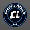
First go at designing so logos done some research about the whole design process and different types. I did not go over the top tried to keep things as simple as possible sometimes that is key. Any comments or thoughts welcome thanks .. and any mistakes you find .....please don't find any !

Made this on photoshop as well BTW I have read that illustrator i better for this type of work as PS works in pixels that is a programme to learn in the future.

https://www.behance.net/clgraphics
3.jpg

final.jpg

Final Text Logo 1.jpg
 
Last edited:
HI, nice work. I don't think the middle one is a logo, maybe part of a website header. The third looks like part of a business PowerPoint presentation, but nicely done colors.

The first is a logo. What I don't care for is that you have the effects on the text but not on the headphones. To have the effects on all of them would be too repetitive however, so I wouldn't consider that a solution. I would suggest trying all the text in the outer ring, with the special fx. Put the headphones in the center and larger, in the simple mode that they are now. Or leave the phones out altogether.

I'm not sure the font works at all. It doesn't seem representative of graphic art in general. The simpler a logo is, the better.

Another style that might work is using an oval instead of a circle.

Here's what I have in mind if you want to stay with the overall design idea.

CL-logo-2.jpg

Here is a rearrangement - not to my liking - of the original circle.

CL-logoo.jpg

Your thoughts?
 
  • Like
Reactions: CL3
By the way, what is the relevance of the headphones?

Just noticed, the oval design I made, looks like a sticker for my car's back window . . .
 
Hi Clare thanks for your feedback appreciate your time.

on the first logo I had the original as the CL in the middle and the GD text where it was with no headphones I added the headphones to fill the gap at the bottom plus i wanted to add a small icon. The relevance of the headphones is for my love and passion for music Im constantly buying new CDS and am also in the process of getting back into production. And I get alot of inspiration from it and hope to make alot more music related designs in the future (posters, flyers, album covers ...)

The 2nd I fully agree with it being used more as a header maybe if i bought the text slightly closer and changed the grungy texture to a black gradient background it would be more suited to that ?.

And the 3rd also is quite plain but that was the idea to make something that was text based and looked business like as this was my first attempt i wanted to try different styles.
 

Back
Top