Hi all,
I'm opening a dog grooming school, work of which I have more than 23 years of experience, but no experience at all with Photoshop, and I'm requesting your help, please.
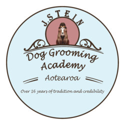
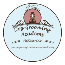
I have attached a sample of what I'm looking for my Logo (it's pretty rough I've made on paintbrush) but just to get an idea of what I have in mind.
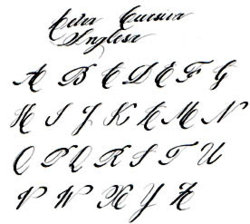
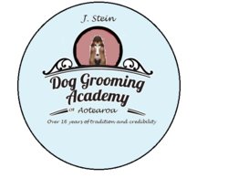
1- The name of my School is J. Stein. For the name I would like to use the same font as the one used on Dog Grooming Academy, I wish the letters matched.
2- The school name following the circle.
3- Feel free to use any font letter, since the one attached it's just a sample, we would just like it be cursive, as in the sample, and instead of black, brown color.
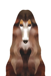
4- For the logo image in the middle of the circle I've attached a cartoon of a dog. If you could use the whole photo to show the long hair of the dog it would be nice, please.
5- The blue on the background is the color of our Dog Grooming Salon, so we would like to keep the same color on the background, please.
6- For the background color of the dog, feel free to use a color that matches and highlights it.
7- The circle around the logo does not have to be so open it can be less.
8- The logo will be used for our Facebook page, for our certificates at the end of the course and for a business card as well. The paper size of our certificates will be 8.5 x 11 inches. If you could send us the images on those 3 sizes we would appreciate.
Thank you in advance and feel free to contact me if you have any questions.
Kind Regards,
Jozi Stein.
I'm opening a dog grooming school, work of which I have more than 23 years of experience, but no experience at all with Photoshop, and I'm requesting your help, please.
I have attached a sample of what I'm looking for my Logo (it's pretty rough I've made on paintbrush) but just to get an idea of what I have in mind.
1- The name of my School is J. Stein. For the name I would like to use the same font as the one used on Dog Grooming Academy, I wish the letters matched.
2- The school name following the circle.
3- Feel free to use any font letter, since the one attached it's just a sample, we would just like it be cursive, as in the sample, and instead of black, brown color.
4- For the logo image in the middle of the circle I've attached a cartoon of a dog. If you could use the whole photo to show the long hair of the dog it would be nice, please.
5- The blue on the background is the color of our Dog Grooming Salon, so we would like to keep the same color on the background, please.
6- For the background color of the dog, feel free to use a color that matches and highlights it.
7- The circle around the logo does not have to be so open it can be less.
8- The logo will be used for our Facebook page, for our certificates at the end of the course and for a business card as well. The paper size of our certificates will be 8.5 x 11 inches. If you could send us the images on those 3 sizes we would appreciate.
Thank you in advance and feel free to contact me if you have any questions.
Kind Regards,
Jozi Stein.

")