What's new
Photoshop Gurus Forum

Welcome to Photoshop Gurus forum. Register a free account today to become a member! It's completely free. Once signed in, you'll enjoy an ad-free experience and be able to participate on this site by adding your own topics and posts, as well as connect with other members through your own private inbox!

HHow to make illustrations look more like "printed"


gabbbahey

Member
Messages
17
Likes
8
Hi!

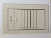
I´m making illustrations for a book. Everything is mainly done in illustrator. But I want a more tactile feeling to it all. (# 1, 2 is made by me) I´m thinking that Im going to import these into photoshop and give them some sort of treatment...

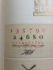
I´m after something that feels more like as if it had been printed. (image 3 and 4) I guess lines bleeding and so on. Does anyone have any generals tips for making my illustrations less sterile and more tactile?

I´m also after the same effect (old style printed text / text hat has bleeder into the paper) for all the text in the book...

thanks!
best
G
 

Attachments

  • 1.png
    1.png
    21.2 KB · Views: 1
  • 2.png
    2.png
    394 KB · Views: 0
  • 3.jpg
    3.jpg
    1.7 MB · Views: 1
  • 4.jpg
    4.jpg
    1.7 MB · Views: 2
I might have to add, that these illustrations are being printed on paper, so they will of course get the paper structure. But what I´m after is the feel of an "older print".
 
There are many qualities that make a printed page seem old.

Not only does the paper impart a texture, so does the printing process itself. There are pinholes and mottling in solid areas, randomly rough edges where the ink interacts with the fibers of the paper. There are breaks in thin lines. No two imprints of the same letter (number, punctuation, whatever) will ever be exactly the same - some will be lighter, some darker; some lighter. Any of these effects can vary both randomly, as well as with position on a page (eg, more faded imprint nearer the edges, the frequency of breaks in lines can vary from the top of the page to the bottom, etc..

The more realistic you want the simulation to be, the more of these (and other) imperfections you will need to incorporate. Doing so takes time and effort.

Tom M


PS - It goes without saying that choice of font and style of graphics (eg, hand-drawn vs done in AI ;-) ) is critical to giving an impression of age.
 
Hi Tom, and thanks for your reply!
I´ve chosen an appropriate font, but don´t want the hand drawn characteristics. I´m more after the exactness of the letter press, but also the imperfections the technique give the lines. But since this will be printed digitally I´d need to add these characteristics myself.

But you´re right, there´s probably no quick fix to this. I have to play around with paper textures and blending modes etc.
Thanks!
G
 
This is done entirely with layer styles.

A pattern overlay on the graphic using a paper texture.
A pattern overlay on the paper using a paper texture, Bevel & Emboss, and Drop Shadow.
Added some shading to the paper.

Screen Shot 2014-04-02 at 8.17.21 AM.png
 
IamSam! Thanks! You keep saving my day!
This is great, I´ve never used the pattern overlay, before. Usually just use a skanned paper. But this works just perfectly. Thanks!
Do you use the paper structures that comes with PS?
 
I don't remember if I added that paper pattern or if it came with Ps....................

Let me look, I'll edit this post with the answer so keep refreshing.

edit: It's called, Brush Pen on canvas and I think it was in the Grayscale Paper patterns that I loaded from the presets.
 
Last edited:

Back
Top